散点图真是一个比较神奇的图形,正如它的名字一样,一堆纷乱如麻的圆点,看似无迹可寻却能显示出数据难以显示的内在逻辑关系。很多人称它“万表之王”,它在数据分析师手里已经演化成了一个强大的数据分析工具。
你一般会选择哪种工具来做数据可视化?Lisa Charlotte Rost从去年五月开始尝试了24种工具或语言来画一张气泡图,经过半年的学习实践发现没有完美的可视化工具,每个工具都有各自的优缺点,但是对于某些领域目的,还是有比较推荐的可视化工具。
以下红色的是软件,蓝色的是语言
越靠左越适合做数据分析,越靠右越适合做展示

越靠右越灵活

左侧是静态,右侧是互动

越往左越容易上手,越往上越灵活

这是一张工具选择推荐图,根据目的分类
左上是简单快捷的目的,左下是故事导向,右上是为了分享的分析,右侧是创新型图表,右下是分析型工具

在看完对工具的推荐后,有兴趣的可以看下这24种工具是如何实现气泡图的。
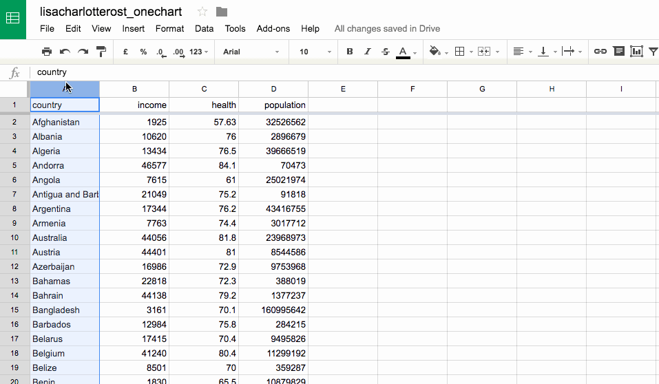
数据源统一如下,4个字段分别为国家,人均收入,寿命,人口总数,想要做的效果是一个气泡图,X轴为人均收入,Y轴为寿命,气泡大小为人口总数
工具1:Excel
工具2:Google Sheets
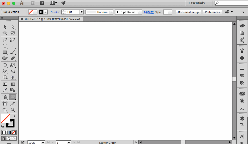
工具3:Adobe Illustrator
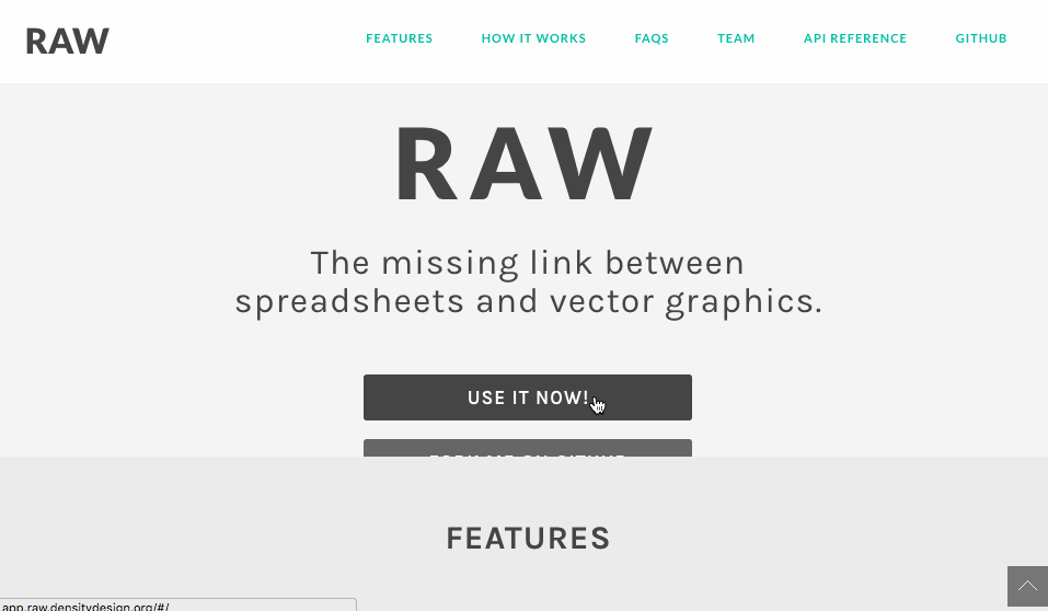
工具4:RAW by DensityDesign
工具5:Lyra

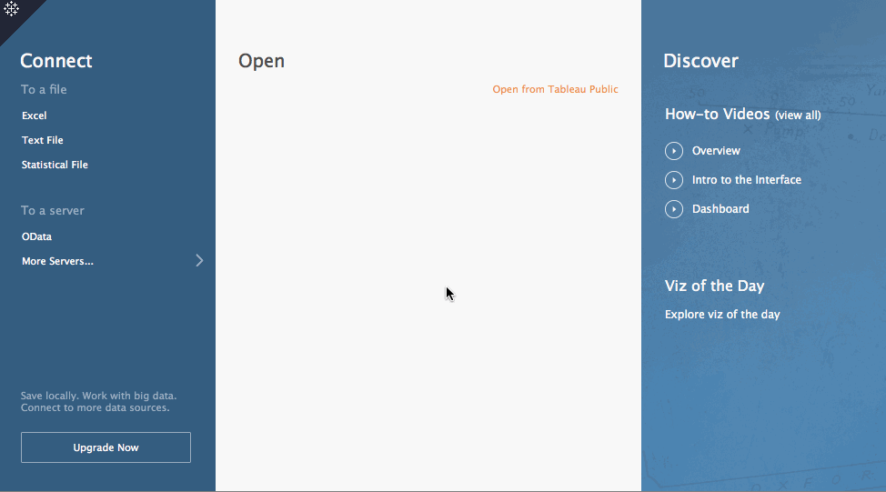
工具6:Tableau Public
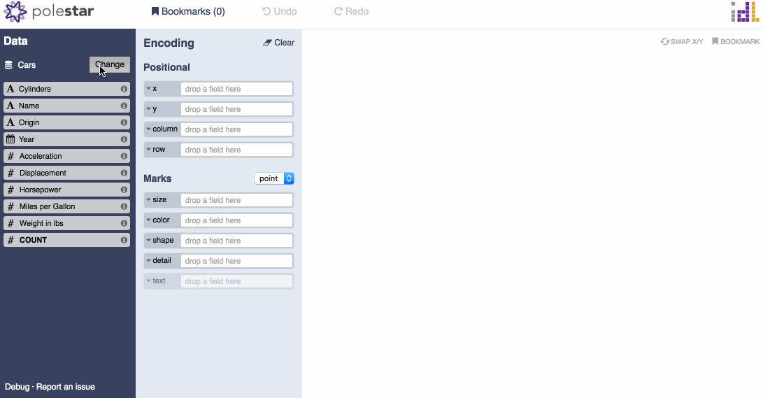
工具7:Polestar
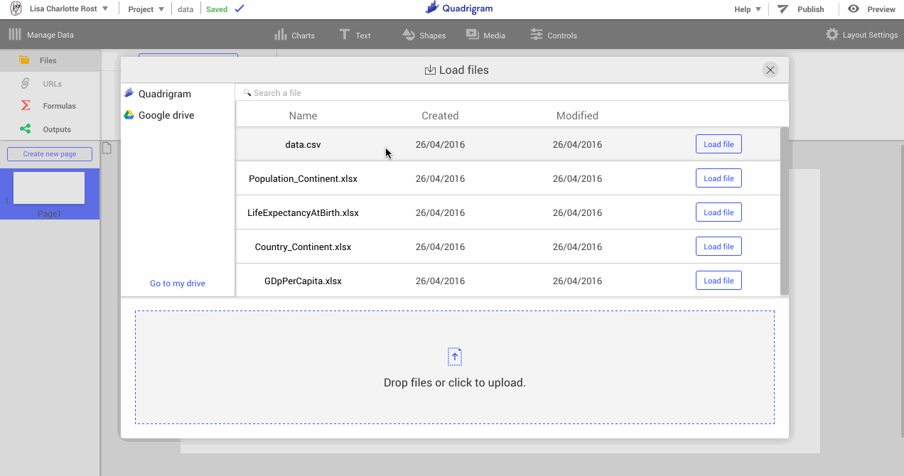
工具8:Quadrigram
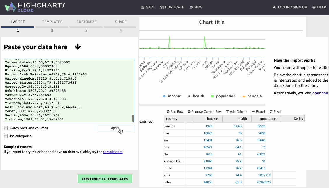
工具9:Highcharts Cloud
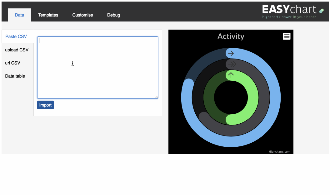
工具10:Easychart
工具11:Plotly

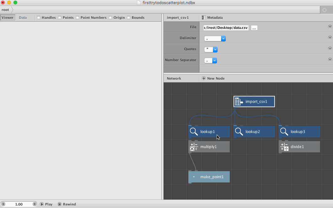
工具12:NodeBox
工具13:R – native
#set working directorysetwd("Desktop")#read csvd = read.csv("data.csv", header=TRUE

工具14:R – ggplot2
#import librarylibrary(ggplot2)#set working directorysetwd("Desktop")#read csvd = read.csv("data.csv", header=TRUE)#plot chartggplot(d) +

  geom_point(aes(x=log(income),y=health,size=population)) +

  expand_limits(x=0)
工具15:R – ggvis
#import librarylibrary(ggvis)library(dplyr)#set working directorysetwd("Desktop")#read csvd = read.csv("data.csv", header=TRUE)#plot chartd %>%

  ggvis(~income, ~health) %>%

  layer_points(size= ~population,opacity:=0.6) %>%

  scale_numeric("x",trans = "log",expand=0)

工具16:Python - matplotlib
#import librariesimport numpy as npimport pandas as pdimport matplotlib.pyplot as pl

工具17:Python - Seaborn
#import librariesimport pandas as pdimport matplotlib.pyplot as pltimport seaborn as

工具18:Python - Bokeh
#import librariesimport pandas as pdfrom bokeh.plotting import figure, show, output_file#read datadata = pd.read_csv("data.csv")#plot chartp = figure(x_axis_type="log")p.scatter(data['income'], data['health'], radius=data['population']/100000,

          fill_color='black', fill_alpha=0.6, line_color=None)#write as html fi

工具19:Processing
void setup() {size(1000,500); #sets size of the canvasbackground(255); #sets background colorscale(1, -1); #inverts y & x axistranslate(0, -height); #inverts y & x axis, step 2Table table = loadTable("data.csv", "header"); #loads csv


  for (TableRow row : table.rows()) { #for each rown in the csv, do:


    float health = row.getFloat("health");

    float income = row.getFloat("income");

    int population = row.getInt("population");

    #map the range of the column to the available height:

    float health_m = map(health,50,90,0,height);

    float income_log = log(income);

    float income_m = map(income_log,2.7, 5.13,0,width/4);

    float population_m =map(population,0,1376048943,1,140);


    ellipse(income_m,health_m,population_m,population_m); //draw the ellipse

  }}

工具20:D3.js
<!-- mostly followed this example:

http://bl.ocks.org/weiglemc/6185069 --><!DOCTYPE html><html><head>

  <style>


  circle {

    fill: black;

    opacity:0.7;

  }


  </style>

  <script type="text/javascript" src="D3.v3.min.js"></script></head><body>

  <script type="text/javascript">


  // load data

  var data = D3.csv("data.csv", function(error, data) {


    // change string (from CSV) into number format

    data.forEach(function(d) {

      d.health = +d.health;

      d.income = Math.log(+d.income);

      d.population = +d.population;

      console.log(d.population, Math.sqrt(d.population))

    });


  // set scales

  var x = D3.scale.linear()

    .domain([0, D3.max(data, function(d) {return d.income;})])

    .range([0, 1000]);


  var y = D3.scale.linear()

    .domain([D3.min(data, function(d) {return d.health;}),

      D3.max(data, function(d) {return d.health; })])

    .range([500, 0]);


  var size = D3.scale.linear()

    .domain([D3.min(data, function(d) {return d.population;}),

      D3.max(data, function(d) {return d.population; })])

    .range([2, 40]);


  // append the chart to the website and set height&width

  var chart = D3.select("body")

  	.append("svg:svg")

  	.attr("width", 1000)

  	.attr("height", 500)


  // draw the bubbles

  var g = chart.append("svg:g");

  g.selectAll("scatter-dots")


    .data(data)

    .enter().append("svg:circle")

        .attr("cx", function(d,i) {return x(d.income);})

        .attr("cy", function(d) return y(d.health);})

        .attr("r", function(d) {return size(d.population);});

  });


  </script></body></html>

工具21:D3.js Templates
...nv.addGraph(function() {


    var chart = nv.models.scatter() //define that it's a scatterplot

        .xScale(D3.scale.log()) //log scale

        .pointRange([10, 5000]) //define bubble sizes

        .color(['black']); //set color


    D3.select('#chart') //select the div in which the chart should be plotted

        .datum(exampleData)

        .call(chart);


    //plot the chart

    return chart;});

工具22:Highcharts.js
<!DOCTYPE HTML><html>

  <head>

    <script src="https://ajax.googleapis.com/ajax/libs/jquery/1.7.1/jquery.min.js" type="text/javascript"></script>

    <script src="https://code.highcharts.com/highcharts.js"></script>

    <script src="https://code.highcharts.com/modules/data.js"></script>

    <script src="https://code.highcharts.com/highcharts-more.js"></script>

  </head>

  <body>

    <div id="chart"></div>


    <script>

    var url = 'data.csv';

    $.get(url, function(csv) {


    // A hack to see through quoted text in the CSV

    csv = csv.replace(/(,)(?=(?:[^"]|"[^"]*")*$)/g, '|');


    $('#chart').highcharts({

      chart: {

        type: 'bubble'

      },


      data: {

        csv: csv,

        itemDelimiter: '|',

        seriesMapping: [{

          name: 0,

          x: 1,

          y: 2,

          z: 3

          }]

        },


        xAxis: {

          type: "logarithmic"

        },

        colors: ["#000000"],

      });

    });


    </script>

  </body></html>

工具23:Vega
{

  "width": 1000,

  "height": 500,

  "data": [

    {

      "name": "data",

      "url": "data.csv",

      "format": {

        "type": "csv",

        "parse": {

          "income": "number"

        }

      }

    }

  ],

  "scales": [

    {

      "name": "xscale",

      "type": "log",

      "domain": {

        "data": "data",

        "field": ["income"]

      },

      "range": "width",

      "nice": true,

      "zero": true

    },

    {

      "name": "yscale",

      "type": "linear",

      "domain": {

        "data": "data",

        "field": ["health"]

      },

      "range": "height",

      "zero": false

    },

    {

      "name": "size",

      "type": "linear",

      "domain": {

        "data": "data",

        "field": "population"

      },

      "range": [0,700]

    }

  ],

  "axes": [

    {

      "type": "x",

      "scale": "xscale",

      "orient": "bottom"

    },

    {

      "type": "y",

      "scale": "yscale",

      "orient": "left"

    }

  ],

  "marks": [

    {

      "type": "symbol",

      "from": {

        "data": "data"

      },

      "properties": {

        "enter": {

          "x": {

            "field": "income",

            "scale": "xscale"

          },

          "y": {

            "field": "health",

            "scale": "yscale"

          },

          "size": {

            "field":"population",

            "scale":"size",

            "shape":"cross"

          },

          "fill": {"value": "#000"},

          "opacity": {"value": 0.6}

        }

      }

    }

  ]}

工具24:Vega Lite
{

  "data": {"url": "data.csv", "formatType": "csv"},

  "mark": "circle",

  "encoding": {

    "y": {

      "field": "health",

      "type": "quantitative",

      "scale": {"zero": false}

    },

    "x": {

      "field": "income",

      "type": "quantitative",

      "scale": {"type": "log"}

    },

    "size": {

      "field": "population",

      "type": "quantitative"

    },

    "color": {"value": "#000"}

  },

  "config": {"cell": {"width": 1000,"height": 500}}

  }

工具25:BIT 超级数据分析平台