没有难学的技艺,只有不够辛勤的付出!
今天这篇文章推送仿的的是网易数独的一幅信息图,内容呈现的是全球各国人民对于养老所持的态度,数据来源于Pew Reserch Centre。
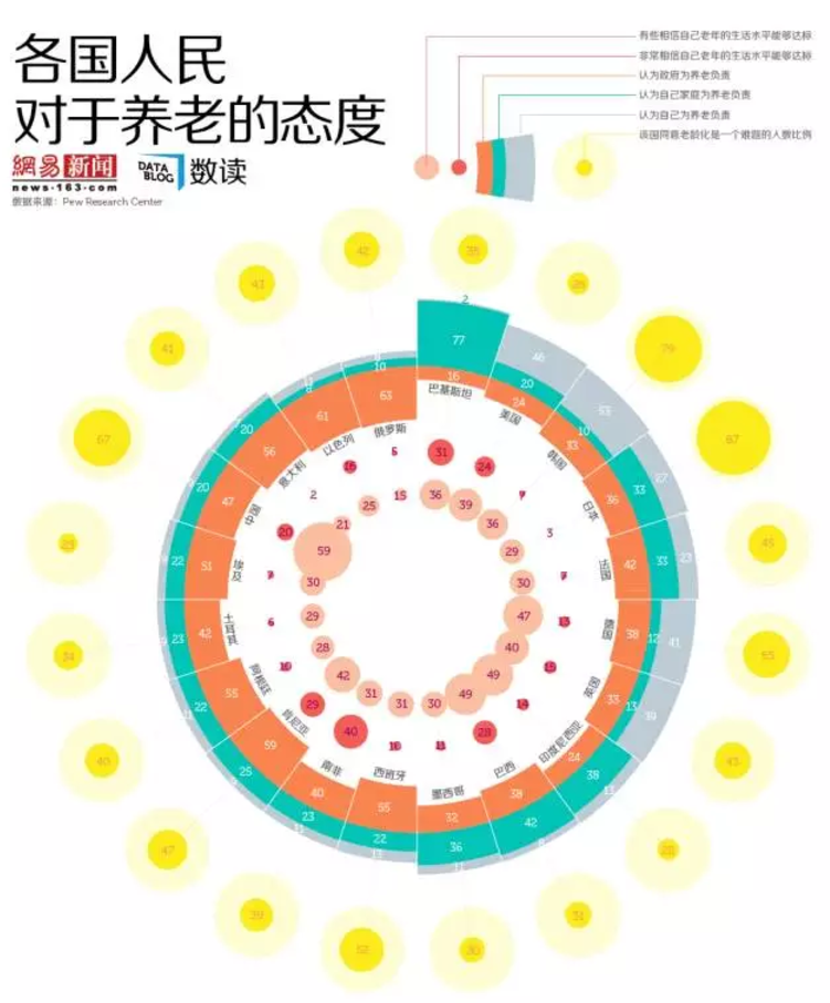
图表整体难度中等,使用ggplot2来写代码,主要考察关于极坐标转换与应用。(ggplot2系统中,两个较为高阶的用法分别为:极坐标系、地理空间的多边形填充)。
#加载包:
library("ggplot2")
library("tidyr")
library("ggthemes")
library("dplyr")
library("Cairo")
library("showtext")
#载入字体:
font.add("myfontl","msyhl.ttc")
font.add("myfont","msyh.ttc")
font.add("myfzhzh","方正正粗黑简体.TTF")
#锁定文件临时目录:
setwd("D:/R/File")
#导入数据
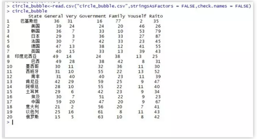
circle_bubble<-read.csv("circle_bubble.csv",stringsAsFactors = FALSE,check.names = FALSE)
仔细观察该图,你会发现,玫瑰图内侧并非底边对齐,而是靠上下中心对齐,要想做到这种效果,必须将一个 细分维度转化为负值(柱形图堆积时会自动将负值堆积在负坐标轴上)。
circle_bubble$Government<--circle_bubble$Government
level<-circle_bubble[,"State"]
circle_bubble$State<-factor(circle_bubble$State,levels=level,ordered=TRUE)
筛选出制作堆积条形图的数据源:
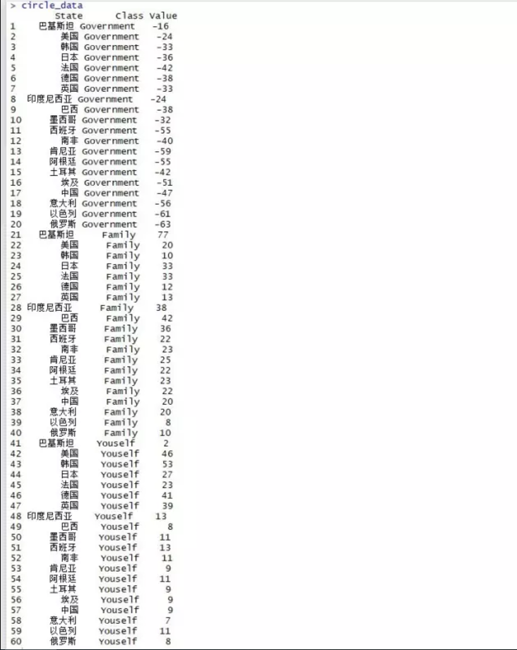
circle_data<-circle_bubble %>% select(State,Government,Family,Youself) %>% gather(Class,Value,-State)
circle_data$Class<-factor(circle_data$Class,levels=c("Government","Youself","Family"),ordered=TRUE)
#构造三个序列的气泡图数据:
circle_point<-circle_bubble[,c("State","General","Very","Raito")]
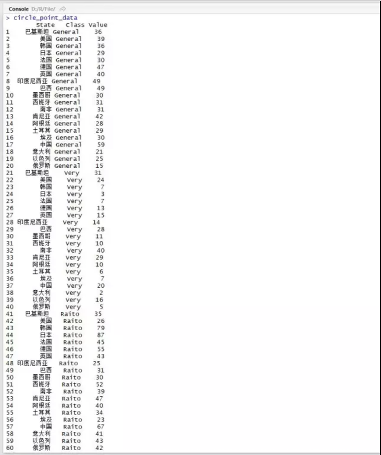
circle_point_data<-gather(circle_point,Class,Value,-State)
circle_point_data$Class<-factor(circle_point_data$Class,levels=c("General","Very","Raito"),order=TRUE)
#构造气泡图模拟Y轴:
circle_point_data <- within(circle_point_data,{
mood_y <- NA
mood_y[Class=="General"]<--150
mood_y[Class=="Very"]<--100
mood_y[Class=="Raito"]<-140})
#构造模拟气泡大小
circle_point_data$Value_y<-ifelse(circle_point_data$Class=="Raito",circle_point_data$Value,0.3*circle_point_data$Value)
(这里没有使用气泡图对应真实值作为气泡大小,而是将除Raito系列之外的两个序列真实值缩小了70%,这么做的目的是为了整体的气泡大小比例显示更为匀称和谐,因为Ratio序列是单值序列,其与自身的100%单位标度比较,剩余两个序列相互比较)。
#构造模拟标签位置
circle_data <- within(circle_data,{
label_y <- NA
label_y[Class=="Government"]<-circle_bubble$Government/2
label_y[Class=="Family"]<-circle_bubble$Family/2
label_y[Class=="Youself"]<-circle_bubble$Family+circle_bubble$Youself-circle_bubble$Youself/2})
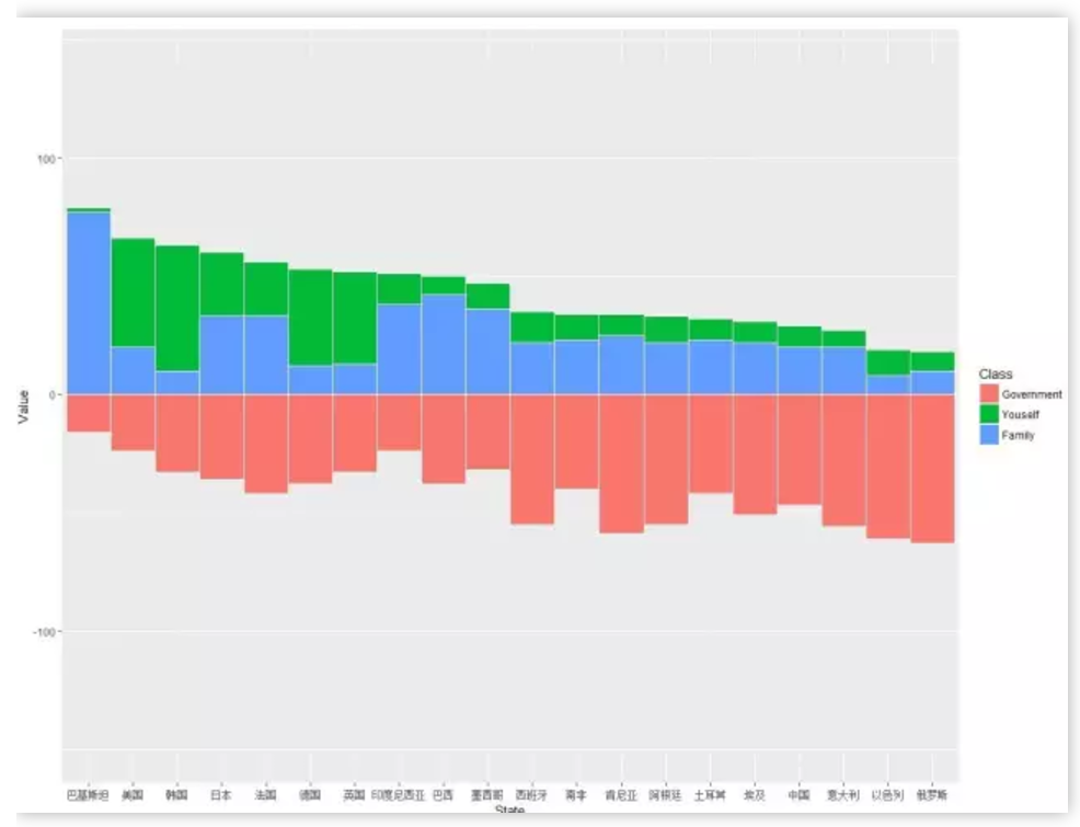
#极坐标化前的柱形图:
ggplot()+
geom_linerange(data=circle_bubble,aes(x=State,ymin=-150,ymax=140),size=.25,color="#D8E5F2",alpha=0.8)+
geom_col(data=circle_data,aes(x=State,y=Value,fill=Class),width=1,colour="white",size=.25)
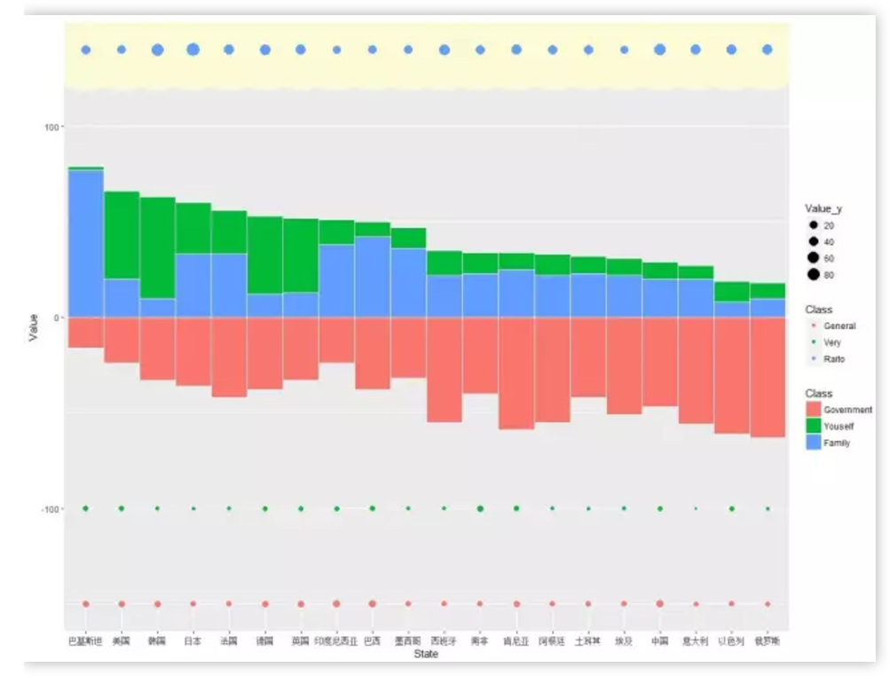
###极坐标化前的柱形图和气泡图
ggplot()+
geom_linerange(data=circle_bubble,aes(x=State,ymin=-150,ymax=140),size=.25,color="#D8E5F2",alpha=0.8)+
geom_col(data=circle_data,aes(x=State,y=Value,fill=Class),width=1,colour="white",size=.25)+
geom_point(data=circle_bubble,aes(State,y=140),size=40,colour="#FEFCD3",alpha=.8)+
geom_point(data=circle_point_data,aes(State,y=mood_y,size=Value_y,colour=Class))+
geom_text(data=circle_data,aes(x=State,y=label_y,group=Class,label=abs(Value)),family="myfont",colour="white",size=5)+
geom_text(data=filter(circle_point_data,mood_y==-150),aes(x=State,y=mood_y,label=Value),family="myfontl",colour="#AA1A66",size=4)+
geom_text(data=filter(circle_point_data,mood_y==-100),aes(x=State,y=mood_y,label=Value),family="myfontl",colour="#A31067",size=4)+
geom_text(data=filter(circle_point_data,mood_y==140),aes(x=State,y=mood_y,label=Value),family="myfontl",colour="#F29E4A",size=5)
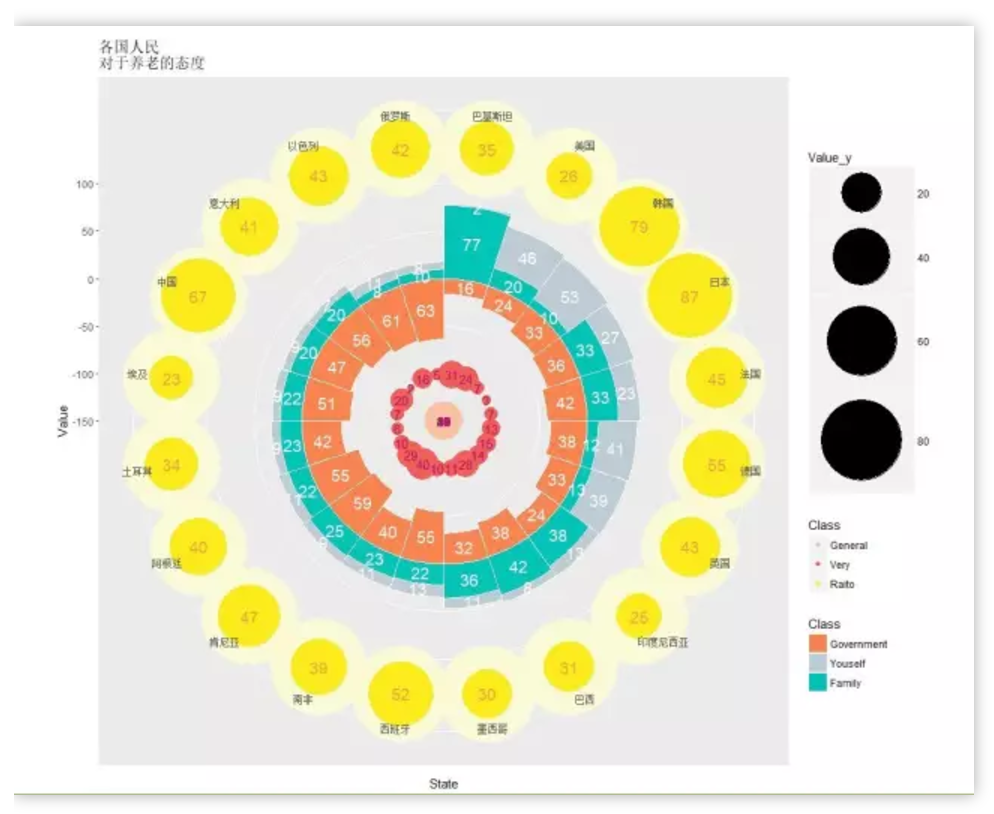
#极坐标化后的柱形图和气泡图(完整标签版)
ggplot()+
geom_linerange(data=circle_bubble,aes(x=State,ymin=-150,ymax=140),size=.25,color="#D8E5F2",alpha=0.8)+
geom_col(data=circle_data,aes(x=State,y=Value,fill=Class),width=1,colour="white",size=.25)+
geom_point(data=circle_bubble,aes(State,y=140),size=40,colour="#FEFCD3",alpha=.8)+
geom_point(data=circle_point_data,aes(State,y=mood_y,size=Value_y,colour=Class))+
geom_text(data=circle_data,aes(x=State,y=label_y,group=Class,label=abs(Value)),family="myfont",colour="white",size=5)+
geom_text(data=filter(circle_point_data,mood_y==-150),aes(x=State,y=mood_y,label=Value),family="myfontl",colour="#AA1A66",size=4)+
geom_text(data=filter(circle_point_data,mood_y==-100),aes(x=State,y=mood_y,label=Value),family="myfontl",colour="#A31067",size=4)+
geom_text(data=filter(circle_point_data,mood_y==140),aes(x=State,y=mood_y,label=Value),family="myfontl",colour="#F29E4A",size=5)+
scale_fill_manual(values=c("#FA844F","#BDCCD4","#00C4B5"))+
scale_colour_manual(values=c("#FAC0A1","#F35C57","#FBEB1B"))+
labs(title="各国人民\n对于养老的态度")+
scale_size_area(max_size=34.8)+
coord_polar()
#最终成品图:
CairoPNG(file="circle_bubble.png",width=1000,height=1000)
showtext.begin()
ggplot()+
geom_linerange(data=circle_bubble,aes(x=State,ymin=-150,ymax=140),size=.25,color="#D8E5F2",alpha=0.8)+
geom_col(data=circle_data,aes(x=State,y=Value,fill=Class),width=1,colour="white",size=.25)+
geom_point(data=circle_bubble,aes(State,y=140),size=40,colour="#FEFCD3",alpha=.8)+
geom_point(data=circle_point_data,aes(State,y=mood_y,size=Value_y,colour=Class))+
geom_text(data=circle_data,aes(x=State,y=label_y,group=Class,label=abs(Value)),family="myfont",colour="white",size=5)+
geom_text(data=filter(circle_point_data,mood_y==-150),aes(x=State,y=mood_y,label=Value),family="myfontl",colour="#AA1A66",size=4)+
geom_text(data=filter(circle_point_data,mood_y==-100),aes(x=State,y=mood_y,label=Value),family="myfontl",colour="#A31067",size=4)+
geom_text(data=filter(circle_point_data,mood_y==140),aes(x=State,y=mood_y,label=Value),family="myfontl",colour="#F29E4A",size=5)+
scale_fill_manual(values=c("#FA844F","#BDCCD4","#00C4B5"))+
scale_colour_manual(values=c("#FAC0A1","#F35C57","#FBEB1B"))+
labs(title="各国人民\n对于养老的态度")+
scale_size_area(max_size=34.8)+
coord_polar()+
ylim(-250,150)+
guides(colour=FALSE,size=FALSE,fill=FALSE)+
theme_map() %+replace%theme(plot.title=element_text(family="myfzhzh",size=50,hjust=0,lineheight=1.2))
showtext.end()
dev.off()
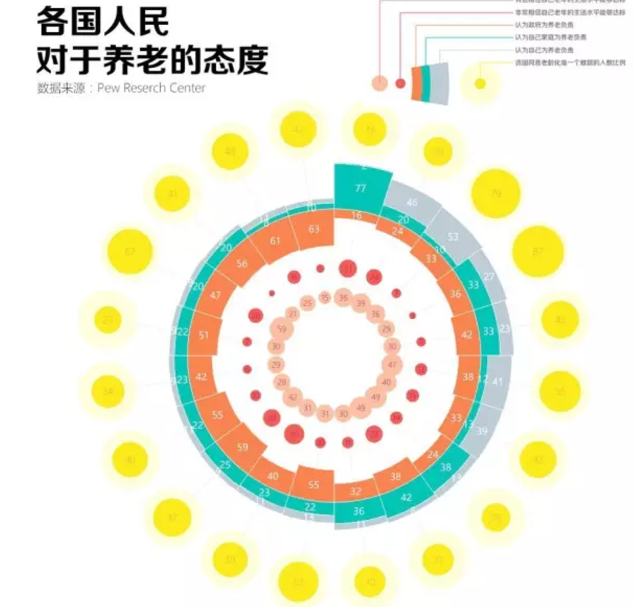
PS修饰后的最终效果(以上进过PS修饰细节)。