barplot 条形图
seaborn 的 barplot() 利用矩阵条的高度反映数值变量的集中趋势,以及使用 errorbar 功能(差棒图)来估计变量之间的差值统计。请谨记 bar plot 展示的是某种变量分布的平均值,当需要精确观察每类变量的分布趋势,boxplot 与 violinplot 往往是更好的选择。
具体用法如下:
seaborn.barplot(x=None, y=None, hue=None, data=None, order=None, hue_order=None,ci=95, n_boot=1000, units=None, orient=None, color=None, palette=None, saturation=0.75, errcolor='.26', errwidth=None, capsize=None, ax=None, estimator=<function mean>,**kwargs)¶Parameters:
x, y, hue : names of variables in data or vector data, optional #设置 x,y 以及颜色控制的变量
Inputs for plotting long-form data. See examples for interpretation.
data : DataFrame, array, or list of arrays, optional #设置输入的数据集
Dataset for plotting. If x and y are absent, this is interpreted as wide-form. Otherwise it is expected to be long-form.
order, hue_order : lists of strings, optional #控制变量绘图的顺序
Order to plot the categorical levels in, otherwise the levels are inferred from the data objects.
estimator : callable that maps vector -> scalar, optional
#设置对每类变量的计算函数,默认为平均值,可修改为 max、median、max 等
Statistical function to estimate within each categorical bin.
ax : matplotlib Axes, optional #设置子图位置,将在下节介绍绘图基础
Axes object to draw the plot onto, otherwise uses the current Axes.
orient : “v” | “h”, optional #控制绘图的方向,水平或者竖直
Orientation of the plot (vertical or horizontal).
capsize : float, optional #设置误差棒帽条的宽度
Width of the “caps” on error bars.
注:代码可左右滑动,下同
import seaborn as sns
sns.set_style("whitegrid")
tips = sns.load_dataset("tips") #载入自带数据集
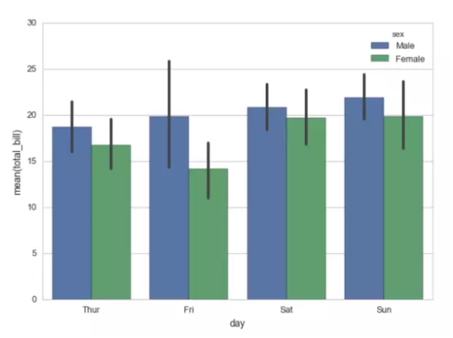
#x轴为分类变量day,y轴为数值变量total_bill,利用颜色再对sex分类
ax = sns.barplot(x="day", y="total_bill", hue="sex", data=tips)
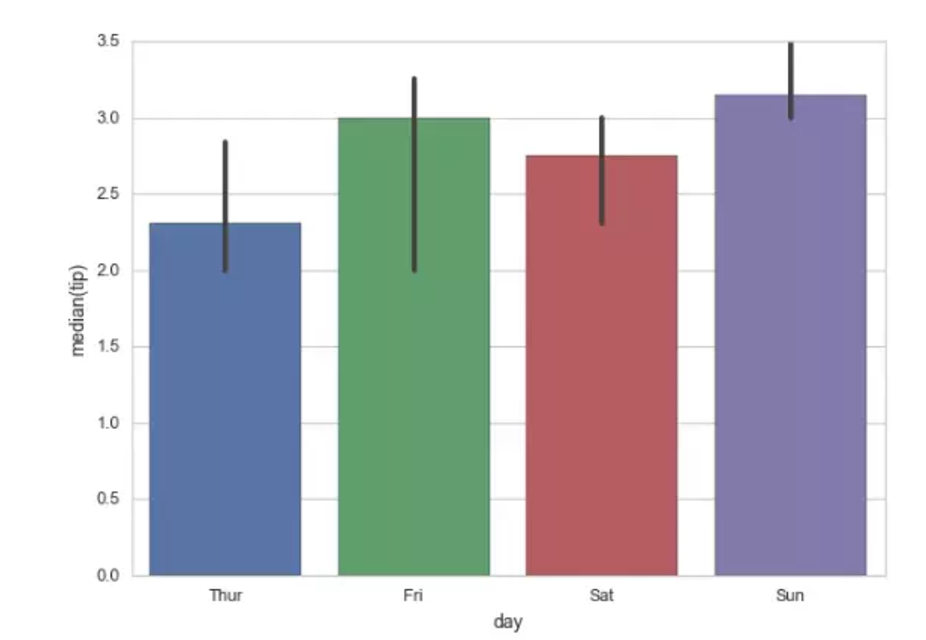
from numpy import median
ax = sns.barplot(x="day", y="tip", data=tips, estimator=median)
#设置中位数为计算函数,注意y轴已显示为median
countplot 计数图
countplot 故名思意,计数图,可将它认为一种应用到分类变量的直方图,也可认为它是用以比较类别间计数差,调用 count 函数的 barplot。
seaborn.countplot(x=None, y=None, hue=None, data=None, order=None, hue_order=None, orient=None, color=None, palette=None,saturation=0.75, ax=None, **kwargs)
x, y, hue : names of variables in data or vector data, optional
Inputs for plotting long-form data. See examples for interpretation.
data : DataFrame, array, or list of arrays, optional
Dataset for plotting. If x and y are absent, this is interpreted as wide-form. Otherwise it is expected to be long-form.
order, hue_order : lists of strings, optional #设置顺序
Order to plot the categorical levels in, otherwise the levels are inferred from the data objects.
orient : “v” | “h”, optional #设置水平或者垂直显示
Orientation of the plot (vertical or horizontal).
ax : matplotlib Axes, optional #设置子图位置,将在下节介绍绘图基础
Axes object to draw the plot onto, otherwise uses the current Axes.
>>> import seaborn as sns
>>> sns.set(style="darkgrid")
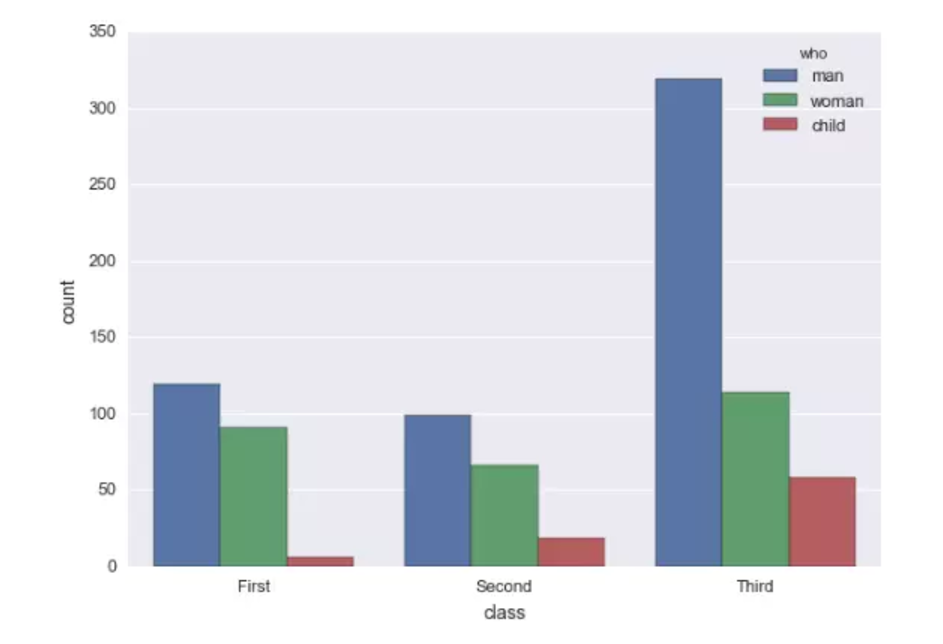
>>> titanic = sns.load_dataset("titanic")
#titanic经典数据集,带有登船人员的信息#源数据集class代表三等舱位,who代表人员分类,男女小孩,对每一类人数计数
>>> ax = sns.countplot(x="class", hue="who", data=titanic)
Senior Example Ⅰ for Practice
import numpy as np
import seaborn as sns
sns.set(style="white") #设置绘图背景
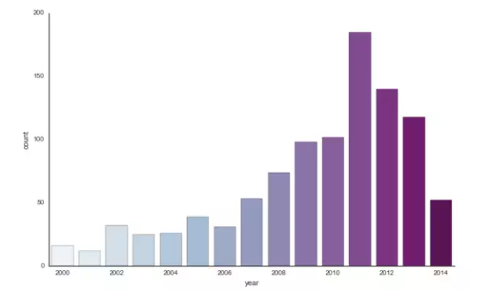
# Load the example planets dataset
planets = sns.load_dataset("planets")
# Make a range of years to show categories with no observations
years = np.arange(2000, 2015) #生成2000-2015连续整数
#Draw a count plot to show the number of planets discovered each year
#选择调色板,绘图参数与顺序,factorplot一种分类变量的集合作图方式,利用kind选择bar、plot等绘图参数以后将具体介绍
g = sns.factorplot(x="year", data=planets, kind="count",
palette="BuPu", size=6, aspect=1.5, order=years)
g.set_xticklabels(step=2) #设置x轴标签间距为2年
Senior Example Ⅱ for Practice
利用 countplot 与 barplot 探索 dc 超级英雄数据,数据集如下所示:

如图第一行为蝙蝠侠的数据有名称,联盟属性,眼睛颜色,头发颜色,性别等信息,一共 6896 个漫画角色与 13 维信息。
# -*-coding:utf-8 -*-
import pandas as pd
import seaborn as sns
dc=pd.read_csv('H:/zhihu/dc.csv')

#第一个图,我们来探索下英雄与坏蛋们眼睛颜色的分布
#看看坏蛋的眼睛颜色是不是都是什么奇怪的颜色
sns.countplot(y='EYE',data=dc,hue='ALIGN')
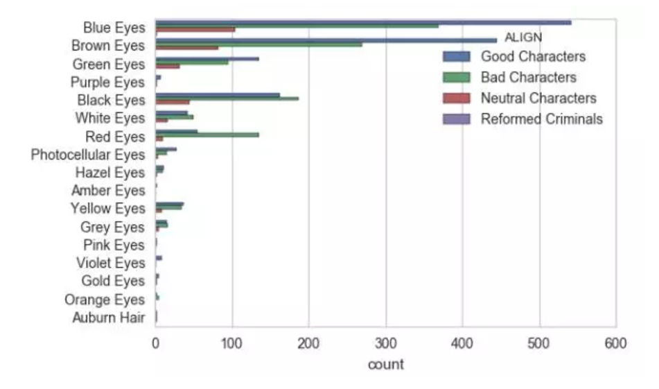
乍一看,大部分角色的眼睛颜色都是蓝色棕色绿色等欧美人种颜色,定睛一看,黑颜色与红颜色的眼睛坏人阵营就占优势了。
#第二个图我们来用用barplot,发现每个角色的出场次数是个数值型变量,是个不错的探索数据,我们来看看各个阵营间与性别间的平均上场次数
sns.barplot(y='APPEARANCES',x='ALIGN',data=dc,hue='SEX')
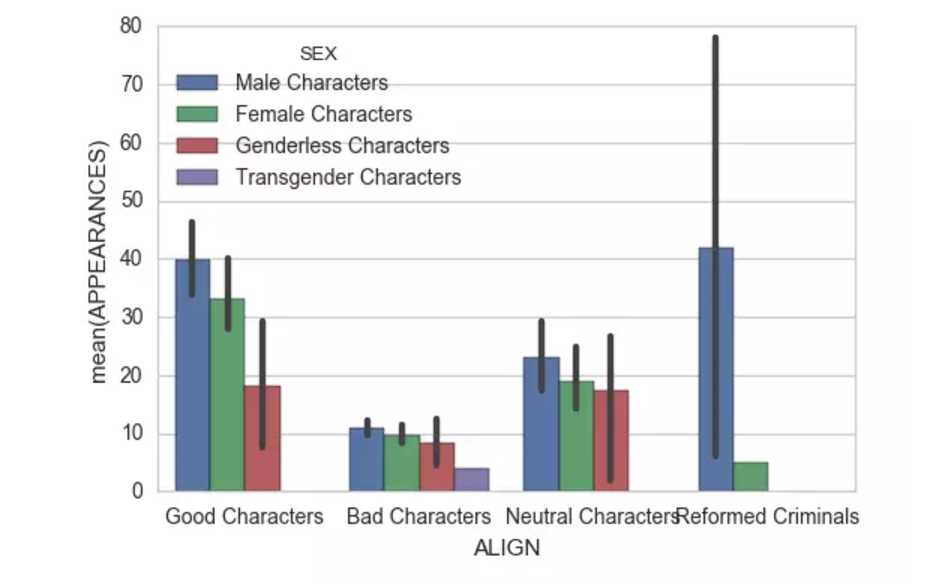
别问我怎么怎么有四个性别,世界之大无奇不有,还有无性别与变性的。总的来说男性和女性还是占了大部分等场时间。
#再来复习一波上一节的知识,来看看好坏阵营间登场小于50次的各大配角们的登场次数分布
ax1=sns.kdeplot(dc['APPEARANCES'][dc['ALIGN']=='Good Characters'][dc['APPEARANCES']<50],shade=True,label='good')

ax2=sns.kdeplot(dc['APPEARANCES'][dc['ALIGN']=='Bad Characters'][dc['APPEARANCES']<50],shade=True,label='bad')

酱油坏蛋们主要集中在 10 次以内,活不过 10 集看来是常态。不过好像好人也是这样的不过没有坏蛋趋势集中。

