本文作者 冯雨润,首发于作者知乎,https://zhuanlan.zhihu.com/p/24464836,已获作者授权原创形式发布,欢迎点击【阅读原文】关注支持!
Seaborn介绍
官方链接:
Seaborn: statistical data visualization
http://seaborn.pydata.org/index.html
Seaborn是一种基于matplotlib的图形可视化python libraty。它提供了一种高度交互式界面,便于用户能够做出各种有吸引力的统计图表。
Seaborn其实是在matplotlib的基础上进行了更高级的API封装,从而使得作图更加容易,在大多数情况下使用seaborn就能做出很具有吸引力的图,而使用matplotlib就能制作具有更多特色的图。应该把Seaborn视为matplotlib的补充,而不是替代物。同时它能高度兼容numpy与pandas数据结构以及scipy与statsmodels等统计模式。掌握seaborn能很大程度帮助我们更高效的观察数据与图表,并且更加深入了解它们。
其有如下特点:
基于matplotlib aesthetics绘图风格,增加了一些绘图模式
增加调色板功能,利用色彩丰富的图像揭示您数据中的模式
运用数据子集绘制与比较单变量和双变量分布的功能
运用聚类算法可视化矩阵数据
灵活运用处理时间序列数据
利用网格建立复杂图像集
安装seaborn
利用pip安装
pip install seaborn
2. 在Anaconda环境下,打开prompt
conda install seaborn
distplot
seaborn的displot()集合了matplotlib的hist()与核函数估计kdeplot的功能,增加了rugplot分布观测条显示与利用scipy库fit拟合参数分布的新颖用途。具体用法如下:
seaborn.distplot(a, bins=None, hist=True, kde=True, rug=False, fit=None, hist_kws=None, kde_kws=None, rug_kws=None, fit_kws=None, color=None, vertical=False, norm_hist=False, axlabel=None, label=None, ax=None)
Parameters:
a : Series, 1d-array, or list.
Observed data. If this is a Series object with a name attribute, the name will be used to label the data axis.
bins : argument for matplotlib hist(), or None, optional #设置矩形图数量
Specification of hist bins, or None to use Freedman-Diaconis rule.
hist : bool, optional #控制是否显示条形图
Whether to plot a (normed) histogram.
kde : bool, optional #控制是否显示核密度估计图
Whether to plot a gaussian kernel density estimate.
rug : bool, optional #控制是否显示观测的小细条(边际毛毯)
Whether to draw a rugplot on the support axis.
fit : random variable object, optional #控制拟合的参数分布图形
An object with fit method, returning a tuple that can be passed to a pdf method a positional arguments following an grid of values to evaluate the pdf on.
{hist, kde, rug, fit}_kws : dictionaries, optional
Keyword arguments for underlying plotting functions.
vertical : bool, optional #显示正交控制
If True, oberved values are on y-axis.
Histograms直方图
直方图(Histogram)又称质量分布图,是一种统计报告图,由一系列高度不等的纵向条纹或线段表示数据分布的情况。 一般用横轴表示数据类型,纵轴表示分布情况。
%matplotlib inlineimport numpy as npimport pandas as pdfrom scipy import stats, integrateimport matplotlib.pyplot as plt #导入importseaborn as snssns.set(color_codes=True)#导入seaborn包设定颜色np.random.seed(sum(map(ord, "distributions")))
x = np.random.normal(size=100)sns.distplot(x, kde=False, rug=True);#kde=False关闭核密度分布,rug表示在x轴上每个观测上生成的小细条(边际毛毯)
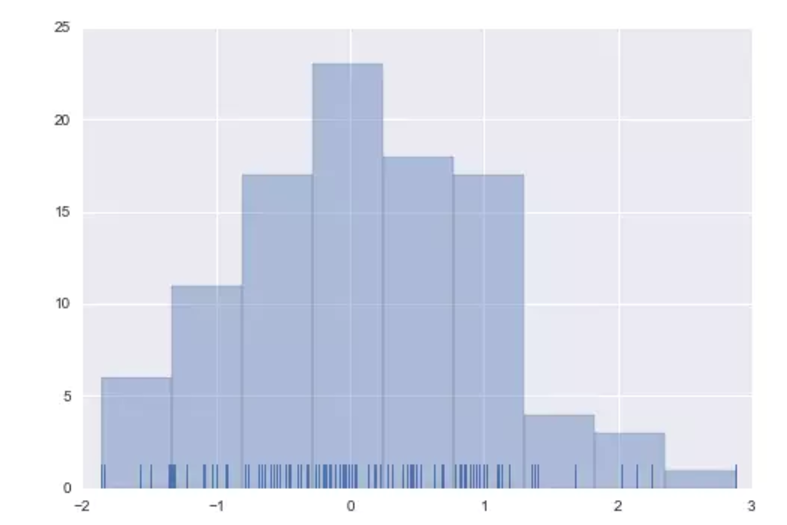
当绘制直方图时,你最需要确定的参数是矩形条的数目以及如何放置它们。利用bins可以方便设置矩形条的数量。如下所示:
sns.distplot(x, bins=20, kde=False, rug=True);#设置了20个矩形条

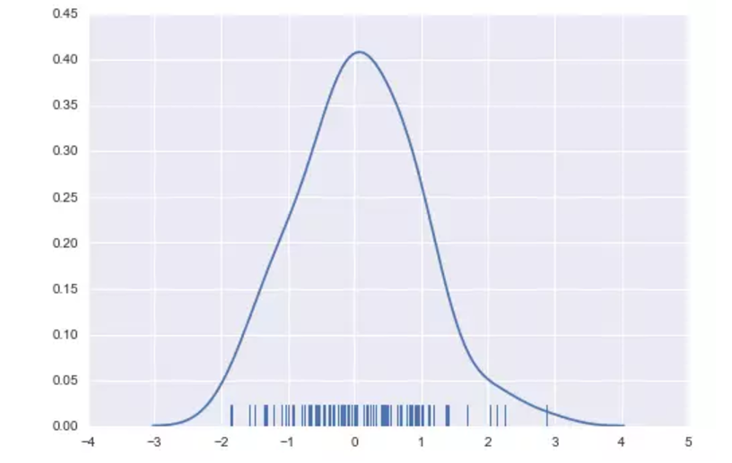
Kernel density estimaton核密度估计
核密度估计是在概率论中用来估计未知的密度函数,属于非参数检验方法之一。.由于核密度估计方法不利用有关数据分布的先验知识,对数据分布不附加任何假定,是一种从数据样本本身出发研究数据分布特征的方法,因而,在统计学理论和应用领域均受到高度的重视。
⒈distplot()
sns.distplot(x, hist=False, rug=True);#关闭直方图,开启rug细条
⒉kdeplot()
sns.kdeplot(x, shade=True);#shade控制阴影

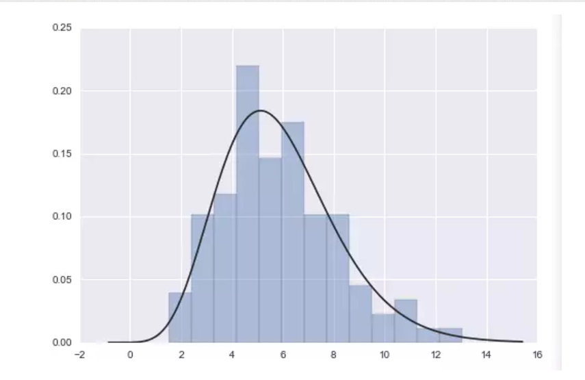
Fitting parametric distributions拟合参数分布
可以利用distplot() 把数据拟合成参数分布的图形并且观察它们之间的差距,再运用fit来进行参数控制。
x = np.random.gamma(6, size=200)#生成gamma分布的数据sns.distplot(x, kde=False, fit=stats.gamma);#fit拟合
Example Ⅰ for practice
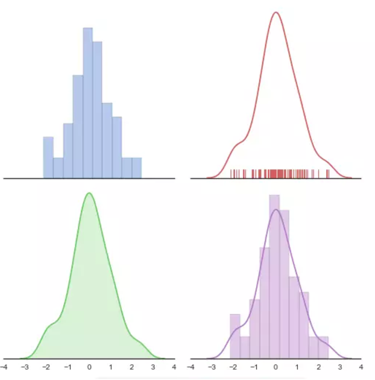
Python source code:
import numpy as npimport seaborn as snsimport matplotlib.pyplot as pltsns.set(style="white", palette="muted", color_codes=True)rs =np.random.RandomState(10)# Set up the matplotlib figuref, axes = plt.subplots(2, 2, figsize=(7, 7), sharex=True)sns.despine(left=True)# Generate a random univariate datasetd = rs.normal(size=100)# Plot a simple histogram with binsize determined automaticallysns.distplot(d,kde=False, color="b", ax=axes[0, 0])# Plot a kernel density estimate and rug plotsns.distplot(d, hist=False, rug=True, color="r", ax=axes[0,1])# Plot a filled kernel density estimatesns.distplot(d, hist=False, color="g", kde_kws={"shade": True}, ax=axes[1, 0])# Plot a historgram and kernel density estimatesns.distplot(d, color="m", ax=axes[1, 1])plt.setp(axes, yticks=[])plt.tight_layout()
Example Ⅱ for practice
利用kdeplot探索某大学学生消费习惯于助学金获得关系,数据集如下所示:
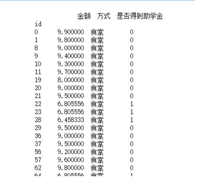
一共有10798条数据
import seaborn as snsimport matplotlib.pyplot as plt%matplotlib inlinesns.set(style="white", palette="muted", color_codes=True)train =pd.read_csv('train.csv')#导入数据集#ax1表示对获得助学金的人分布作图,ax2表示对未获得助学金的人分布作图ax1=sns.kdeplot(train['金额'][train['是否得到助学金']==1],color='r')ax2=sns.kdeplot(train['金额'][train['是否得到助学金']==0],color='b')
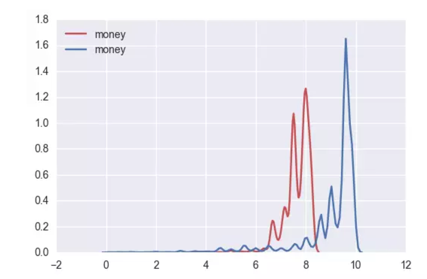
通过分布可以发现,蓝色图像分布靠右,红色分布靠左,x轴表示消费金额,得出得到助学金的同学日常消费较未得到的同学更低,印证了助学金一定程度用来帮助贫困生改善生活的应用。
小作者第一篇文章,对大家有用的话请多多关注与提出意见,一定积极采纳。需要数据集进行训练的小伙伴可以私信我。
谢谢各位观众大老爷。
欢迎加入 图表绘制之魔方学院QQ群 交流探讨