前言
【本文授权“Python爱好者社区”微信公众号以本人“王大伟”为作者原创首发】
官方文档是很好的学习资料,我一直深信不疑。
——王大伟
照猫画虎
在matplotlib官方文档的example中,我发现了很多漂亮的图
巧笑倩兮,美目盼兮
我们打开一个看看:
http://matplotlib.org/examples/pie_and_polar_charts/pie_demo_features.html
官方代码如下:
"""
===============
Basic pie chart
===============
Demo of a basic pie chart plus a few additional features.
In addition to the basic pie chart, this demo shows a few optional features:
* slice labels
* auto-labeling the percentage
* offsetting a slice with "explode"
* drop-shadow
* custom start angle
Note about the custom start angle:
The default ``startangle`` is 0, which would start the "Frogs" slice on the
positive x-axis. This example sets ``startangle = 90`` such that everything is
rotated counter-clockwise by 90 degrees, and the frog slice starts on the
positive y-axis.
"""
import matplotlib.pyplot as plt
# Pie chart, where the slices will be ordered and plotted counter-clockwise:
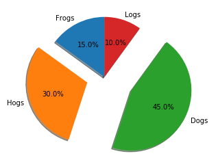
labels = 'Frogs', 'Hogs', 'Dogs', 'Logs'
sizes = [15, 30, 45, 10]
explode = (0, 0.1, 0, 0) # only "explode" the 2nd slice (i.e. 'Hogs')
fig1, ax1 = plt.subplots()
ax1.pie(sizes, explode=explode, labels=labels, autopct='%1.1f%%',
shadow=True, startangle=90)
ax1.axis('equal') # Equal aspect ratio ensures that pie is drawn as a circle.
plt.show()
运行一下:
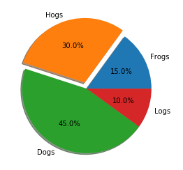
发现matplotlib画的图 还是挺好看的!
我们来分析一下她美在哪里?是眼睛、眉毛、还是?
鬓若刀裁,眉如墨画,面如桃瓣,目若秋波
其实 ,官方文档都告诉我们啦,哈哈哈哈

今天被宝强哥的新闻刷屏了
宝强哥即官方,那宋喆呢?你懂的
思绪收回。。。
刚才代码里有一段注释:
"""

===============

Basic pie chart

===============


Demo of a basic pie chart plus a few additional features.


In addition to the basic pie chart, this demo shows a few optional features:


    * slice labels

    * auto-labeling the percentage

    * offsetting a slice with "explode"

    * drop-shadow

    * custom start angle


Note about the custom start angle:


The default ``startangle`` is 0, which would start the "Frogs" slice on the

positive x-axis. This example sets ``startangle = 90`` such that everything is

rotated counter-clockwise by 90 degrees, and the frog slice starts on the

positive y-axis.

"""
意思如下:
除了基本的饼图,此演示还展示了一些可选功能:
*每块饼打上标签
*自动计算标记百分比
*用“爆炸”偏移出一片
*添加阴影
*定制起始角度
我们一个个看:
(1)每块饼打上标签
这个很好理解

每块饼都是有标签的,
ax1.pie(sizes, explode=explode, labels=labels, autopct='%1.1f%%',

        shadow=True, startangle=90)
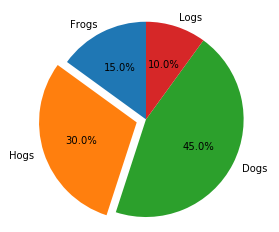
把labels=labels去掉
完整代码:
import matplotlib.pyplot as plt


# Pie chart, where the slices will be ordered and plotted counter-clockwise:

labels = 'Frogs', 'Hogs', 'Dogs', 'Logs'

sizes = [15, 30, 45, 10]

explode = (0, 0.1, 0, 0)  # only "explode" the 2nd slice (i.e. 'Hogs')


fig1, ax1 = plt.subplots()

ax1.pie(sizes, explode=explode, autopct='%1.1f%%',

        shadow=True, startangle=90)

ax1.axis('equal')  # Equal aspectratio ensures that pie is drawn as a circle.


plt.show()
这下就没标签了!
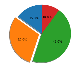
(2)自动计算标记百分比
我们看官方代码:
sizes = [15, 30, 45, 10]
这部分数字加起来是100,正好对应了图中的百分比
思考:现实数据可能是个数,不是算好的百分比能直接绘图么?
答案是可以的!
例如:我们改一下代码这部分为:
sizes = [15, 3.333333, 74, 10.002]
完整代码如下:
import matplotlib.pyplot as plt


# Pie chart, where the slices will be ordered and plotted counter-clockwise:

labels = 'Frogs', 'Hogs', 'Dogs', 'Logs'

sizes = [15, 3.333333, 74, 10.002]

explode = (0, 0.1, 0, 0)  # only "explode" the 2nd slice (i.e. 'Hogs')


fig1, ax1 = plt.subplots()

ax1.pie(sizes, explode=explode, labels=labels, autopct='%1.1f%%',

        shadow=True, startangle=90)

ax1.axis('equal')  # Equal aspectratio ensures that pie is drawn as a circle.


plt.show()
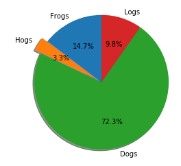
结果是自动算出了百分比,不信你可以自己算算试试哦~
(3)用“爆炸”偏移出一片
我们看出这饼就像pizza一样,被切出了一片

说实话 我饿了。。。
然后一块不够吃啊,我切两块行不行?
看看官方代码!
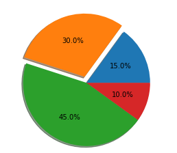
explode = (0, 0.1, 0, 0) # only "explode" the 2nd slice (i.e. 'Hogs')
这里有个0.1很特殊,我们改成1试试
explode = (0, 1, 0, 0) # only "explode" the 2nd slice (i.e. 'Hogs')
完整代码如下:
import matplotlib.pyplot as plt


# Pie chart, where the slices will be ordered and plotted counter-clockwise:

labels = 'Frogs', 'Hogs', 'Dogs', 'Logs'

sizes = [15, 30, 45, 10]

explode = (0, 1, 0, 0)  # only "explode" the 2nd slice (i.e. 'Hogs')


fig1, ax1 = plt.subplots()

ax1.pie(sizes, explode=explode, labels=labels, autopct='%1.1f%%',

        shadow=True, startangle=90)

ax1.axis('equal')  # Equal aspectratio ensures that pie is drawn as a circle.


plt.show()
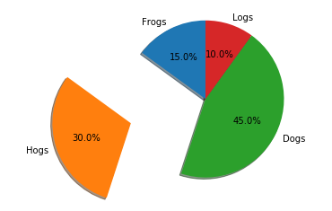
原来这个数字是控制切出的pizza偏移的距离啊!(假装恍然大悟)
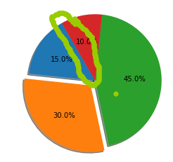
不过,我要切的是两片啊!
宝宝饿,宝宝要吃两片才行
相信你已经会啦~
explode = (0, 0.3, 0.5, 0) # only "explode" the 2nd slice (i.e. 'Hogs')
完整代码如下:
import matplotlib.pyplot as plt


# Pie chart, where the slices will be ordered and plotted counter-clockwise:

labels = 'Frogs', 'Hogs', 'Dogs', 'Logs'

sizes = [15, 30, 45, 10]

explode = (0, 0.3, 0.5, 0)  # only "explode" the 2nd slice (i.e. 'Hogs')


fig1, ax1 = plt.subplots()

ax1.pie(sizes, explode=explode, labels=labels, autopct='%1.1f%%',

        shadow=True, startangle=90)

ax1.axis('equal')  # Equal aspectratio ensures that pie is drawn as a circle.


plt.show()
切出两块,偏移还不一样呢~
(4)添加阴影
像爬虫一样定位:
ax1.pie(sizes, explode=explode, labels=labels, autopct='%1.1f%%',

        shadow=True, startangle=90)
把shadow改为False试试
完整代码:
import matplotlib.pyplot as plt


# Pie chart, where the slices will be ordered and plotted counter-clockwise:

labels = 'Frogs', 'Hogs', 'Dogs', 'Logs'

sizes = [15, 30, 45, 10]

explode = (0, 0.1, 0, 0)  # only "explode" the 2nd slice (i.e. 'Hogs')


fig1, ax1 = plt.subplots()

ax1.pie(sizes, explode=explode, labels=labels, autopct='%1.1f%%',

        shadow=False, startangle=90)

ax1.axis('equal')  # Equal aspectratio ensures that pie is drawn as a circle.


plt.show()
这下就没阴影咯~
(5)定制起始角度
ax1.pie(sizes, explode=explode, labels=labels, autopct='%1.1f%%',

        shadow=True, startangle=90)
这里 startangle=90 起始角度是90度,那0度是什么样的呢?
ax1.pie(sizes, explode=explode, labels=labels, autopct='%1.1f%%',

        shadow=True, startangle=0)
完整代码:
import matplotlib.pyplot as plt


# Pie chart, where the slices will be ordered and plotted counter-clockwise:

labels = 'Frogs', 'Hogs', 'Dogs', 'Logs'

sizes = [15, 30, 45, 10]

explode = (0, 0.1, 0, 0)  # only "explode" the 2nd slice (i.e. 'Hogs')


fig1, ax1 = plt.subplots()

ax1.pie(sizes, explode=explode, autopct='%1.1f%%',

        shadow=True, startangle=0)

ax1.axis('equal')  # Equal aspectratio ensures that pie is drawn as a circle.


plt.show()
对比发现,0度是x轴正向,90度是y轴正向
猜想:是逆时针的方向,那120度试试?
果然是这样!
举一反三
更多参数功能等你发现:
?ax1.pie

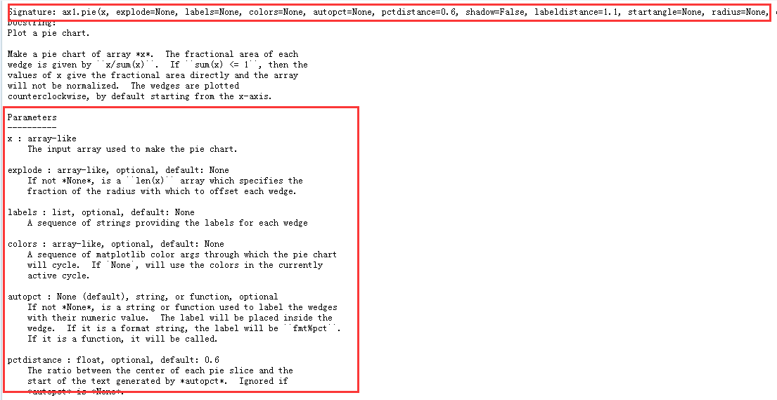
学习方法你掌握了么?
这里还有一堆美丽的她等你探索呢~
来啊,快活啊
猛戳以下链接:
http://matplotlib.org/examples/index.html
文中如有错误请留言评论,感谢~