

作者:路遥马亡 R语言中文社区专栏作者
前言
上次推文小白R语言数据可视化进阶练习一汇总了一部分的图集,这次推文接上一篇再次汇总,此图集汇总将不断更新!
08
相关图
相关图,通常分析多个因素之间的相关性时都会计算相关性系数,通过作图的方式,让相关性可视化,更利于数据分析。
1library(GGally)
2
3# Create data
4sample_data <- data.frame( v1 = 1:100 + rnorm(100,sd=20), v2 = 1:100 + rnorm(100,sd=27), v3 = rep(1, 100) + rnorm(100, sd = 1))
5sample_data$v4 = sample_data$v1 ** 2
6sample_data$v5 = -(sample_data$v1 ** 2)
7
8# Check correlation between variables
9cor(sample_data) #计算相关性系数
10
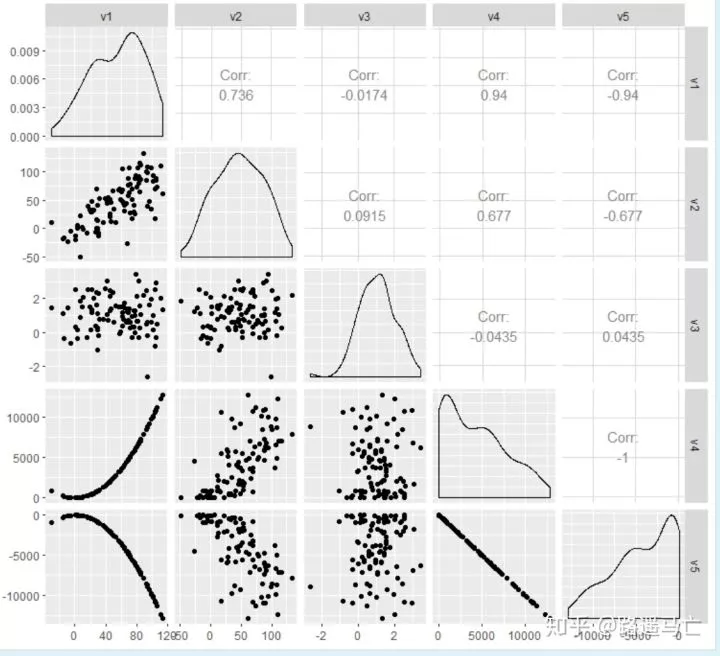
11# Check correlations (as scatterplots), distribution and print corrleation coefficient
12ggpairs(sample_data) #上三角表示各个因素之间的相关性系数,对角线就是各个因素的密度图,
13#下三角就是任意两个元素绘成的散点图
14
15# Nice visualization of correlations
16ggcorr(sample_data, method = c("everything", "pearson"),label = T)

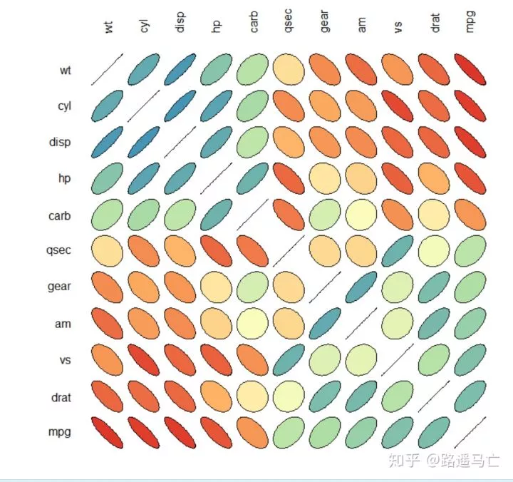
 1# Libraries
 2library(ellipse)
 3library(RColorBrewer)
 4
 5# Use of the mtcars data proposed by R
 6data=cor(mtcars)
 7
 8# Build a Pannel of 100 colors with Rcolor Brewer
 9my_colors <- brewer.pal(5, "Spectral")  #需要5个“spectral”色系的颜色
10my_colors=colorRampPalette(my_colors)(100)#将数值映射到不同的颜色上,这时就需要一系列的颜色梯度,
11#100代表100种颜色,根据之前的五种基本色,调处100种新的颜色。
12
13# Order the correlation matrix
14ord <- order(data[1, ])
15data_ord = data[ord, ord]#根据第一个因素与其他因素的相关系数大小调整原矩阵
16plotcorr(data_ord , col=my_colors[data_ord*50+50], mar=c(0,0,0,0 )   )#mar()用于调整图形整体大小
17
18#这个图挺有意思的,椭圆越瘪,相关性越强
下面讲一点图外话,如何利用R绘画表格并把它放入图中(主要是学了大半天,发现这个和相关图并没有什么关系,但是还是放进来了,不喜欢的直接跳过)
1library(ggplot2)
2library(gridExtra)
3
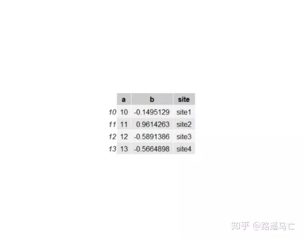
4#Create data : we take a subset of the mtcars dataset provided by R:
5mydata <- data.frame(a=1:50, b=rnorm(50))
6mytable <- cbind(sites=c("site 1","site 2","site 3","site 4"),mydata[10:13,])
7
8# --- Graph 1 : If you want ONLY the table in your image :
9# First I create an empty graph with absolutely nothing :
10qplot(1:10, 1:10, geom = "blank") + theme_bw() + theme(line = element_blank(), text = element_blank()) +
11 # Then I add my table :
12 annotation_custom(grob = tableGrob(mytable))
13#法二
14library(grid)
15d<-head(iris,3)
16g<-tableGrob(d)
17grid.newpage()
18grid.draw(g)
19
20
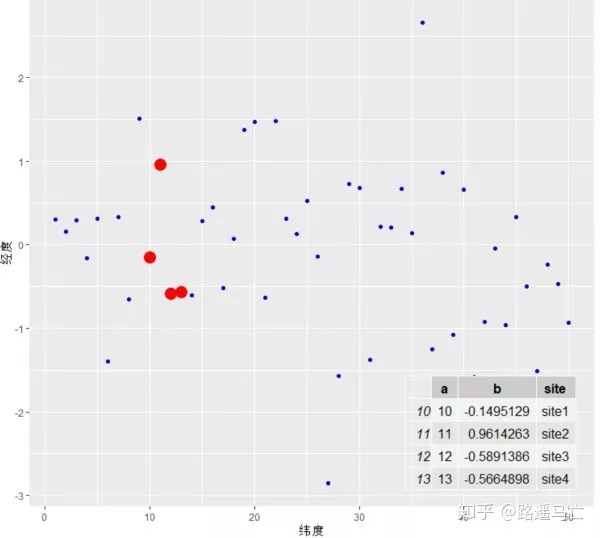
21# --- Graph 2 : If you want a graph AND a table on it :
22my_plot <- ggplot(mydata,aes(x=a,y=b)) + geom_point(colour="blue") + geom_point(data=mydata[10:13, ], aes(x=a, y=b), colour="red", size=5) +
23 annotation_custom(tableGrob(mytable), xmin=35, xmax=50, ymin=-3, ymax=-1.5)
24my_plot
09
气泡图
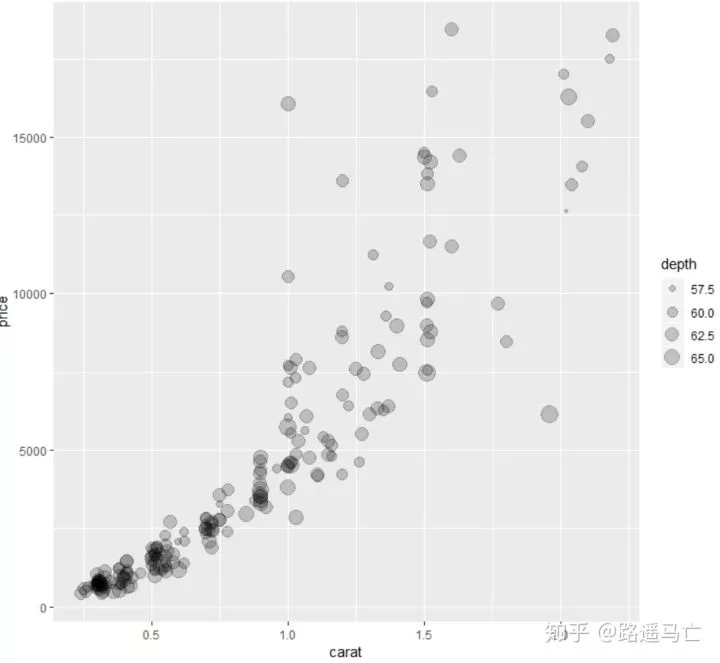
气泡图可将三维变量反映在二维平面上,第三位用点的大小表示。有个不足就是如果数据过多,很多气泡会出现重叠,难以达到预期的效果。
 1library(ggplot2)
 2library(tidyverse)
 3library(dplyr)
 4
 5# Let's use the diamonds data set (available in base R)
 6data = diamonds %>% sample_n(200)
 7
 8# A basic scatterplot = relationship between 2 values:
 9ggplot(data, aes(x=carat, y=price)) +
10  geom_point()
11
12# Now we see there is a link between caract and price
13# But what if we want to know about depth in the same time?
14ggplot(data, aes(x=carat, y=price, size=depth)) +
15  geom_point(alpha=0.2)
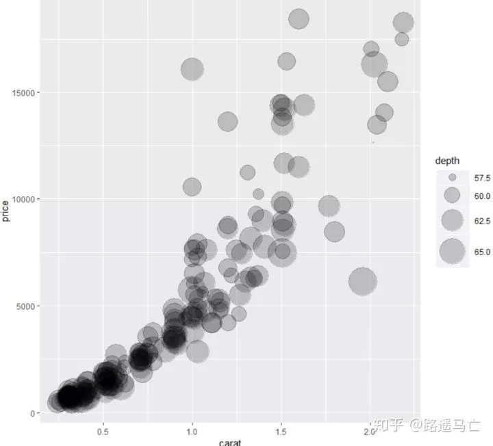
即使是气泡图,各个数据间的大小比较并不是很明显,所以需要时使用scale_size_continuous()函数。
1ggplot(data, aes(x=carat, y=price, size=depth)) +
2  geom_point(alpha=0.2) +
3  scale_size_continuous(range = c(0.5, 15))#控制最大气泡和最小气泡,调节气泡相对大小
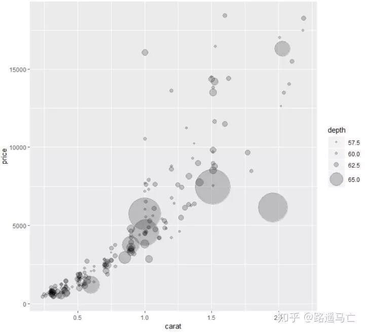
1# Note that you can add a transformation to your size variable.
2# For example if you want to highlight very high variables, you can use a exponential transformation.
3# Available: "asn", "atanh", "boxcox", "exp", "identity", "log", "log10", "log1p", "log2", "logit", "probability", "probit", "reciprocal", "reverse" and "sqrt"
4ggplot(data, aes(x=carat, y=price, size=depth)) +
5  geom_point(alpha=0.2) +
6  scale_size_continuous( trans="exp", range=c(1, 25))#转化为指数,这样可以把大小差距拉开
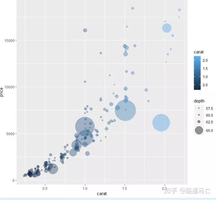
也可以通过颜色的深浅导入第四个变量,但似乎效果不是很好
1ggplot(data, aes(x=carat, y=price, size=depth,color=carat)) +
2  geom_point(alpha=0.4) +
3  scale_size_continuous( trans="exp", range=c(1, 25))
10
折线图
这里主要介绍用于时间序列的折线图。
1# library
2library(tidyverse)
3library(dplyr)
4library(ggplot2)
5
6# Build a Time serie data set for last year
7day=as.Date("2017-06-14") - 0:364 #构造出一年的日期数据
8value=runif(365) + seq(-140, 224)^2 / 10000#seq()生成一系列连续的数
9data=data.frame(day, value)
10
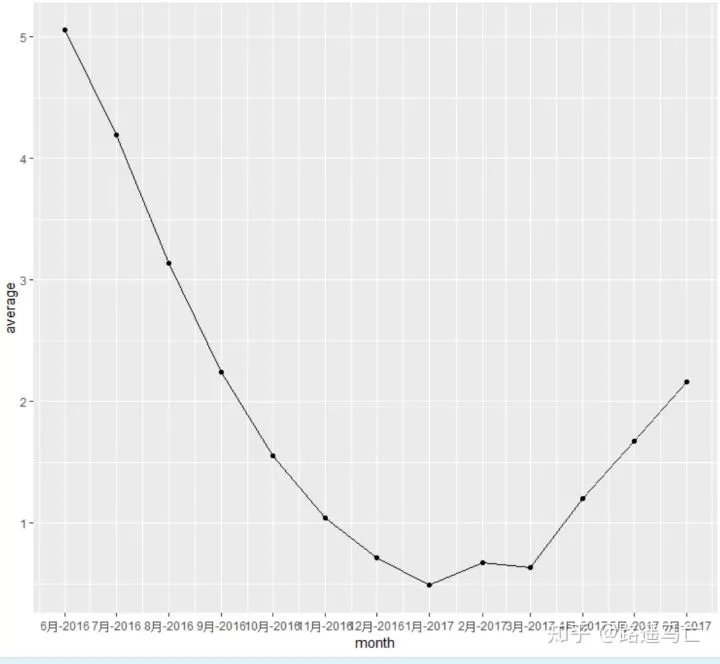
11# 计算月均销量
12don=data %>% mutate(month = as.Date(cut(day, breaks = "month"))) %>% #group by month
13 group_by(month) %>%
14 summarise(average = mean(value)) #与group by 联用,新生成一列放入原数据框
15
16# And make the plot
17ggplot(don, aes(x=month, y=average)) +
18 geom_line() +
19 geom_point() +
20 scale_x_date(date_labels = "%b-%Y", date_breaks="1 month")#横坐标间断点为每个月,输出格式为月—年
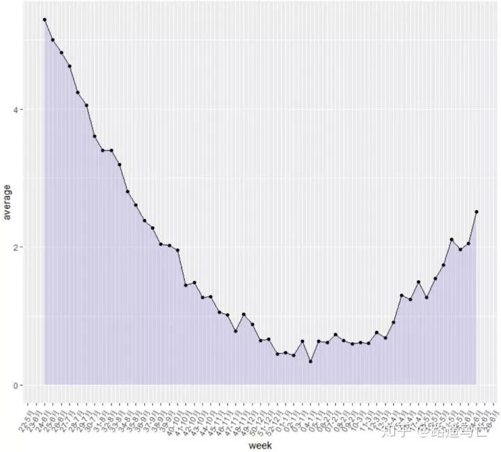
 1# 计算周平均销量
 2don=data %>% mutate(week = as.Date(cut(day, breaks = "week"))) %>%
 3  group_by(week) %>%
 4  summarise(average = mean(value))
 5
 6# And make the plot
 7ggplot(don, aes(x=week, y=average)) +
 8  geom_line() +
 9  geom_point() +
10  geom_area(fill=alpha('red',0.2)) +#填充线下区域
11  scale_x_date(date_labels = "%W-%b", date_breaks="1 week") + # 横坐标间断点为每周,输出格式为周—月
12  theme(axis.text.x=element_text(angle=60, hjust=1))   #调整x坐标轴属性
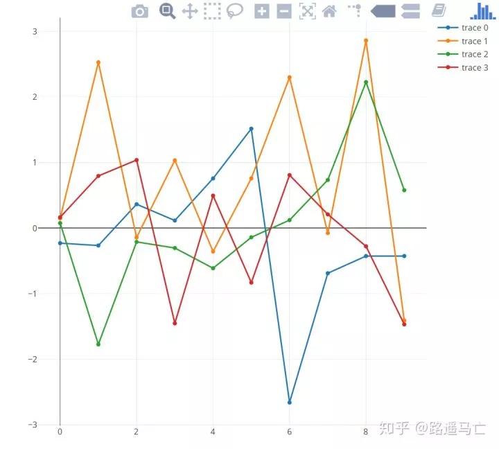
在一张图中绘制多条折线图
 1library(plotly)
 2
 3# Create data
 4my_y=rnorm(10)*3
 5my_x=seq(0,9)
 6
 7# Let's do a first plot
 8p<-plot_ly(y=my_y, x=my_x , type="scatter", mode="markers+lines")
 9
10# Add 5 trace to this graphic with a loop!
11for(i in 1:3){
12  my_y=rnorm(10)
13  p<-add_trace(p, y=my_y, x=my_x , type="scatter", mode="markers+lines" )
14}
11
二维密度图
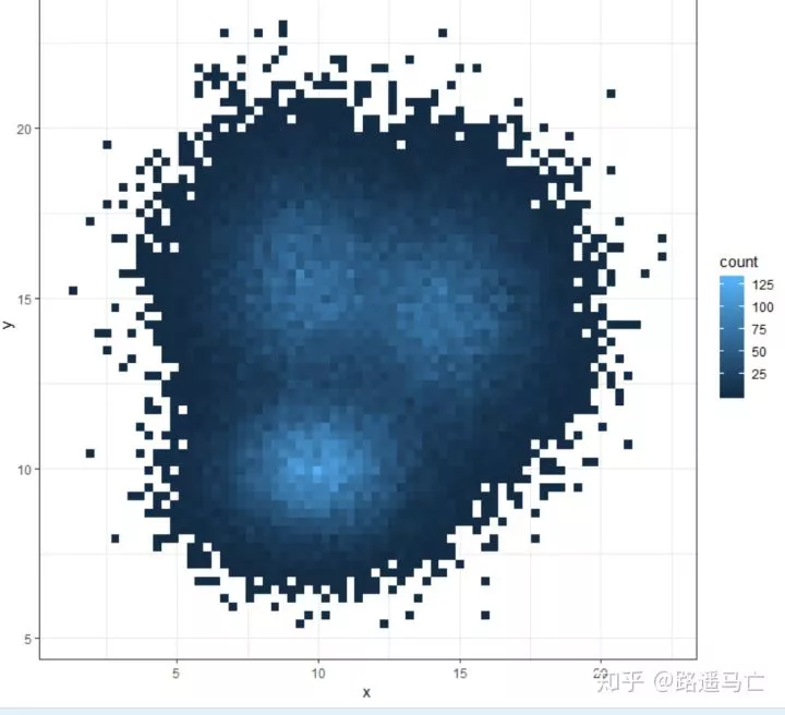
二维密度图与散点图相似,但是当点过多,重叠程度较大,就需要用二维密度图反映其密集程度。
利用geom_bin2d()可以绘出二维密图,其中bins表示生成方块的长度,每个方块包含的点的数目利用颜色深浅反映
 1library(tidyverse)
 2
 3# Data
 4a <- data.frame( x=rnorm(20000, 10, 1.9), y=rnorm(20000, 10, 1.2) )
 5b <- data.frame( x=rnorm(20000, 14.5, 1.9), y=rnorm(20000, 14.5, 1.9) )
 6c <- data.frame( x=rnorm(20000, 9.5, 1.9), y=rnorm(20000, 15.5, 1.9) )
 7data <- rbind(a,b,c)
 8ggplot(data, aes(x=x, y=y) ) +
 9  geom_bin2d() +
10  theme_bw()
11
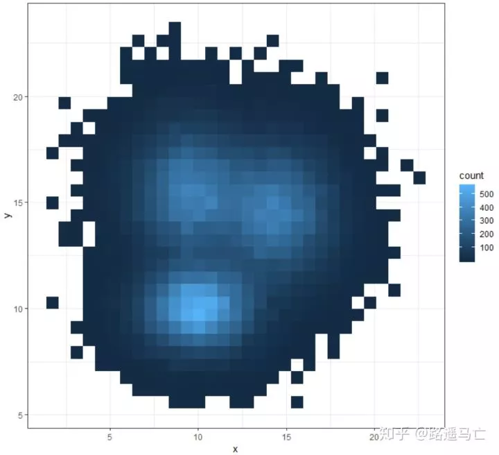
1# Number of bins in each direction?
2ggplot(data, aes(x=x, y=y) ) +
3  geom_bin2d(bins = 70) +
4  theme_bw()
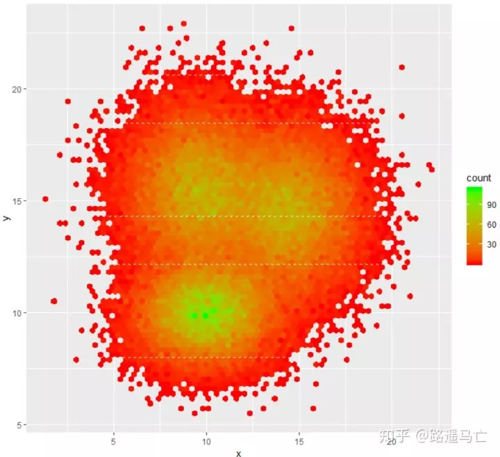
生成区域也不一定是方块,可以利用函数geom_hex()生成六边形。
1# Number of bins in each direction?
2ggplot(data, aes(x=x, y=y)) +
3  geom_hex(bins = 70) +
4  scale_fill_gradient(low="red", high="green") #调整颜色
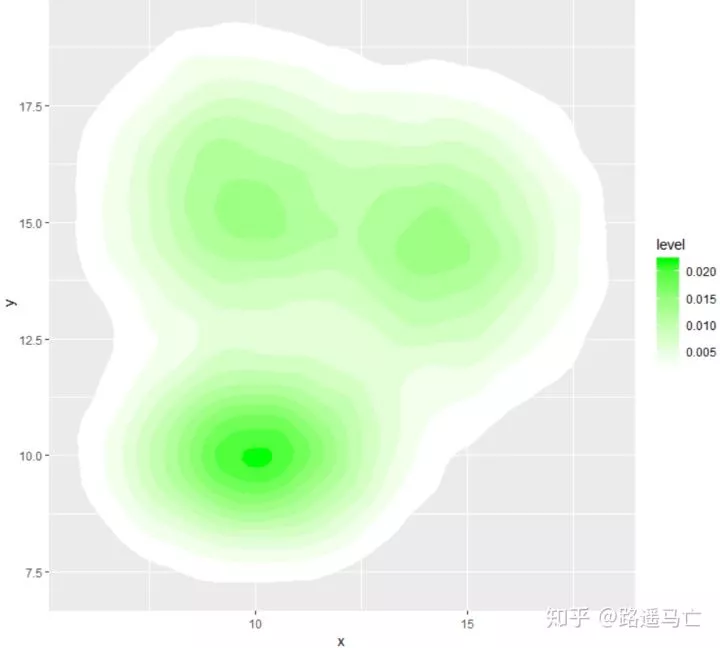
展现数据分布轮廓,并填充和高亮
1ggplot(data, aes(x=x, y=y) ) +
2 stat_density_2d(aes(fill = ..level..), geom = "polygon", colour="white")
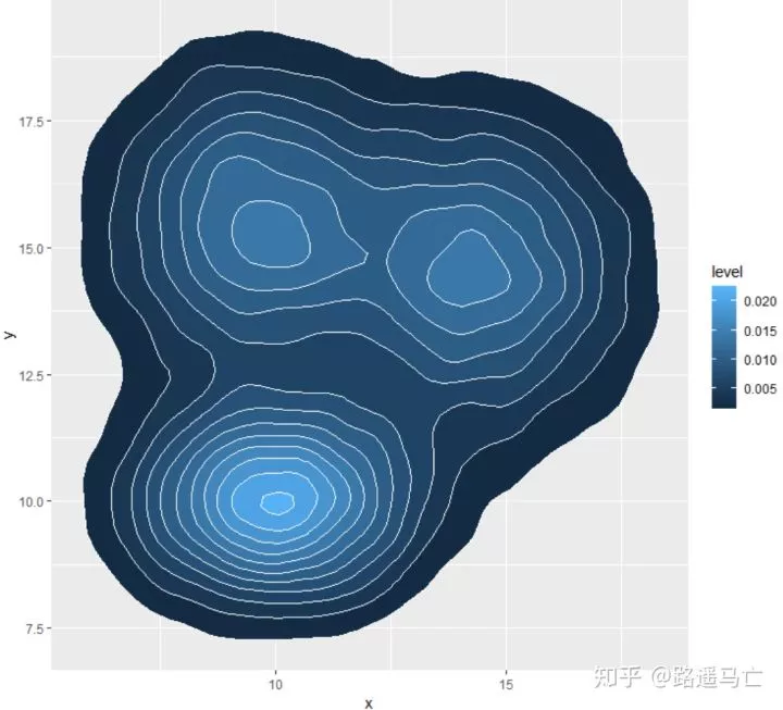
也可以利用scale_fill_gradient()函数改变颜色
12
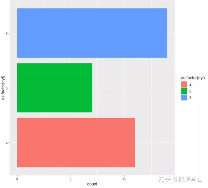
条形图
条形图的画法,在此要特别区分与直方图,直方图与密度图类似,反映的是大量数据的分布情况,而条形图所表达是频数分布图。
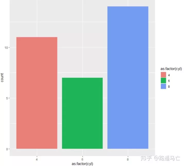
1ggplot(mtcars, aes(x=as.factor(cyl), fill=as.factor(cyl) )) + geom_bar( ) +
2  scale_fill_hue(c = 80)     #scale_fill_hue()用于调节色彩深浅

关于颜色的选择也可以使用RColorRrewer包,我之前的文章也提到过如何使用这个包
1ggplot(mtcars, aes(x=as.factor(cyl), fill=as.factor(cyl) )) + geom_bar( ) +
2  scale_fill_brewer(palette = "Set2")

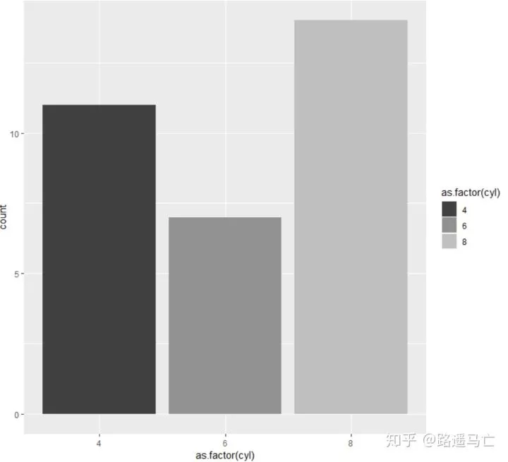
也可以选择灰白黑色系
1# 4: Using greyscale:
2ggplot(mtcars, aes(x=as.factor(cyl), fill=as.factor(cyl) )) + geom_bar( ) +
3  scale_fill_grey(start = 0.25, end = 0.75)
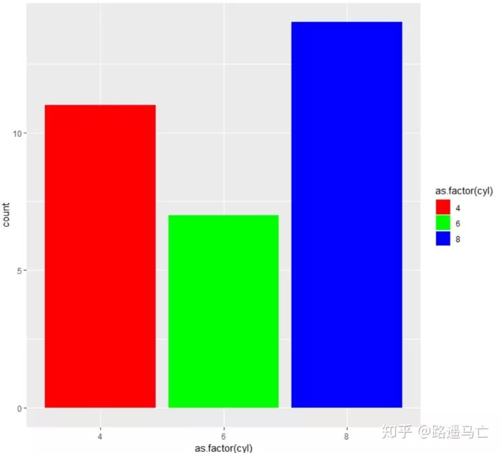
最后,也可以利用scale_fill_manual()自定义颜色。
1# 5: Set manualy
2ggplot(mtcars, aes(x=as.factor(cyl), fill=as.factor(cyl) )) +  geom_bar( ) +
3  scale_fill_manual(values = c("red", "green", "blue") )
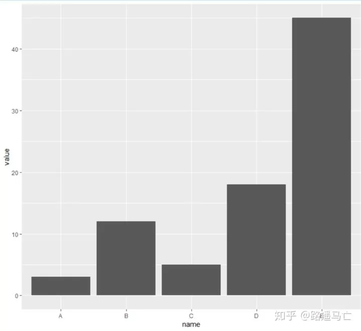
geom_bar()函数自动包含了统计频数这个环节,如果在已经知道各因素的频数的情况下,可以利用identity这个参数,直接画出条形图。
1# Create data
2data=data.frame(name=c("A","B","C","D","E") ,  value=c(3,12,5,18,45))
3# Barplot
4ggplot(data, aes(x=name, y=value)) + geom_bar(stat = "identity")
5#identity表示对数据不进行处理
当然如果比较喜欢水平方向的条形图,也可以利用coord_flip()调整方向。
1ggplot(mtcars, aes(x=as.factor(cyl), fill=as.factor(cyl) )) +
2  geom_bar() +
3  coord_flip()
13
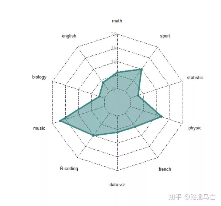
雷达图
雷达图,也称为蜘蛛网图(大概是形状的原因)。
雷达图可同时反映一个个体的多方面数值因素,可在一个图中表示多个个体,利于比较。
 1radarchart( data  , axistype=1 ,
 2
 3            #定义绘制图形的格式
 4            pcol=rgb(0.2,0.5,0.5,0.9) , pfcol=rgb(0.2,0.5,0.5,0.5) , plwd=4 ,
 5
 6            #自定义网格格式
 7            cglcol="black", cglty=4 ,axislabcol="grey", caxislabels=seq(0,20,5), cglwd=0.7,
 8
 9            #自定义标签的字体粗细大小
10            vlcex=0.8 )
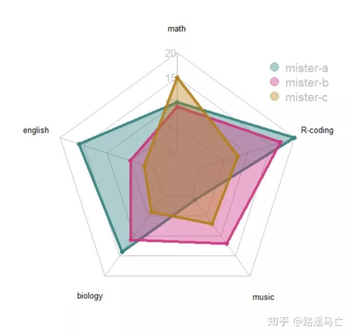
前文提到也可以在一张图中放入多个个体。
 1library(fmsb)
 2
 3set.seed(99)
 4data=as.data.frame(matrix( sample( 0:20 , 15 , replace=F) , ncol=5))
 5colnames(data)=c("math" , "english" , "biology" , "music" , "R-coding" )
 6rownames(data)=paste("mister" , letters[1:3] , sep="-")
 7
 8# 用于生成雷达图的最大最小值
 9data=rbind(rep(20,5) , rep(0,5) , data)
10
11colors_border=c( rgb(0.2,0.5,0.5,0.9), rgb(0.8,0.2,0.5,0.9) , rgb(0.7,0.5,0.1,0.9) )
12colors_in=c( rgb(0.2,0.5,0.5,0.4), rgb(0.8,0.2,0.5,0.4) , rgb(0.7,0.5,0.1,0.4) )
13
14radarchart( data  , axistype=1 ,
15   pcol=colors_border , pfcol=colors_in , plwd=4 , plty=1,
16
17   cglcol="grey", cglty=1, axislabcol="grey", caxislabels=seq(0,20,5), cglwd=0.8,
18
19   vlcex=0.8
20   )
21legend(x=0.7, y=1, legend = rownames(data[-c(1,2),]), bty = "n", pch=20 , col=colors_in , text.col = "grey", cex=1.2, pt.cex=3)
这里特别提到,radarchart()函数中,有个参数maxmin默认值是T,意味着,雷达图最大值为第一行,最小值为第二行,如果选为F,雷达图就会就会自动判每个因素的最大值和最小值,此时雷达图呈现得并不对称(在同一个线上的值并不相等)
14
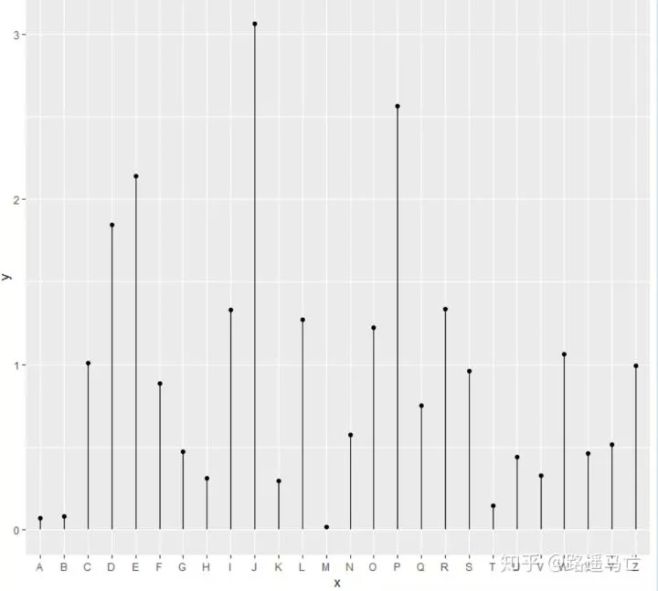
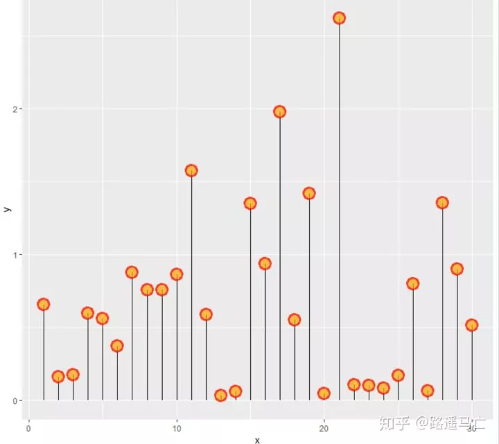
棒棒糖图
棒棒糖图是散点图和直方图的结合,可以输入两个数值型变量,或者一个分类变量和一个数值型变量。
1library(tidyverse)
2
3data=data.frame(x=seq(1,30), y=abs(rnorm(30)))
4
5ggplot(data, aes(x=x, y=y)) +
6  geom_point(color='red',size=5) +
7  geom_segment( aes(x=x, xend=1:30, y=0,yend=y))

1data=data.frame(x=LETTERS[1:26], y=abs(rnorm(26)))
2
3ggplot(data, aes(x=x, y=y)) +
4  geom_point() +
5  geom_segment( aes(x=x, xend=x, y=0, yend=y))
也可以利用各种参数修改散点颜色、形状、透明度。
1ggplot(data, aes(x=x, y=y)) +
2  geom_segment( aes(x=x, xend=x, y=0, yend=y)) +
3  geom_point( size=5, color="red", fill=alpha("orange", 0.3), alpha=0.7, shape=21, stroke=2)
也可以修改根的形状、颜色、粗细,利用Linetype参数修改成了点状图
1ggplot(data, aes(x=x, y=y)) +
2 geom_segment( aes(x=x, xend=x, y=0, yend=y) , size=1, color="blue", linetype="dotted" ) +
3 geom_point()

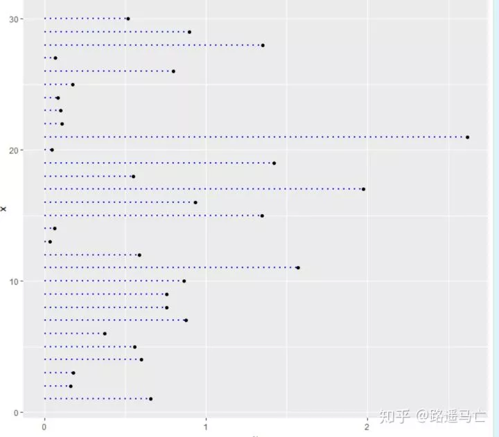
加上 coord_flip(),就可以让棒棒糖图旋转90°。更利于观察数据。
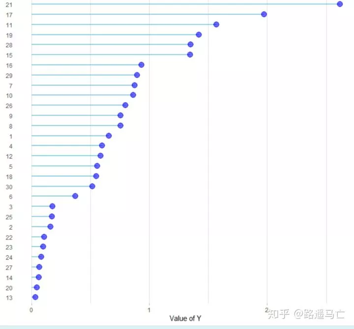
 更多时候,我们希望看到的是排序后的棒棒糖图,能让我们一眼看出最大值最小值。
 1data %>%
 2 arrange(y) %>%
 3 mutate(x=factor(x,x)) %>%    #这一步重要,重新定义因子变量,决定了绘图顺序
 4 ggplot( aes(x=x, y=y)) +
 5 geom_segment( aes(x=x, xend=x, y=0, yend=y), color="skyblue", size=1) +
 6 geom_point( color="blue", size=4, alpha=0.6) +
 7 theme_light() +
 8 coord_flip() +
 9 theme(
10 panel.grid.major.y = element_blank(),
11 panel.border = element_blank(),
12 axis.ticks.y = element_blank()
13 ) +
14 xlab("") +
15 ylab("Value of Y")
最后,我们也可以自行定义基准线,特别是我们比较关心当前数据的均值或者中值的时候,我们更能进行比较。

15
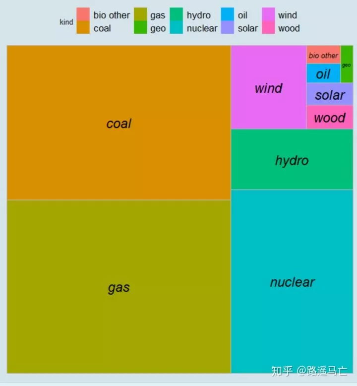
树图
树图,通过将数值型变量转换为矩形面积大小,分类型变量用标签进行区分
1library(treemapify)
2energy<-data.frame(value<-c(1240.11,23.90,1393.30,805.33,265.83,17.42,
3                            36.75,226.87,40.50,22.07),kind<-c('coal','oil','gas','nuclear','hydro','geo','solar','wind','wood','bio other'))
4energy$kind<-as.factor(energy$kind)
5ggplot(data=energy,aes(area=value,fill=kind,label=kind))+geom_treemap()+geom_treemap_text(fontface='italic',place='centre')+theme_economist()
这里用了geom_treemap()函数,并且用到了theme_economist()改了主题,当然还有其他主题可以选择。
 也可以使用treemap()包中的treemap()函数。
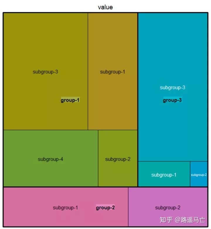
 1#先掌握最基本的树图画法
 2library(treemap)
 3
 4group=c(rep("group-1",4),rep("group-2",2),rep("group-3",3))
 5subgroup=paste("subgroup" , c(1,2,3,4,1,2,1,2,3), sep="-")
 6value=c(13,5,22,12,11,7,3,1,23)
 7data=data.frame(group,subgroup,value)
 8
 9# treemap
10treemap(data,
11        index=c("group","subgroup"),   #分组依据,注意分成了两组
12        vSize="value"  #大小根据数值型变量分配
13        type="index"  #根据分类划分不同的颜色
14)
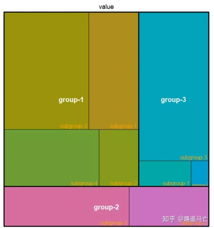
 1library(treemap)
 2
 3
 4group=c(rep("group-1",4),rep("group-2",2),rep("group-3",3))
 5subgroup=paste("subgroup" , c(1,2,3,4,1,2,1,2,3), sep="-")
 6value=c(13,5,22,12,11,7,3,1,23)
 7data=data.frame(group,subgroup,value)
 8
 9# 自定义标签
10treemap(data, index=c("group","subgroup"),     vSize="value", type="index",
11
12    fontsize.labels=c(15,12),                # 标签大小
13    fontface.labels=c(2,1),                  # 标签类型: 1,2,3,4 for normal, bold, italic, bold-italic...
14    bg.labels=c("transparent"),              # 标签背景设置为透明
15    align.labels=list(
16        c("center", "center"),
17        c("right", "bottom")
18        ),                                   # 标签放置位置
19    overlap.labels=0.5,                     #如果前一个标签覆盖了后一个标签的50%以上,则不显示前一个标签
20    inflate.labels=F,                        # 标签大小是否随着举行面积增大而增大
21
22)
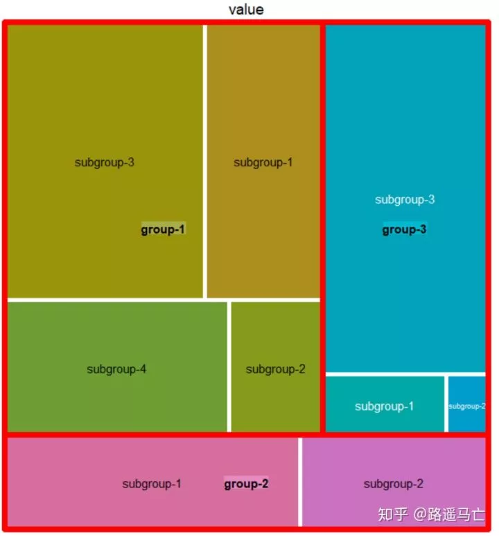
1#也可以自定义矩形边界
2
3treemap(data, index=c("group","subgroup"), vSize="value", type="index",
4
5   border.col=c("black","white"),
6   border.lwds=c(7,2)
7   )
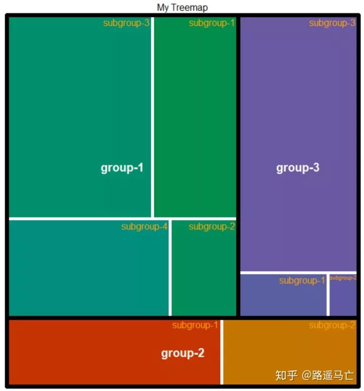
1#自定义颜色和标题
2treemap(data, index=c("group","subgroup"), vSize="value",
3   type="index",
4   palette = "Set1",             # Select your color palette from the RColorBrewer presets or make your own.
5  title="My Treemap",
6  fontsize.title=12,            # 标题大小
7)
16
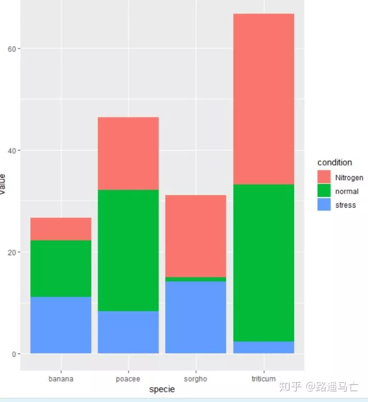
叠图条形图
叠图条形图是在条形图的基础上,在每个变量的基础上在分为多个自变量
 1# library
 2library(ggplot2)
 3library(ggthemes)
 4
 5# create a dataset
 6specie=c(rep("sorgho" , 3) , rep("poacee" , 3) , rep("banana" , 3) , rep("triticum" , 3) )
 7condition=rep(c("normal" , "stress" , "Nitrogen") , 4)
 8value=abs(rnorm(12 , 0 , 15))
 9data=data.frame(specie,condition,value)
10
11# 并排
12ggplot(data, aes(fill=condition, y=value, x=specie)) +
13  geom_bar(position="dodge", stat="identity")##position = fill 堆叠元素,并标准化为1;dodge避免重叠;identity不做任何调整;
14#jitter给点添加扰动避免重合;stack将图形元素堆叠起来。
15#stat=identity表示表示x,y原值,不是计数

1# 重叠
2ggplot(data, aes(fill=condition, y=value, x=specie)) +
3  geom_bar( stat="identity")#只进行绝对量比较
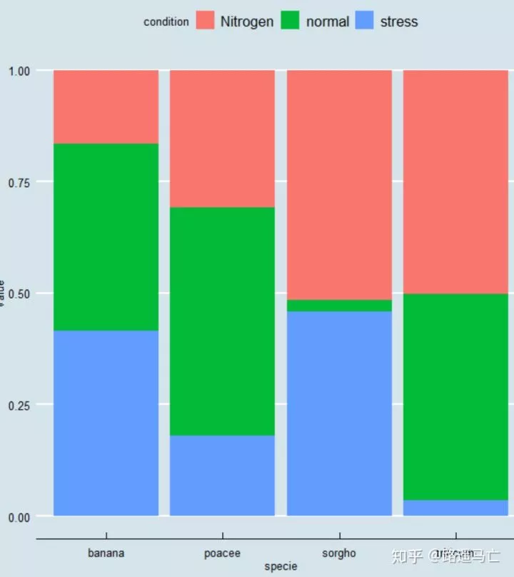
1#归一化
2ggplot(data, aes(fill=condition, y=value, x=specie)) +
3  geom_bar( stat="identity", position="fill")+#归一化,绝对量不相等,相对量相等
4  theme_economist()
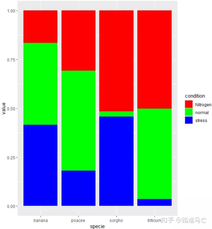
1#自定义颜色
2ggplot(data, aes(fill=condition, y=value, x=specie)) +
3  geom_bar( stat="identity", position="fill") +
4  #scale_fill_brewer(palette = "Set1")
5  scale_fill_manual(values=c('red','green','blue'))
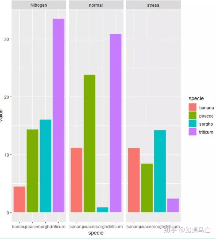
防止分组太多,影响了图的可读性,可以利用facet先进行分组,再在小组里面一句不同的颜色区分比较
1ggplot(data, aes(y=value, x=specie,  fill=specie)) +
2  geom_bar( stat="identity") +
3  facet_wrap(~condition)
17
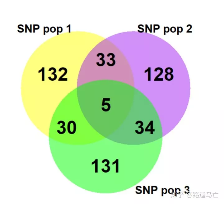
集合图
集合图适用于表现两组数据的交集,圆的面积表示重要性。一般不要超过三组数据,否则会影响数据的可读性。
 1library(VennDiagram)
 2
 3#Then generate 3 sets of words.There I generate 3 times 200 SNPs names.
 4SNP_pop_1=paste(rep("SNP_" , 200) , sample(c(1:1000) , 200 , replace=F) , sep="")
 5SNP_pop_2=paste(rep("SNP_" , 200) , sample(c(1:1000) , 200 , replace=F) , sep="")
 6SNP_pop_3=paste(rep("SNP_" , 200) , sample(c(1:1000) , 200 , replace=F) , sep="")
 7venn.diagram(
 8  x = list(SNP_pop_1 , SNP_pop_2 , SNP_pop_3),
 9  category.names = c("SNP pop 1" , "SNP pop 2 " , "SNP pop 3"),
10  filename = '#14_venn_diagramm.png',  #生成图片自动保存
11  output = TRUE ,
12  imagetype="png" ,
13  height = 480 ,
14  width = 480 ,
15  resolution = 300,
16  compression = "lzw",
17  lwd = 2,
18  lty = 'blank',
19  fill = c('yellow', 'purple', 'green'),
20  cex = 1,
21  fontface = "bold",
22  fontfamily = "sans",
23  cat.cex = 0.6,
24  cat.fontface = "bold",
25  cat.default.pos = "outer",
26  cat.pos = c(-27, 27, 135),
27  cat.dist = c(0.055, 0.055, 0.085),
28  cat.fontfamily = "sans",
29  rotation = 1
30)
18
地图背景图
如何用R绘制地图背景图。背景图只是第一步,更多的是在地图上进行一系列操作,例如:气泡图、线图....后续都会一一讲解。
首先最简单的方法使用leaflet()包,只需一行代码就可以调出世界地图,是不是很爽。
1library(leaflet)
2
3m=leaflet() %>% addTiles()
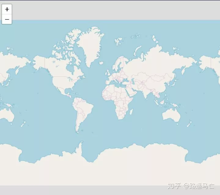
实现用leaflet()函数初始化地图,addTiles()函数添加世界地图。
1m=leaflet()
2# Then we Add default OpenStreetMap map tiles
3m=addTiles(m)
4# We can choose a zone:
5setView(m, lng = 108.97895693778992, lat = 34.24705357677057, zoom = 18)
6#setView()就是具体定位了,经纬度度,个人对zoom的理解就是对这个点的聚焦程度,在这里小编定位了自己的母校

各种图都可以画,卫星图、地形图。在文末会把各种不同的图的输入参数给出来,下图是交大的卫星图。
1addProviderTiles(m,"Esri.WorldImagery")

19
网络图
网络图由点和边构成,反映的是两个节点的连接关系或者流通关系。
为了更好地绘制网络图,你的数据必须被转化为以下几种形式:
邻接矩阵:一个方阵,行和列中的元素是相同的。示例:相关矩阵。
 1#首先绘制一个定向,无权重的网络图
 2#library
 3library(igraph)
 4set.seed(10)
 5
 6# Create data
 7data=matrix(sample(0:2, 25, replace=TRUE), nrow=5)
 8colnames(data)=rownames(data)=LETTERS[1:5]
 9
10# Tell Igraph it is an adjency matrix... with default parameters
11set.seed(10)
12network=graph_from_adjacency_matrix(data)
13
14# plot it
15plot(network)
对于网络图,可分为有向图和无向图,有权图和无权图,通过调整参数,修改图的表现形式。
1par(mfrow=c(1,2))
2set.seed(10)
3network=graph_from_adjacency_matrix(data, weighted=NULL)
4plot(network, main="UNweighted")
5# right
6set.seed(10)
7network1=graph_from_adjacency_matrix(data, weighted=TRUE)
8plot(network1, main="weighted")

影响矩阵:一个影响矩阵不一定有相同的行数和列数。默认情况下,它是从行定向到列。
 1library(igraph)
 2set.seed(1)
 3data=matrix(sample(0:2, 15, replace=TRUE), nrow=3)
 4colnames(data) <- letters[1:5]
 5rownames(data) <- LETTERS[1:3]
 6
 7# create the network object
 8set.seed(1)
 9network=graph_from_incidence_matrix(data)
10
11# plot it
12plot(network)
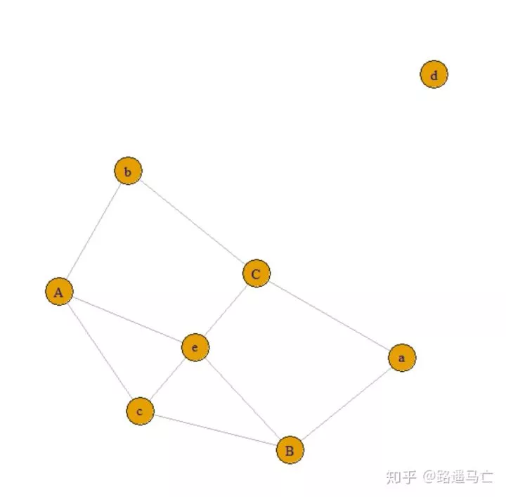
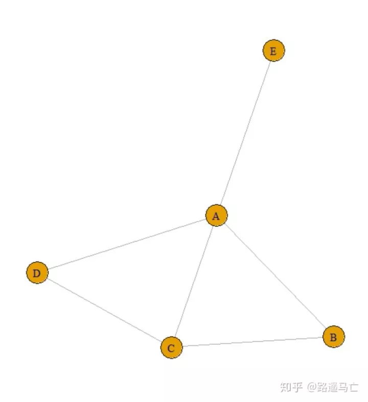
边的列表:通过表格的方式列出每一条的始末点

 1# create data:
 2links=data.frame(
 3  source=c("A","A", "A", "A", "A","F", "B"),
 4  target=c("B","B", "C", "D", "F","A","E")
 5)
 6
 7# create the network object
 8set.seed(10)
 9network=graph_from_data_frame(d=links, directed=F)
10# plot it
11plot(network)
同时,可以给数据框添加新的变量,来反映节点的一些特征。
1par(mfrow=c(1,2))
2nodes=data.frame(
3 name=LETTERS[1:6],
4 carac=c( rep(10,3), rep(30,3))
5)
6
7# Turn it into igraph object
8network=graph_from_data_frame(d=links, vertices=nodes, directed=F)
9
10# And use these new info in the plot!
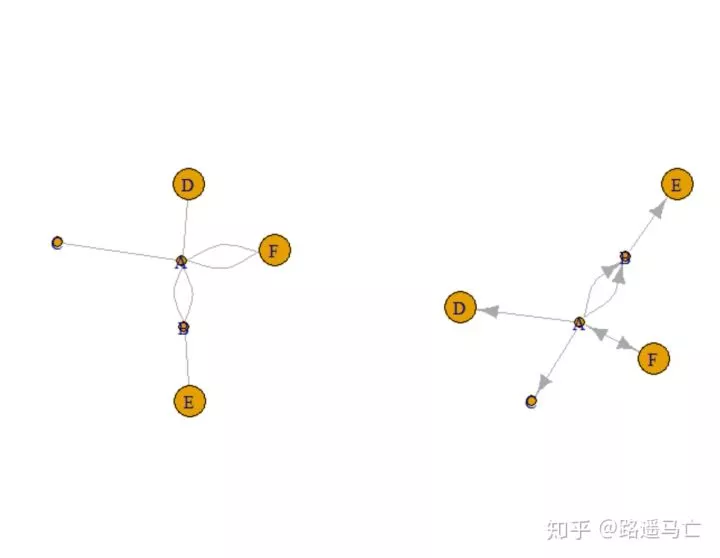
11plot(network, vertex.size=nodes$carac)
12
13# The same but directed:
14network=graph_from_data_frame(d=links, vertices=nodes, directed=T)
15plot(network, vertex.size=nodes$carac)
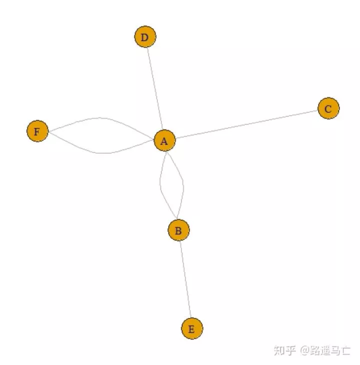
连接的文本列表:提供一个包含所有边的连接向量。
1network=graph_from_literal( A-B-C-D, E-A-E-A, D-C-A, D-A-D-C )
2plot(network)
后期会补充调整网络图节点、边特征的一些参数。敬请期待!

往期精彩:
广告
R数据可视化手册
作者:[美]Winston Chang 著,肖楠,邓一硕,魏太云 译
当当

公众号后台回复关键字即可学习
回复 爬虫 爬虫三大案例实战
回复 Python 1小时破冰入门
回复 数据挖掘 R语言入门及数据挖掘
回复 人工智能 三个月入门人工智能
回复 数据分析师 数据分析师成长之路
回复 机器学习 机器学习的商业应用
回复 数据科学 数据科学实战
回复 常用算法 常用数据挖掘算法