这次我用的是Kaggel上关于人力资源的数据库,这是一个模拟的数据库。
数据列名:
- Employee satisfaction level(员工满意度)
- Last evaluation(上一次评价分数)
- Number of projects(参与项目数量)
- Average monthly hours(每月上班时间)
- Time spent at the company(在公司呆的年份数)
- Whether they have had a work accident(是否在工作上有过事故)
- Whether they have had a promotion in the last 5 years(在5年是否有过升级)
- Department(部门)
- Salary(工资水平,分成下,中,上)
- Whether the employee has left(是否有员工离开)
1、首先我们总体来观察下我们的数据
hr = pd.read_csv('HR_comma_sep.csv')

hr.head()

接下来我将工资水平下,中,上对应成为1,2,3,然后去掉原来的工资一列。
set(hr.salary)

mapping = {'high':3,'medium':2,'low':1}

hr['salary_level'] = hr.salary.map(mapping)

hr = hr.drop('salary',axis=1)

hr.head()

我们来看下数据库中总共有多少种职位,这里比较奇怪的是sales这一列就是职位,可能是输入错入吧。如果需要的话,可以用rename修改
n = set(hr.sales)

print ("Position names :{}".format(n))
返回了10个职位分别为:Position names :{'product_mng', 'technical', 'management', 'IT', 'hr', 'marketing', 'support', 'sales', 'RandD', 'accounting'}
hr['sales'].value_counts().plot.pie(autopct='%1.1f%%',figsize=(5,5))
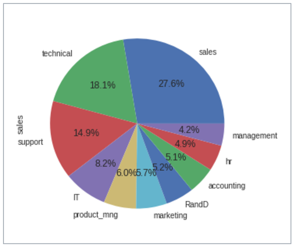
从上图中可以看到,这个数据库中,销售占比最多,其次是技术。
sns.heatmap(hr.corr(),vmax=1, square=True,annot=True)

我主要看到是否离开主要和满意程度,工作事故,薪资水平,所在公司年限有关。比较有趣的是工作事故越高,反而离开概率越低。
2、将数据按职位、是否离开归类,进行各个职位之间的纵向比较。
plt.subplot(1,2,1)

hr.groupby(["sales","left"]).mean().loc[:,"satisfaction_level"].plot(kind='bar')

plt.subplot(1,2,2)

hr.groupby(["sales","left"]).count().loc[:,"satisfaction_level"].plot(kind='bar')

plt.tight_layout
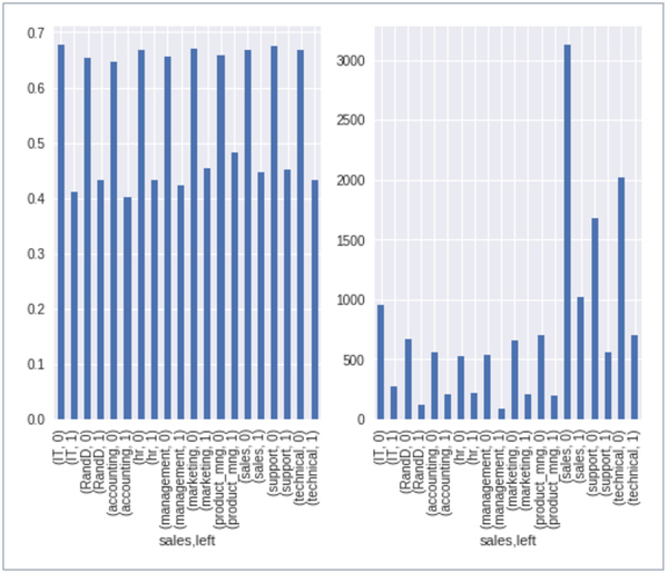
会计的满意程度最低,不管是在不离职和离职中。销售的离职人数最多,但是因为销售的基数也最多,并不能说销售的流动率最高。
hr.groupby(["sales","left"]).mean().loc[:,"salary_level"].plot(kind='bar')

很明显management的离开和未离开的薪资水平差距很大。未离开的管理职位的薪资水平也远远超过其他的职位,平均水平超过中等水平,可以说管理职位的离开和薪资有明显的关系;hr离开和未离开薪资水平差距最小。
3、横向分析,我对于技术岗位感兴趣,所以我挑选技术岗位分析
hr_te = hr[hr.sales == 'technical']

print ("people left vs peopel not left",hr_te.groupby('left').count().loc[:,["satisfaction_level"]])

plt.subplot(1,2,1)

hr_te.groupby('left').count().iloc[:,1].plot(kind='bar')

plt.subplot(1,2,2)

hr_te.groupby('left').count().iloc[:,1].plot.pie(autopct='%1.1f%%',figsize=(8,4))
people left vs peopel
not left :2023
left:697

在技术岗位,总共2023人未离开,697人选择离开。其中离开的占到25.6%,未离开的占到74.4%。
hr_te.groupby("left").sum().loc[:,["Work_accident",'promotion_last_5years']]

w1 = 348/2023

w2 = 33/697

print ("the precentage of work_accident_amony_not_left is :",w1)

print ("the precentage of work_accident_amony_left is :",w2)


p1 = 25/2023

p2 = 3/697

print ("the precentage of promation_amony_not_left is :",p1)

print ("the precentage of promation_amony_left is :",p2)
在所有离开的人中,仅有0.43%的人在过去5年中有升职,而在未离开人中,有1.12%的人过去5年升职。
chart1 = hr_te.drop(["Work_accident",'promotion_last_5years'],axis=1).groupby('left').mean()


plt.subplot(2,2,1)

chart1['average_montly_hours'].plot(kind = 'bar')

plt.title('average_montly_hours')

plt.subplot(2,2,2)

chart1['number_project'].plot(kind = 'bar')

plt.title('number_project')

plt.subplot(2,2,3)

chart1['time_spend_company'].plot(kind = 'bar')

plt.title('time_spend_company')


plt.tight_layout()

去掉工作事故列和5年升职列,我们对剩余的列做平均值。对于技术岗位,离开的人群都是低满意度,高项目数量,高工作时间,高呆公司年限。
4、最后
做了这个数据分析,人员的流动和工作的满意度,薪资水平,工作压力密切相关。从技术岗位来看,离开的人有着高项目数量,高工作时间,但是低薪资水平。就是简单的付出与得到没有成正比。所以老板们,请加薪吧!!哈哈
