
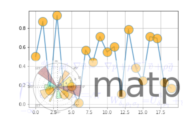
from __future__ import print_function

import numpy as np

import matplotlib.cbook as cbook

import matplotlib.image as image

import matplotlib.pyplot as plt


datafile = cbook.get_sample_data('logo2.png', asfileobj=False)

print('loading %s' % datafile)

im = image.imread(datafile)

im[:, :, -1] = 0.5  # set the alpha channel


fig, ax = plt.subplots()


ax.plot(np.random.rand(20), '-o', ms=20, lw=2, alpha=0.7, mfc='orange')

ax.grid()

fig.figimage(im, 10, 10, zorder=3)


plt.show()
2. 函数散点图
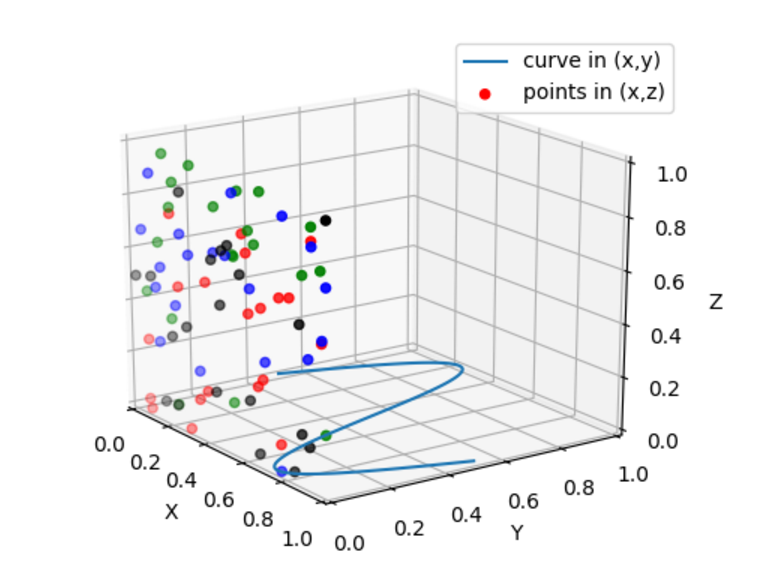
from mpl_toolkits.mplot3d import Axes3D

import numpy as np

import matplotlib.pyplot as plt


fig = plt.figure()

ax = fig.gca(projection='3d')


# Plot a sin curve using the x and y axes.

x = np.linspace(0, 1, 100)

y = np.sin(x * 2 * np.pi) / 2 + 0.5

ax.plot(x, y, zs=0, zdir='z', label='curve in (x,y)')


# Plot scatterplot data (20 2D points per colour) on the x and z axes.

colors = ('r', 'g', 'b', 'k')

x = np.random.sample(20*len(colors))

y = np.random.sample(20*len(colors))

c_list = []

for c in colors:

    c_list.append([c]*20)

# By using zdir='y', the y value of these points is fixed to the zs value 0

# and the (x,y) points are plotted on the x and z axes.

ax.scatter(x, y, zs=0, zdir='y', c=c_list, label='points in (x,z)')


# Make legend, set axes limits and labels

ax.legend()

ax.set_xlim(0, 1)

ax.set_ylim(0, 1)

ax.set_zlim(0, 1)

ax.set_xlabel('X')

ax.set_ylabel('Y')

ax.set_zlabel('Z')


# Customize the view angle so it's easier to see that the scatter points lie

# on the plane y=0

ax.view_init(elev=20., azim=-35)


plt.show()
3. 三维曲面图
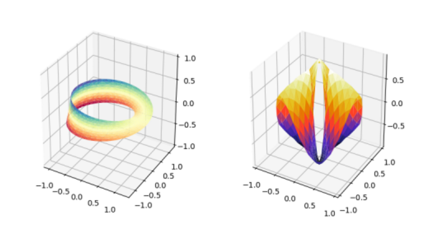
import numpy as np

import matplotlib.pyplot as plt

from mpl_toolkits.mplot3d import Axes3D

import matplotlib.tri as mtri


fig = plt.figure(figsize=plt.figaspect(0.5))


#============

# First plot

#============


# Make a mesh in the space of parameterisation variables u and v

u = np.linspace(0, 2.0 * np.pi, endpoint=True, num=50)

v = np.linspace(-0.5, 0.5, endpoint=True, num=10)

u, v = np.meshgrid(u, v)

u, v = u.flatten(), v.flatten()


# This is the Mobius mapping, taking a u, v pair and returning an x, y, z

# triple

x = (1 + 0.5 * v * np.cos(u / 2.0)) * np.cos(u)

y = (1 + 0.5 * v * np.cos(u / 2.0)) * np.sin(u)

z = 0.5 * v * np.sin(u / 2.0)


# Triangulate parameter space to determine the triangles

tri = mtri.Triangulation(u, v)


# Plot the surface.  The triangles in parameter space determine which x, y, z

# points are connected by an edge.

ax = fig.add_subplot(1, 2, 1, projection='3d')

ax.plot_trisurf(x, y, z, triangles=tri.triangles, cmap=plt.cm.Spectral)

ax.set_zlim(-1, 1)


#============

# Second plot

#============


# Make parameter spaces radii and angles.

n_angles = 36

n_radii = 8

min_radius = 0.25

radii = np.linspace(min_radius, 0.95, n_radii)


angles = np.linspace(0, 2*np.pi, n_angles, endpoint=False)

angles = np.repeat(angles[..., np.newaxis], n_radii, axis=1)

angles[:, 1::2] += np.pi/n_angles


# Map radius, angle pairs to x, y, z points.

x = (radii*np.cos(angles)).flatten()

y = (radii*np.sin(angles)).flatten()

z = (np.cos(radii)*np.cos(angles*3.0)).flatten()


# Create the Triangulation; no triangles so Delaunay triangulation created.

triang = mtri.Triangulation(x, y)


# Mask off unwanted triangles.

xmid = x[triang.triangles].mean(axis=1)

ymid = y[triang.triangles].mean(axis=1)

mask = np.where(xmid**2 + ymid**2 < min_radius**2, 1, 0)

triang.set_mask(mask)


# Plot the surface.

ax = fig.add_subplot(1, 2, 2, projection='3d')

ax.plot_trisurf(triang, z, cmap=plt.cm.CMRmap)


plt.show()
4. 地形地貌
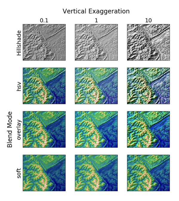
import numpy as np

import matplotlib.pyplot as plt

from matplotlib.cbook import get_sample_data

from matplotlib.colors import LightSource


dem = np.load(get_sample_data('jacksboro_fault_dem.npz'))

z = dem['elevation']


#-- Optional dx and dy for accurate vertical exaggeration --------------------

# If you need topographically accurate vertical exaggeration, or you don't want

# to guess at what *vert_exag* should be, you'll need to specify the cellsize

# of the grid (i.e. the *dx* and *dy* parameters).  Otherwise, any *vert_exag*

# value you specify will be relative to the grid spacing of your input data

# (in other words, *dx* and *dy* default to 1.0, and *vert_exag* is calculated

# relative to those parameters).  Similarly, *dx* and *dy* are assumed to be in

# the same units as your input z-values.  Therefore, we'll need to convert the

# given dx and dy from decimal degrees to meters.

dx, dy = dem['dx'], dem['dy']

dy = 111200 * dy

dx = 111200 * dx * np.cos(np.radians(dem['ymin']))

#-----------------------------------------------------------------------------


# Shade from the northwest, with the sun 45 degrees from horizontal

ls = LightSource(azdeg=315, altdeg=45)

cmap = plt.cm.gist_earth


fig, axes = plt.subplots(nrows=4, ncols=3, figsize=(8, 9))

plt.setp(axes.flat, xticks=[], yticks=[])


# Vary vertical exaggeration and blend mode and plot all combinations

for col, ve in zip(axes.T, [0.1, 1, 10]):

    # Show the hillshade intensity image in the first row

    col[0].imshow(ls.hillshade(z, vert_exag=ve, dx=dx, dy=dy), cmap='gray')


    # Place hillshaded plots with different blend modes in the rest of the rows

    for ax, mode in zip(col[1:], ['hsv', 'overlay', 'soft']):

        rgb = ls.shade(z, cmap=cmap, blend_mode=mode,

                       vert_exag=ve, dx=dx, dy=dy)

        ax.imshow(rgb)


# Label rows and columns

for ax, ve in zip(axes[0], [0.1, 1, 10]):

    ax.set_title('{0}'.format(ve), size=18)

for ax, mode in zip(axes[:, 0], ['Hillshade', 'hsv', 'overlay', 'soft']):

    ax.set_ylabel(mode, size=18)


# Group labels...

axes[0, 1].annotate('Vertical Exaggeration', (0.5, 1), xytext=(0, 30),

                    textcoords='offset points', xycoords='axes fraction',

                    ha='center', va='bottom', size=20)

axes[2, 0].annotate('Blend Mode', (0, 0.5), xytext=(-30, 0),

                    textcoords='offset points', xycoords='axes fraction',

                    ha='right', va='center', size=20, rotation=90)

fig.subplots_adjust(bottom=0.05, right=0.95)


plt.show()
5. 统计图
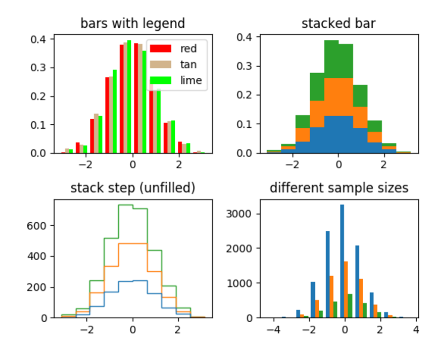
import numpy as np

import matplotlib.pyplot as plt


np.random.seed(0)


n_bins = 10

x = np.random.randn(1000, 3)


fig, axes = plt.subplots(nrows=2, ncols=2)

ax0, ax1, ax2, ax3 = axes.flatten()


colors = ['red', 'tan', 'lime']

ax0.hist(x, n_bins, normed=1, histtype='bar', color=colors, label=colors)

ax0.legend(prop={'size': 10})

ax0.set_title('bars with legend')


ax1.hist(x, n_bins, normed=1, histtype='bar', stacked=True)

ax1.set_title('stacked bar')


ax2.hist(x, n_bins, histtype='step', stacked=True, fill=False)

ax2.set_title('stack step (unfilled)')


# Make a multiple-histogram of data-sets with different length.

x_multi = [np.random.randn(n) for n in [10000, 5000, 2000]]

ax3.hist(x_multi, n_bins, histtype='bar')

ax3.set_title('different sample sizes')


fig.tight_layout()

plt.show()
6. 形状和集合
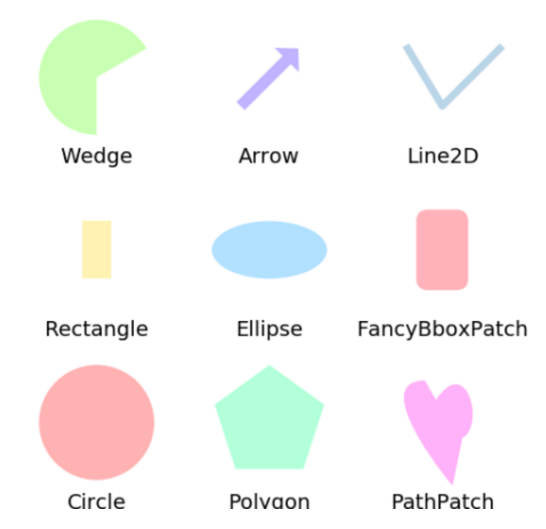
import matplotlib.pyplot as plt

plt.rcdefaults()


import numpy as np

import matplotlib.pyplot as plt

import matplotlib.path as mpath

import matplotlib.lines as mlines

import matplotlib.patches as mpatches

from matplotlib.collections import PatchCollection


def label(xy, text):

    y = xy[1] - 0.15  # shift y-value for label so that it's below the artist

    plt.text(xy[0], y, text, ha="center", family='sans-serif', size=14)


fig, ax = plt.subplots()

# create 3x3 grid to plot the artists

grid = np.mgrid[0.2:0.8:3j, 0.2:0.8:3j].reshape(2, -1).T


patches = []


# add a circle

circle = mpatches.Circle(grid[0], 0.1, ec="none")

patches.append(circle)

label(grid[0], "Circle")


# add a rectangle

rect = mpatches.Rectangle(grid[1] - [0.025, 0.05], 0.05, 0.1, ec="none")

patches.append(rect)

label(grid[1], "Rectangle")


# add a wedge

wedge = mpatches.Wedge(grid[2], 0.1, 30, 270, ec="none")

patches.append(wedge)

label(grid[2], "Wedge")


# add a Polygon

polygon = mpatches.RegularPolygon(grid[3], 5, 0.1)

patches.append(polygon)

label(grid[3], "Polygon")


# add an ellipse

ellipse = mpatches.Ellipse(grid[4], 0.2, 0.1)

patches.append(ellipse)

label(grid[4], "Ellipse")


# add an arrow

arrow = mpatches.Arrow(grid[5, 0] - 0.05, grid[5, 1] - 0.05, 0.1, 0.1, width=0.1)

patches.append(arrow)

label(grid[5], "Arrow")


# add a path patch

Path = mpath.Path

path_data = [

    (Path.MOVETO, [0.018, -0.11]),

    (Path.CURVE4, [-0.031, -0.051]),

    (Path.CURVE4, [-0.115,  0.073]),

    (Path.CURVE4, [-0.03 ,  0.073]),

    (Path.LINETO, [-0.011,  0.039]),

    (Path.CURVE4, [0.043,  0.121]),

    (Path.CURVE4, [0.075, -0.005]),

    (Path.CURVE4, [0.035, -0.027]),

    (Path.CLOSEPOLY, [0.018, -0.11])

    ]

codes, verts = zip(*path_data)

path = mpath.Path(verts + grid[6], codes)

patch = mpatches.PathPatch(path)

patches.append(patch)

label(grid[6], "PathPatch")


# add a fancy box

fancybox = mpatches.FancyBboxPatch(

    grid[7] - [0.025, 0.05], 0.05, 0.1,

    boxstyle=mpatches.BoxStyle("Round", pad=0.02))

patches.append(fancybox)

label(grid[7], "FancyBboxPatch")


# add a line

x, y = np.array([[-0.06, 0.0, 0.1], [0.05, -0.05, 0.05]])

line = mlines.Line2D(x + grid[8, 0], y + grid[8, 1], lw=5., alpha=0.3)

label(grid[8], "Line2D")


colors = np.linspace(0, 1, len(patches))

collection = PatchCollection(patches, cmap=plt.cm.hsv, alpha=0.3)

collection.set_array(np.array(colors))

ax.add_collection(collection)

ax.add_line(line)


plt.subplots_adjust(left=0, right=1, bottom=0, top=1)

plt.axis('equal')

plt.axis('off')


plt.show()
本站文章版权归原作者及原出处所有 。内容为作者个人观点, 并不代表本站赞同其观点和对其真实性负责。本站是一个个人学习交流的平台,并不用于任何商业目的,如果有任何问题,请及时联系我们,我们将根据著作权人的要求,立即更正或者删除有关内容。本站拥有对此声明的最终解释权。