
作者:徐瑞龙,量化分析师,R语言中文社区专栏作者
博客专栏:
本文翻译自《Time Series Deep Learning, Part 2: Predicting Sunspot Frequency With Keras Lstm in R》,略有删减。
深度学习于商业的用途之一是提高时间序列预测的准确性。之前的教程显示了如何利用自相关性预测未来 10 年的月度太阳黑子数量。本教程将借助 RStudio 重新审视太阳黑子数据集,并且使用到 TensorFlow for R 中一些高级的深度学习功能,展示基于 keras 的深度学习教程遇到 tfruns(用于追踪、可视化和管理 TensorFlow 训练、实验的一整套工具)后产生出的有趣结果。
学习路线
该深度学习教程将教会你:
时间序列深度学习如何应用于商业
深度学习预测太阳黑子
如何建立 LSTM 模型
如何回测 LSTM 模型
事实上,最酷的事之一是你能画出 LSTM 预测的回测结果。
商业中的时间序列深度学习
时间序列预测是商业中实现投资回报率(ROI)的一个关键领域。想一想:预测准确度提高 10% 就可以为机构节省数百万美元。这怎么可能?下面让我们来看看。
我们将以 NVIDIA 为例,一家为 Artificial Intelligence 和 Deep Learning 生产最先进芯片的半导体厂商。NVIDIA 生产的图形处理器或 GPU,这对于高性能深度学习所要求的大规模数值计算来说是必需的。芯片看起来像这样。

与所有制造商一样,NVIDIA 需要预测其产品的需求。为什么? 因为他们据此可以为客户提供合适数量的芯片。这个预测很关键,需要很多技巧和一些运气才能做到这一点。
我们所讨论的是销售预测,它推动了 NVIDIA 做出的所有生产制造决策。这包括购买多少原材料,有多少人来制造芯片,以及需要多少预算用于加工和装配操作。销售预测中的错误越多,NVIDIA 产生的成本就越大,因为所有这些活动(供应链、库存管理、财务规划等)都会变得没有意义!
商业中应用时间序列深度学习
时间序列深度学习对于预测具有高自相关性的数据非常准确,因为包括 LSTM 和 GRU 在内的算法可以从序列中学习信息,无论模式何时发生。这些特殊的 RNN 旨在具有长期记忆性,这意味着它们善于在最近发生的观察和很久之前发生的观察之间学习模式。这使它们非常适合时间序列!但它们对销售数据有用吗?也许,来!我们讨论一下。
销售数据混合了各种特征,但通常有季节性模式和趋势。趋势可以是平坦的、线性的、指数的等等。这通常不是 LSTM 擅长的地方,但其他传统的预测方法可以检测趋势。但是,季节性不同。销售数据中的季节性是一种可以在多个频率(年度、季度、月度、周度甚至每天)上出现的模式。LSTM 非常适合检测季节性,因为它通常具有自相关性。因此,LSTM 和 GRU 可以很好地帮助改进季节性检测,从而减少销售预测中的整体预测误差。
深度学习时间序列预测:使用 keras 预测太阳黑子
这一节我们将借助基本的 R 工具在太阳黑子数据集上做时间序列预测。太阳黑子是太阳表面的低温区域,这里有一张来自 NASA 的太阳黑子图片。

我们使用月度数据集 sunspots.month(也有一个年度频率的版本),它包括 265 年间(1749 - 2013)的月度太阳黑子观测。

预测该数据集具有相当的挑战性,因为短期内的高变异性以及长期内明显的不规则周期性。例如,低频周期达到的最大幅度差异很大,达到最大低频周期高度所需的高频周期步数也是如此。(译注:数据中的局部高点之间间隔大约为 11 年)
我们的文章将重点关注两个主要方面:如何将深度学习应用于时间序列预测,以及如何在该领域中正确应用交叉验证。对于后者,我们将使用 rsample 包来允许对时间序列数据进行重新抽样。对于前者,我们的目标不是达到最佳表现,而是显示使用递归神经网络对此类数据进行建模时的一般操作过程。
递归神经网络
当我们的数据具有序列结构时,我们就用递归神经网络(RNN)进行建模。
目前为止,在 RNN 中,建立的最佳架构是 GRU(门递归单元)和 LSTM(长短期记忆网络)。今天,我们不要放大它们自身独特的东西,而是集中于它们与最精简的 RNN 的共同点上:基本的递归结构。
与通常称为多层感知器(MLP)的神经网络的原型相比,RNN 具有随时间推移的状态。来自 Goodfellow 等人的著作——“深度学习的圣经”,从这个图中可以很好地看出这一点:
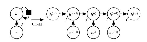
每次,状态是当前输入和先前隐含状态的组合。这让人联想到自回归模型,但是对于神经网络,我们必须在某种程度上停止依赖。
因为那是为了确定权重,我们会不断计算输入变化后我们的损失如何变化。现在,如果我们必须考虑的输入在任意时间步无限地返回,那么我们将无法计算所有这些梯度。然而,在实践中,我们的隐含状态将在每次迭代中通过固定数量的步骤继续前进。
一旦我们加载并预处理数据,我们就会回过头来。
设置、预处理与探索
所用的包
这里是该教程所涉及到的包。
# Core Tidyverse

library(tidyverse)

library(glue)

library(forcats)


# Time Series

library(timetk)

library(tidyquant)

library(tibbletime)


# Visualization

library(cowplot)


# Preprocessing

library(recipes)


# Sampling / Accuracy

library(rsample)

library(yardstick)


# Modeling

library(keras)

library(tfruns)
如果你之前没有在 R 中运行过 Keras,你需要用 install_keras() 函数安装 Keras。
# Install Keras if you have not installed before

install_keras()
数据
数据集 sunspot.month 是一个 ts 类对象(非 tidy 类),所以我们将使用 timetk 中的 tk_tbl() 函数转换为 tidy 数据集。我们使用这个函数而不是来自 tibble 的 as.tibble(),用来自动将时间序列索引保存为zoo yearmon 索引。最后,我们将使用 lubridate::as_date()(使用 tidyquant 时加载)将 zoo 索引转换为日期,然后转换为 tbl_time 对象以使时间序列操作起来更容易。
sun_spots <- datasets::sunspot.month %>%

    tk_tbl() %>%

    mutate(index = as_date(index)) %>%

    as_tbl_time(index = index)


sun_spots
# A time tibble: 3,177 x 2

# Index: index

   index      value

   <date>     <dbl>

 1 1749-01-01  58

 2 1749-02-01  62.6

 3 1749-03-01  70

 4 1749-04-01  55.7

 5 1749-05-01  85

 6 1749-06-01  83.5

 7 1749-07-01  94.8

 8 1749-08-01  66.3

 9 1749-09-01  75.9

10 1749-10-01  75.5

# ... with 3,167 more rows
探索性数据分析
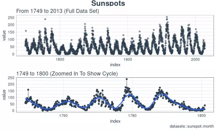
时间序列很长(有 265 年!)。我们可以将时间序列的全部(265 年)以及前 50 年的数据可视化,以获得该时间系列的直观感受。
使用 cowplot 可视化太阳黑子数据
我们将创建若干 ggplot 对象并借助 cowplot::plot_grid() 把这些对象组合起来。对于需要缩放的部分,我们使用 tibbletime::time_filter(),可以方便的实现基于时间的过滤。
p1 <- sun_spots %>%

    ggplot(aes(index, value)) +

    geom_point(

        color = palette_light()[[1]],

        alpha = 0.5) +

    theme_tq() +

    labs(

        title = "From 1749 to 2013 (Full Data Set)")


p2 <- sun_spots %>%

    filter_time("start" ~ "1800") %>%

    ggplot(aes(index, value)) +

    geom_line(

        color = palette_light()[[1]],

        alpha = 0.5) +

    geom_point(color = palette_light()[[1]]) +

    geom_smooth(

        method = "loess",

        span = 0.2, se = FALSE) +

    theme_tq() +

    labs(

        title = "1749 to 1759 (Zoomed In To Show Changes over the Year)",

        caption = "datasets::sunspot.month")


p_title <- ggdraw() +

    draw_label(

        "Sunspots", size = 18,

        fontface = "bold",

        colour = palette_light()[[1]])


plot_grid(

    p_title, p1, p2,

    ncol = 1, rel_heights = c(0.1, 1, 1))
回测:时间序列交叉验证
在序列数据上执行交叉验证时,必须保留对以前时间样本的时间依赖性。我们可以通过平移窗口的方式选择连续子样本,进而创建交叉验证抽样计划。实质上,由于没有未来测试数据,我们需要创造若干人造“未来”数据来解决这个问题,在金融领域这通常被称为“回测”。
之前的教程提到过,rsample 包包含回测功能。“Time Series Analysis Example”描述了一个使用 rolling_origin() 函数为时间序列交叉验证创建样本的过程。我们将使用这种方法。
开发一个回测策略
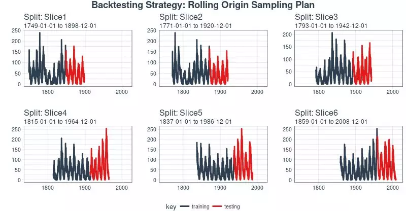
我们创建的抽样计划使用 100 年(initial = 12 x 100)的数据作为训练集,50 年(assess = 12 x 50)的数据用于测试集。我们选择大约 22 年的跳跃跨度(skip = 12 x 22 - 1),将样本均匀分布到 6 组中,跨越整个 265 年的太阳黑子历史。最后,我们选择 cumulative = FALSE 来允许平移起始点,这确保了较近期数据上的模型相较那些不太新近的数据没有不公平的优势(使用更多的观测数据)。rolling_origin_resamples 是一个 tibble 型的返回值。
periods_train <- 12 * 100

periods_test  <- 12 * 50

skip_span     <- 12 * 22 - 1


rolling_origin_resamples <- rolling_origin(

    sun_spots,

    initial    = periods_train,

    assess     = periods_test,

    cumulative = FALSE,

    skip       = skip_span)


rolling_origin_resamples
# Rolling origin forecast resampling

# A tibble: 6 x 2

  splits       id

  <list>       <chr>

1 <S3: rsplit> Slice1

2 <S3: rsplit> Slice2

3 <S3: rsplit> Slice3

4 <S3: rsplit> Slice4

5 <S3: rsplit> Slice5

6 <S3: rsplit> Slice6
可视化回测策略
我们可以用两个自定义函数来可视化再抽样。首先是 plot_split(),使用 ggplot2 绘制一个再抽样分割图。请注意,expand_y_axis 参数默认将日期范围扩展成整个 sun_spots 数据集的日期范围。当我们将所有的图形同时可视化时,这将变得有用。
# Plotting function for a single split

plot_split <- function(split,

                       expand_y_axis = TRUE,

                       alpha = 1,

                       size = 1,

                       base_size = 14)

{


    # Manipulate data

    train_tbl <- training(split) %>%

        add_column(key = "training")


    test_tbl  <- testing(split) %>%

        add_column(key = "testing")


    data_manipulated <- bind_rows(

        train_tbl, test_tbl) %>%

        as_tbl_time(index = index) %>%

        mutate(

            key = fct_relevel(

                key, "training", "testing"))


    # Collect attributes

    train_time_summary <- train_tbl %>%

        tk_index() %>%

        tk_get_timeseries_summary()


    test_time_summary <- test_tbl %>%

        tk_index() %>%

        tk_get_timeseries_summary()


    # Visualize

    g <- data_manipulated %>%

        ggplot(

            aes(x = index, y = value, color = key)) +

        geom_line(size = size, alpha = alpha) +

        theme_tq(base_size = base_size) +

        scale_color_tq() +

        labs(

            title    = glue("Split: {split$id}"),

            subtitle = glue(

                "{train_time_summary$start} to {test_time_summary$end}"),

            y = "",

            x = "") +

        theme(legend.position = "none")


    if (expand_y_axis)

    {


        sun_spots_time_summary <- sun_spots %>%

            tk_index() %>%

            tk_get_timeseries_summary()


        g <- g +

            scale_x_date(

                limits = c(

                    sun_spots_time_summary$start,

                    sun_spots_time_summary$end))

    }


    return(g)

}
plot_split() 函数接受一个分割(在本例中为 Slice01),并可视化抽样策略。我们使用 expand_y_axis = TRUE 将横坐标范围扩展到整个数据集的日期范围。
rolling_origin_resamples$splits[[1]] %>%

    plot_split(expand_y_axis = TRUE) +

    theme(legend.position = "bottom")

第二个函数是 plot_sampling_plan(),使用 purrr 和 cowplot 将 plot_split() 函数应用到所有样本上。
# Plotting function that scales to all splits

plot_sampling_plan <- function(sampling_tbl,

                               expand_y_axis = TRUE,

                               ncol = 3,

                               alpha = 1,

                               size = 1,

                               base_size = 14,

                               title = "Sampling Plan")

{

    # Map plot_split() to sampling_tbl

    sampling_tbl_with_plots <- sampling_tbl %>%

        mutate(

            gg_plots = map(

                splits, plot_split,

                expand_y_axis = expand_y_axis,

                alpha = alpha, base_size = base_size))


    # Make plots with cowplot

    plot_list <- sampling_tbl_with_plots$gg_plots


    p_temp <- plot_list[[1]] +

        theme(legend.position = "bottom")

    legend <- get_legend(p_temp)


    p_body <- plot_grid(

        plotlist = plot_list, ncol = ncol)


    p_title <- ggdraw() +

        draw_label(

            title, size = 14,

            fontface = "bold",

            colour = palette_light()[[1]])


    g <- plot_grid(

        p_title, p_body,

        legend, ncol = 1,

        rel_heights = c(0.05, 1, 0.05))


    return(g)

}
现在我们可以使用 plot_sampling_plan() 可视化整个回测策略!我们可以看到抽样计划如何平移抽样窗口逐渐切分出训练和测试子样本。
rolling_origin_resamples %>%

    plot_sampling_plan(

        expand_y_axis = T, ncol = 3,

        alpha = 1, size = 1, base_size = 10,

        title = "Backtesting Strategy: Rolling Origin Sampling Plan")
此外,我们可以让 expand_y_axis = FALSE,对每个样本进行缩放。
rolling_origin_resamples %>%

    plot_sampling_plan(

        expand_y_axis = F, ncol = 3,

        alpha = 1, size = 1, base_size = 10,

        title = "Backtesting Strategy: Zoomed In")

当在太阳黑子数据集上测试 LSTM 模型准确性时,我们将使用这种回测策略(来自一个时间序列的 6 个样本,每个时间序列分为 100/50 两部分,并且样本之间有大约 22 年的偏移)。
LSTM 模型
首先,我们将在回测策略的某个样本上用 Keras 开发一个状态 LSTM 模型,通常是最近的一个。然后,我们将模型套用到所有样本,以测试和验证模型性能。
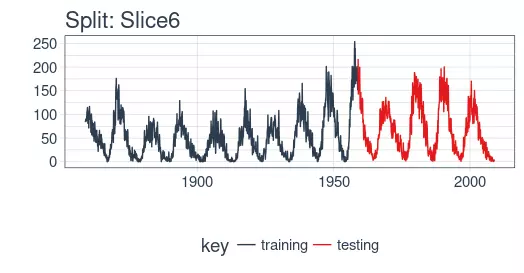
example_split    <- rolling_origin_resamples$splits[[6]]

example_split_id <- rolling_origin_resamples$id[[6]]
我么可以用 plot_split() 函数可视化该分割,设定 expand_y_axis = FALSE 以便将横坐标缩放到样本本身的范围。
plot_split(

    example_split,

    expand_y_axis = FALSE,

    size = 0.5) +

    theme(legend.position = "bottom") +

    ggtitle(glue("Split: {example_split_id}"))
数据准备
为了帮助进行超参数调整,除了训练集之外,我们还需要一个验证集。例如,我们将使用一个回调函数 callback_early_stopping,当验证集上没有显着的表现时,它会停止训练(多少算显著由你决定)。
我们将分析集的三分之二用于训练,三分之一用于验证。
df_trn <- analysis(example_split)[1:800, , drop = FALSE]

df_val <- analysis(example_split)[801:1200, , drop = FALSE]

df_tst <- assessment(example_split)
首先,我们将训练和测试数据集合成一个数据集,并使用列 key 来标记它们来自哪个集合(training 或 testing)。请注意,tbl_time 对象需要在调用 bind_rows() 时重新指定索引,但是这个问题应该很快在 dplyr 包中得到纠正。
df <- bind_rows(

    df_trn %>% add_column(key = "training"),

    df_val %>% add_column(key = "validation"),

    df_tst %>% add_column(key = "testing")) %>%

    as_tbl_time(index = index)


df
# A time tibble: 1,800 x 3

# Index: index

   index      value key

   <date>     <dbl> <chr>

 1 1849-06-01  81.1 training

 2 1849-07-01  78   training

 3 1849-08-01  67.7 training

 4 1849-09-01  93.7 training

 5 1849-10-01  71.5 training

 6 1849-11-01  99   training

 7 1849-12-01  97   training

 8 1850-01-01  78   training

 9 1850-02-01  89.4 training

10 1850-03-01  82.6 training

# ... with 1,790 more rows
用 recipe 做数据预处理
LSTM 算法通常要求输入数据经过中心化并标度化。我们可以使用 recipe 包预处理数据。我们用 step_sqrt 来转换数据以减少异常值的影响,再结合 step_center 和 step_scale 对数据进行中心化和标度化。最后,数据使用 bake() 函数实现处理转换。
rec_obj <- recipe(

    value ~ ., df) %>%

    step_sqrt(value) %>%

    step_center(value) %>%

    step_scale(value) %>%

    prep()


df_processed_tbl <- bake(rec_obj, df)


df_processed_tbl
# A tibble: 1,800 x 3

   index      value key

   <date>     <dbl> <fct>

 1 1849-06-01 0.714 training

 2 1849-07-01 0.660 training

 3 1849-08-01 0.473 training

 4 1849-09-01 0.922 training

 5 1849-10-01 0.544 training

 6 1849-11-01 1.01  training

 7 1849-12-01 0.974 training

 8 1850-01-01 0.660 training

 9 1850-02-01 0.852 training

10 1850-03-01 0.739 training

# ... with 1,790 more rows
接着,记录中心化和标度化的信息,以便在建模完成之后可以将数据逆向转换回去。平方根转换可以通过乘方运算逆转回去,但要在逆转中心化和标度化之后。
center_history <- rec_obj$steps[[2]]$means["value"]

scale_history  <- rec_obj$steps[[3]]$sds["value"]


c("center" = center_history, "scale" = scale_history)
center.value  scale.value

    6.694468     3.238935
调整数据形状
Keras LSTM 希望输入和目标数据具有特定的形状。输入必须是 3 维数组,维度大小为 num_samples、num_timesteps、num_features。
这里,num_samples 是集合中观测的数量。这将以每份 batch_size 大小的分量分批提供给模型。第二个维度 num_timesteps 是我们上面讨论的隐含状态的长度。最后,第三个维度是我们正在使用的预测变量的数量。对于单变量时间序列,这是 1。
隐含状态的长度应该选择多少?这通常取决于数据集和我们的目标。如果我们提前一步预测,即仅预测下个月,我们主要关注的是选择一个状态长度,以便学习数据中存在的任何模式。
现在说我们想要预测 12 个月的数据,就像 SILSO(世界数据中心,用于生产、保存和传播国际太阳黑子观测)所做的。我们通过 Keras 实现这一目标的方法是使 LSTM 隐藏状态与后续输出有相同的长度。因此,如果我们想要产生 12 个月的预测,我们的 LSTM 隐藏状态长度应该是 12。(译注:原始数据的周期大约是 10 到 11 年,使用相邻两年的数据不能涵盖一个完整的周期,致使模型无法学习到和周期有关的模式,最终表现可能不佳。)
然后使用 time_distributed() 包装器将这 12 个时间步连接到 12 个线性预测器单元。该包装器的任务是将相同的计算(即,相同的权重矩阵)应用于它接收的每个状态输入。
目标数组的格式应该是什么?由于我们在这里预测了几个时间步,目标数据也需要是 3 维的。维度 1 同样是批量维度,维度 2 同样对应于时间步(被预测的),维度 3 是包装层的大小。在我们的例子中,包装层是单个单元的 layer_dense(),因为我们希望每个时间点只有一个预测。
所以,让我们调整数据形状。这里的主要动作是用滑动窗口创建长度 12 的输入,后续 12 个观测作为输出。举个更简单的例子,假设我们的输入是从 1 到 10 的数字,我们选择的序列长度(状态大小)是 4,下面就是我们希望我们的训练输入看起来的样子:
1,2,3,4

2,3,4,5

3,4,5,6
相应的目标数据:
5,6,7,8

6,7,8,9

7,8,9,10
我们将定义一个简短的函数,对给定的数据集进行调整。最后,我们形式上添加了需要的第三个维度(即使在我们的例子中该维度的大小为 1)。
# these variables are being defined just because of the order in which

# we present things in this post (first the data, then the model)

# they will be superseded by FLAGS$n_timesteps, FLAGS$batch_size and n_predictions

# in the following snippet

n_timesteps <- 12

n_predictions <- n_timesteps

batch_size <- 10


# functions used

build_matrix <- function(tseries,

                         overall_timesteps)

{

    t(sapply(

        1:(length(tseries) - overall_timesteps + 1),

        function(x) tseries[x:(x + overall_timesteps - 1)]))

}


reshape_X_3d <- function(X)

{

    dim(X) <- c(dim(X)[1], dim(X)[2], 1)

    X

}


# extract values from data frame

train_vals <- df_processed_tbl %>%

    filter(key == "training") %>%

    select(value) %>%

    pull()

valid_vals <- df_processed_tbl %>%

    filter(key == "validation") %>%

    select(value) %>%

    pull()

test_vals <- df_processed_tbl %>%

    filter(key == "testing") %>%

    select(value) %>%

    pull()


# build the windowed matrices

train_matrix <- build_matrix(

    train_vals, n_timesteps + n_predictions)

valid_matrix <- build_matrix(

    valid_vals, n_timesteps + n_predictions)

test_matrix <- build_matrix(

    test_vals, n_timesteps + n_predictions)


# separate matrices into training and testing parts

# also, discard last batch if there are fewer than batch_size samples

# (a purely technical requirement)

X_train <- train_matrix[, 1:n_timesteps]

y_train <- train_matrix[, (n_timesteps + 1):(n_timesteps * 2)]

X_train <- X_train[1:(nrow(X_train) %/% batch_size * batch_size), ]

y_train <- y_train[1:(nrow(y_train) %/% batch_size * batch_size), ]


X_valid <- valid_matrix[, 1:n_timesteps]

y_valid <- valid_matrix[, (n_timesteps + 1):(n_timesteps * 2)]

X_valid <- X_valid[1:(nrow(X_valid) %/% batch_size * batch_size), ]

y_valid <- y_valid[1:(nrow(y_valid) %/% batch_size * batch_size), ]


X_test <- test_matrix[, 1:n_timesteps]

y_test <- test_matrix[, (n_timesteps + 1):(n_timesteps * 2)]

X_test <- X_test[1:(nrow(X_test) %/% batch_size * batch_size), ]

y_test <- y_test[1:(nrow(y_test) %/% batch_size * batch_size), ]

# add on the required third axis

X_train <- reshape_X_3d(X_train)

X_valid <- reshape_X_3d(X_valid)

X_test <- reshape_X_3d(X_test)


y_train <- reshape_X_3d(y_train)

y_valid <- reshape_X_3d(y_valid)

y_test <- reshape_X_3d(y_test)
构建 LSTM 模型
现在我们的数据具有了所需的形式,让我们构建最终模型。与深度学习一样,一项重要且经常耗时的工作是调整超参数。为了使这篇文章保持独立,并且考虑到这主要是关于如何在 R 中使用 LSTM 的教程,让我们假设在经过大量实验后发现了以下设置(实际上实验确实发生了,但没有达到最佳的表现)。
我们没有硬编码超参数,而是使用 tfruns 设置了一个环境,在环境中可以轻松地实现网格搜索。
我们会注释这些参数的作用,但具体含义留到以后再解释。
FLAGS <- flags(

    # There is a so-called "stateful LSTM" in Keras. While LSTM is stateful per se,

    # this adds a further tweak where the hidden states get initialized with values

    # from the item at same position in the previous batch.

    # This is helpful just under specific circumstances, or if you want to create an

    # "infinite stream" of states, in which case you'd use 1 as the batch size.

    # Below, we show how the code would have to be changed to use this, but it won't be further

    # discussed here.

    flag_boolean("stateful", FALSE),

    # Should we use several layers of LSTM?

    # Again, just included for completeness, it did not yield any superior performance on this task.

    # This will actually stack exactly one additional layer of LSTM units.

    flag_boolean("stack_layers", FALSE),

    # number of samples fed to the model in one go

    flag_integer("batch_size", 10),

    # size of the hidden state, equals size of predictions

    flag_integer("n_timesteps", 12),

    # how many epochs to train for

    flag_integer("n_epochs", 100),

    # fraction of the units to drop for the linear transformation of the inputs

    flag_numeric("dropout", 0.2),

    # fraction of the units to drop for the linear transformation of the recurrent state

    flag_numeric("recurrent_dropout", 0.2),

    # loss function. Found to work better for this specific case than mean squared error

    flag_string("loss", "logcosh"),

    # optimizer = stochastic gradient descent. Seemed to work better than adam or rmsprop here

    # (as indicated by limited testing)

    flag_string("optimizer_type", "sgd"),

    # size of the LSTM layer

    flag_integer("n_units", 128),

    # learning rate

    flag_numeric("lr", 0.003),

    # momentum, an additional parameter to the SGD optimizer

    flag_numeric("momentum", 0.9),

    # parameter to the early stopping callback

    flag_integer("patience", 10))


# the number of predictions we'll make equals the length of the hidden state

n_predictions <- FLAGS$n_timesteps

# how many features = predictors we have

n_features <- 1

# just in case we wanted to try different optimizers, we could add here

optimizer <- switch(

    FLAGS$optimizer_type,

    sgd = optimizer_sgd(

        lr = FLAGS$lr,

        momentum = FLAGS$momentum))


# callbacks to be passed to the fit() function

# We just use one here: we may stop before n_epochs if the loss on the validation set

# does not decrease (by a configurable amount, over a configurable time)

callbacks <- list(

    callback_early_stopping(

        patience = FLAGS$patience))
经过所有这些准备工作,构建和训练模型的代码就相当简短!让我们首先快速查看“长版本”,这将允许你测试堆叠多个 LSTM 或使用状态 LSTM,然后通过最终的短版本(两者都不做)并对其进行评论。
完整的代码,仅供参考。
model <- keras_model_sequential()


model %>%

    layer_lstm(

        units = FLAGS$n_units,

        batch_input_shape  = c(

            FLAGS$batch_size,

            FLAGS$n_timesteps,

            n_features),

        dropout = FLAGS$dropout,

        recurrent_dropout = FLAGS$recurrent_dropout,

        return_sequences = TRUE,

        stateful = FLAGS$stateful)


if (FLAGS$stack_layers)

{

    model %>%

        layer_lstm(

            units             = FLAGS$n_units,

            dropout           = FLAGS$dropout,

            recurrent_dropout = FLAGS$recurrent_dropout,

            return_sequences  = TRUE,

            stateful          = FLAGS$stateful)

}


model %>% time_distributed(

    layer_dense(units = 1))


model %>%

    compile(

        loss      = FLAGS$loss,

        optimizer = optimizer,

        metrics   = list("mean_squared_error"))


if (!FLAGS$stateful) {

    model %>% fit(

        x          = X_train,

        y          = y_train,

        validation_data = list(X_valid, y_valid),

        batch_size = FLAGS$batch_size,

        epochs     = FLAGS$n_epochs,

        callbacks  = callbacks)


} else

{

    for (i in 1:FLAGS$n_epochs)

    {

        model %>% fit(

            x          = X_train,

            y          = y_train,

            validation_data = list(X_valid, y_valid),

            callbacks  = callbacks,

            batch_size = FLAGS$batch_size,

            epochs     = 1,

            shuffle    = FALSE)

        model %>% reset_states()

    }

}


if (FLAGS$stateful)

    model %>% reset_states()
现在让我们逐步完成下面更简单但更好(或同样)的配置。
# create the model

model <- keras_model_sequential()


# add layers

# we have just two, the LSTM and the time_distributed

model %>%

    layer_lstm(

        units = FLAGS$n_units,

        # the first layer in a model needs to know the shape of the input data

        batch_input_shape  = c(

            FLAGS$batch_size, FLAGS$n_timesteps, n_features),

        dropout = FLAGS$dropout,

        recurrent_dropout = FLAGS$recurrent_dropout,

        # by default, an LSTM just returns the final state

        return_sequences = TRUE) %>%

    time_distributed(layer_dense(units = 1))


model %>%

    compile(

        loss = FLAGS$loss,

        optimizer = optimizer,

        # in addition to the loss, Keras will inform us about current MSE while training

        metrics = list("mean_squared_error"))


history <- model %>% fit(

    x          = X_train,

    y          = y_train,

    validation_data = list(X_valid, y_valid),

    batch_size = FLAGS$batch_size,

    epochs     = FLAGS$n_epochs,

    callbacks  = callbacks)
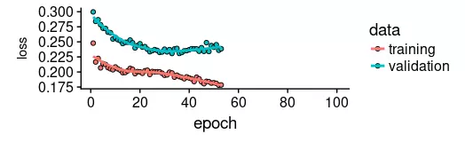
正如我们所见,训练在约 55 个周期后停止,因为验证集损失不再减少。我们还发现验证集上的表现比训练集上的性能差——通常表明过度拟合。
这个话题,我们将在另一个时间单独讨论,但有趣的是,使用更高 dropout 和 recurrent_dropout(与增加的模型容量相结合)的正则化并没有产生更好的泛化表现。这可能与我们在介绍中提到的这个特定时间序列的特征有关。
plot(history, metrics = "loss")
现在让我们看看该模型捕捉训练集特征的效果如何。
pred_train <- model %>%

    predict(

        X_train,

        batch_size = FLAGS$batch_size) %>%

    .[, , 1]


# Retransform values to original scale

pred_train <- (pred_train * scale_history + center_history) ^2

compare_train <- df %>%

    filter(key == "training")


# build a dataframe that has both actual and predicted values

for (i in 1:nrow(pred_train))

{

    varname <- paste0("pred_train", i)

    compare_train <- mutate(

        compare_train,

        !!varname := c(

            rep(NA, FLAGS$n_timesteps + i - 1),

            pred_train[i,],

            rep(NA,

                nrow(compare_train) - FLAGS$n_timesteps * 2 - i + 1)))

}
我们计算所有预测序列的平均 RSME。
coln <- colnames(compare_train)[4:ncol(compare_train)]

cols <- map(coln, quo(sym(.)))

rsme_train <- map_dbl(

    cols,

    function(col)

    {

        rmse(

            compare_train,

            truth = value,

            estimate = !!col,

            na.rm = TRUE)

    }) %>%

    mean()


rsme_train
21.01495
这些预测看起来如何?由于所有预测序列的可视化看起来会非常拥挤,我们会间隔地选择起始点。
ggplot(

    compare_train,

    aes(x = index, y = value)) +

    geom_line() +

    geom_line(aes(y = pred_train1), color = "cyan") +

    geom_line(aes(y = pred_train50), color = "red") +

    geom_line(aes(y = pred_train100), color = "green") +

    geom_line(aes(y = pred_train150), color = "violet") +

    geom_line(aes(y = pred_train200), color = "cyan") +

    geom_line(aes(y = pred_train250), color = "red") +

    geom_line(aes(y = pred_train300), color = "red") +

    geom_line(aes(y = pred_train350), color = "green") +

    geom_line(aes(y = pred_train400), color = "cyan") +

    geom_line(aes(y = pred_train450), color = "red") +

    geom_line(aes(y = pred_train500), color = "green") +

    geom_line(aes(y = pred_train550), color = "violet") +

    geom_line(aes(y = pred_train600), color = "cyan") +

    geom_line(aes(y = pred_train650), color = "red") +

    geom_line(aes(y = pred_train700), color = "red") +

    geom_line(aes(y = pred_train750), color = "green") +

    ggtitle("Predictions on the training set")
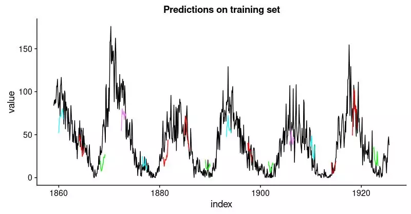
看起来像当好。对于验证集,我们并不认为有同样好的结果。
pred_test <- model %>%

    predict(

        X_test,

        batch_size = FLAGS$batch_size) %>%

    .[, , 1]


# Retransform values to original scale

pred_test <- (pred_test * scale_history + center_history) ^2

pred_test[1:10, 1:5] %>% print()

compare_test <- df %>% filter(key == "testing")


# build a dataframe that has both actual and predicted values

for (i in 1:nrow(pred_test))

{

    varname <- paste0("pred_test", i)

    compare_test <-mutate(

        compare_test,

        !!varname := c(

            rep(NA, FLAGS$n_timesteps + i - 1),

            pred_test[i,],

            rep(NA,

                nrow(compare_test) - FLAGS$n_timesteps * 2 - i + 1)))

}


compare_test %>% write_csv(

    str_replace(model_path, ".hdf5", ".test.csv"))

compare_test[FLAGS$n_timesteps:(FLAGS$n_timesteps + 10), c(2, 4:8)] %>%

    print()


coln <- colnames(compare_test)[4:ncol(compare_test)]

cols <- map(coln, quo(sym(.)))

rsme_test <- map_dbl(

    cols,

    function(col)

    {

        rmse(

            compare_test,

            truth = value,

            estimate = !!col,

            na.rm = TRUE)

    }) %>%

    mean()


rsme_test
31.31616
ggplot(

    compare_test,

    aes(x = index, y = value)) +

    geom_line() +

    geom_line(aes(y = pred_test1), color = "cyan") +

    geom_line(aes(y = pred_test50), color = "red") +

    geom_line(aes(y = pred_test100), color = "green") +

    geom_line(aes(y = pred_test150), color = "violet") +

    geom_line(aes(y = pred_test200), color = "cyan") +

    geom_line(aes(y = pred_test250), color = "red") +

    geom_line(aes(y = pred_test300), color = "green") +

    geom_line(aes(y = pred_test350), color = "cyan") +

    geom_line(aes(y = pred_test400), color = "red") +

    geom_line(aes(y = pred_test450), color = "green") +

    geom_line(aes(y = pred_test500), color = "cyan") +

    geom_line(aes(y = pred_test550), color = "violet") +

    ggtitle("Predictions on test set")
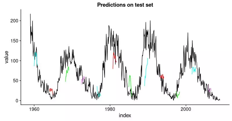
这不如训练集那么好,但也不错,因为这个时间序列非常具有挑战性。
在手动选择的示例分割中定义并运行我们的模型后,让我们现在回到我们的整体重新抽样框架。
在所有分割上回测模型
为了获得所有分割的预测,我们将上面的代码移动到一个函数中并将其应用于所有分割。它返回包含两个数据框的列表,分别对应训练和测试集,每个数据框包含模型的预测以及实际值。
obtain_predictions <- function(split)

{

    df_trn <- analysis(split)[1:800, , drop = FALSE]

    df_val <- analysis(split)[801:1200, , drop = FALSE]

    df_tst <- assessment(split)


    df <- bind_rows(

        df_trn %>% add_column(key = "training"),

        df_val %>% add_column(key = "validation"),

        df_tst %>% add_column(key = "testing")) %>%

        as_tbl_time(index = index)


    rec_obj <- recipe(

        value ~ ., df) %>%

        step_sqrt(value) %>%

        step_center(value) %>%

        step_scale(value) %>%

        prep()


    df_processed_tbl <- bake(rec_obj, df)


    center_history <- rec_obj$steps[[2]]$means["value"]

    scale_history  <- rec_obj$steps[[3]]$sds["value"]


    FLAGS <- flags(

        flag_boolean("stateful", FALSE),

        flag_boolean("stack_layers", FALSE),

        flag_integer("batch_size", 10),

        flag_integer("n_timesteps", 12),

        flag_integer("n_epochs", 100),

        flag_numeric("dropout", 0.2),

        flag_numeric("recurrent_dropout", 0.2),

        flag_string("loss", "logcosh"),

        flag_string("optimizer_type", "sgd"),

        flag_integer("n_units", 128),

        flag_numeric("lr", 0.003),

        flag_numeric("momentum", 0.9),

        flag_integer("patience", 10))


    n_predictions <- FLAGS$n_timesteps

    n_features <- 1


    optimizer <- switch(

        FLAGS$optimizer_type,

        sgd = optimizer_sgd(

            lr = FLAGS$lr, momentum = FLAGS$momentum))

    callbacks <- list(

        callback_early_stopping(patience = FLAGS$patience))


    train_vals <- df_processed_tbl %>%

        filter(key == "training") %>%

        select(value) %>%

        pull()

    valid_vals <- df_processed_tbl %>%

        filter(key == "validation") %>%

        select(value) %>%

        pull()

    test_vals <- df_processed_tbl %>%

        filter(key == "testing") %>%

        select(value) %>%

        pull()


    train_matrix <- build_matrix(

        train_vals, FLAGS$n_timesteps + n_predictions)

    valid_matrix <- build_matrix(

        valid_vals, FLAGS$n_timesteps + n_predictions)

    test_matrix <- build_matrix(

        test_vals, FLAGS$n_timesteps + n_predictions)


    X_train <- train_matrix[, 1:FLAGS$n_timesteps]

    y_train <- train_matrix[, (FLAGS$n_timesteps + 1):(FLAGS$n_timesteps * 2)]

    X_train <- X_train[1:(nrow(X_train) %/% FLAGS$batch_size * FLAGS$batch_size),]

    y_train <- y_train[1:(nrow(y_train) %/% FLAGS$batch_size * FLAGS$batch_size),]


    X_valid <- valid_matrix[, 1:FLAGS$n_timesteps]

    y_valid <- valid_matrix[, (FLAGS$n_timesteps + 1):(FLAGS$n_timesteps * 2)]

    X_valid <- X_valid[1:(nrow(X_valid) %/% FLAGS$batch_size * FLAGS$batch_size),]

    y_valid <- y_valid[1:(nrow(y_valid) %/% FLAGS$batch_size * FLAGS$batch_size),]


    X_test <- test_matrix[, 1:FLAGS$n_timesteps]

    y_test <- test_matrix[, (FLAGS$n_timesteps + 1):(FLAGS$n_timesteps * 2)]

    X_test <- X_test[1:(nrow(X_test) %/% FLAGS$batch_size * FLAGS$batch_size),]

    y_test <- y_test[1:(nrow(y_test) %/% FLAGS$batch_size * FLAGS$batch_size),]


    X_train <- reshape_X_3d(X_train)

    X_valid <- reshape_X_3d(X_valid)

    X_test <- reshape_X_3d(X_test)


    y_train <- reshape_X_3d(y_train)

    y_valid <- reshape_X_3d(y_valid)

    y_test <- reshape_X_3d(y_test)


    model <- keras_model_sequential()


    model %>%

        layer_lstm(

            units              = FLAGS$n_units,

            batch_input_shape  = c(

                FLAGS$batch_size, FLAGS$n_timesteps, n_features),

            dropout            = FLAGS$dropout,

            recurrent_dropout  = FLAGS$recurrent_dropout,

            return_sequences   = TRUE) %>%

        time_distributed(layer_dense(units = 1))


    model %>%

        compile(

            loss = FLAGS$loss,

            optimizer = optimizer,

            metrics = list("mean_squared_error"))


    model %>% fit(

        x          = X_train,

        y          = y_train,

        validation_data = list(X_valid, y_valid),

        batch_size = FLAGS$batch_size,

        epochs     = FLAGS$n_epochs,

        callbacks  = callbacks)


    pred_train <- model %>%

        predict(

            X_train,

            batch_size = FLAGS$batch_size) %>%

        .[, , 1]


    # Retransform values

    pred_train <- (pred_train * scale_history + center_history) ^ 2

    compare_train <- df %>% filter(key == "training")


    for (i in 1:nrow(pred_train))

    {

        varname <- paste0("pred_train", i)

        compare_train <- mutate(

            compare_train,

            !!varname := c(

                rep(NA, FLAGS$n_timesteps + i - 1),

                pred_train[i, ],

                rep(NA,

                    nrow(compare_train) - FLAGS$n_timesteps * 2 - i + 1)))

    }


    pred_test <- model %>%

        predict(

            X_test,

            batch_size = FLAGS$batch_size) %>%

        .[, , 1]


    # Retransform values

    pred_test <- (pred_test * scale_history + center_history) ^ 2

    compare_test <- df %>% filter(key == "testing")


    for (i in 1:nrow(pred_test))

    {

        varname <- paste0("pred_test", i)

        compare_test <- mutate(

            compare_test,

            !!varname := c(

                rep(NA, FLAGS$n_timesteps + i - 1),

                pred_test[i, ],

                rep(NA,

                    nrow(compare_test) - FLAGS$n_timesteps * 2 - i + 1)))

    }


    list(

        train = compare_train,

        test = compare_test)

}
将函数应用到所有分割上,得到一系列预测。
all_split_preds <- rolling_origin_resamples %>%

     mutate(predict = map(splits, obtain_predictions))
计算所有分割的 RMSE:
calc_rmse <- function(df)

{

    coln <- colnames(df)[4:ncol(df)]

    cols <- map(coln, quo(sym(.)))

    map_dbl(

        cols,

        function(col)

        {

            rmse(

                df, truth = value,

                estimate = !!col, na.rm = TRUE)

        }) %>%

        mean()

}


all_split_preds <- all_split_preds %>% unnest(predict)

all_split_preds_train <- all_split_preds[seq(1, 11, by = 2), ]

all_split_preds_test <- all_split_preds[seq(2, 12, by = 2), ]


all_split_rmses_train <- all_split_preds_train %>%

    mutate(rmse = map_dbl(predict, calc_rmse)) %>%

    select(id, rmse)


all_split_rmses_test <- all_split_preds_test %>%

    mutate(rmse = map_dbl(predict, calc_rmse)) %>%

    select(id, rmse)
这是 6 个分割的 RMSE。
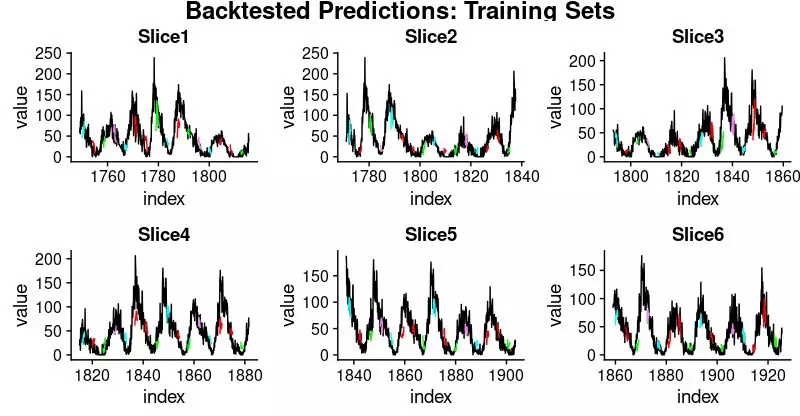
all_split_rmses_train
# A tibble: 6 x 2

  id      rmse

  <chr>  <dbl>

1 Slice1  22.2

2 Slice2  20.9

3 Slice3  18.8

4 Slice4  23.5

5 Slice5  22.1

6 Slice6  21.1
all_split_rmses_test
# A tibble: 6 x 2

  id      rmse

  <chr>  <dbl>

1 Slice1  21.6

2 Slice2  20.6

3 Slice3  21.3

4 Slice4  31.4

5 Slice5  35.2

6 Slice6  31.4
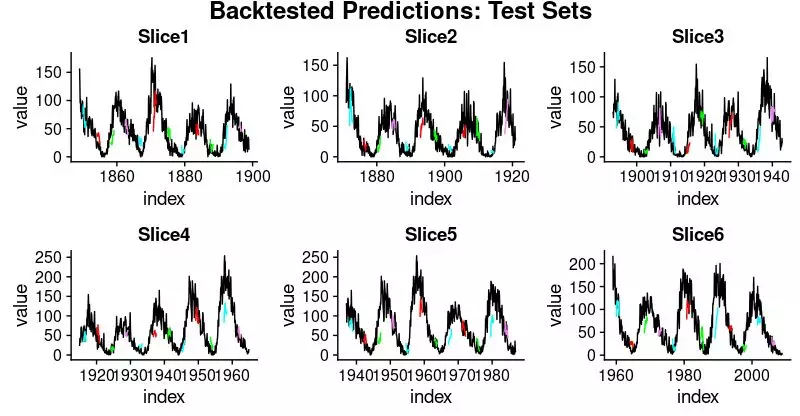
在这些数字中,我们看到了一些有趣的东西:时间序列的前三个分割上的泛化表现比后者更好。这证实了我们的印象,如上所述,数据似乎有一些隐藏的变化发展,这使预测更加困难。
这里是相应训练和测试集的预测可视化。
首先,训练集:
plot_train <- function(slice,

                       name)

{

    ggplot(

        slice,

        aes(x = index, y = value)) +

        geom_line() +

        geom_line(aes(y = pred_train1), color = "cyan") +

        geom_line(aes(y = pred_train50), color = "red") +

        geom_line(aes(y = pred_train100), color = "green") +

        geom_line(aes(y = pred_train150), color = "violet") +

        geom_line(aes(y = pred_train200), color = "cyan") +

        geom_line(aes(y = pred_train250), color = "red") +

        geom_line(aes(y = pred_train300), color = "red") +

        geom_line(aes(y = pred_train350), color = "green") +

        geom_line(aes(y = pred_train400), color = "cyan") +

        geom_line(aes(y = pred_train450), color = "red") +

        geom_line(aes(y = pred_train500), color = "green") +

        geom_line(aes(y = pred_train550), color = "violet") +

        geom_line(aes(y = pred_train600), color = "cyan") +

        geom_line(aes(y = pred_train650), color = "red") +

        geom_line(aes(y = pred_train700), color = "red") +

        geom_line(aes(y = pred_train750), color = "green") +

        ggtitle(name)

}


train_plots <- map2(

    all_split_preds_train$predict,

    all_split_preds_train$id, plot_train)

p_body_train  <- plot_grid(

    plotlist = train_plots, ncol = 3)

p_title_train <- ggdraw() +

    draw_label(

        "Backtested Predictions: Training Sets",

        size = 18, fontface = "bold")


plot_grid(

    p_title_train, p_body_train,

    ncol = 1,

    rel_heights = c(0.05, 1, 0.05))
接着是测试集:
plot_test <- function(slice,

                      name)

{

    ggplot(

        slice, aes(x = index, y = value)) +

        geom_line() +

        geom_line(aes(y = pred_test1), color = "cyan") +

        geom_line(aes(y = pred_test50), color = "red") +

        geom_line(aes(y = pred_test100), color = "green") +

        geom_line(aes(y = pred_test150), color = "violet") +

        geom_line(aes(y = pred_test200), color = "cyan") +

        geom_line(aes(y = pred_test250), color = "red") +

        geom_line(aes(y = pred_test300), color = "green") +

        geom_line(aes(y = pred_test350), color = "cyan") +

        geom_line(aes(y = pred_test400), color = "red") +

        geom_line(aes(y = pred_test450), color = "green") +

        geom_line(aes(y = pred_test500), color = "cyan") +

        geom_line(aes(y = pred_test550), color = "violet") +

        ggtitle(name)

}


test_plots <- map2(

    all_split_preds_test$predict,

    all_split_preds_test$id, plot_test)


p_body_test  <- plot_grid(

    plotlist = test_plots, ncol = 3)

p_title_test <- ggdraw() +

    draw_label(

        "Backtested Predictions: Test Sets",

        size = 18, fontface = "bold")


plot_grid(

    p_title_test, p_body_test,

    ncol = 1, rel_heights = c(0.05, 1, 0.05))

这是一个很长的帖子,必然会留下很多问题,首先是我们如何获得好的超参数设置(学习率、周期数、dropout)? 我们如何选择隐含状态的长度?或者甚至,我们能否直观了解 LSTM 在给定数据集上的表现(具有其特定特征)?我们将在未来的文章中解决上述问题。
往期回顾

公众号后台回复关键字即可学习
回复 爬虫 爬虫三大案例实战
回复 Python 1小时破冰入门回复 数据挖掘 R语言入门及数据挖掘
回复 人工智能 三个月入门人工智能
回复 数据分析师 数据分析师成长之路
回复 机器学习 机器学习的商业应用
回复 数据科学 数据科学实战
回复 常用算法 常用数据挖掘算法