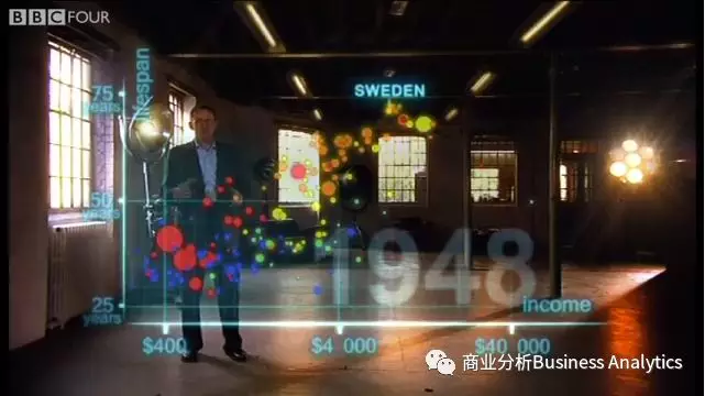
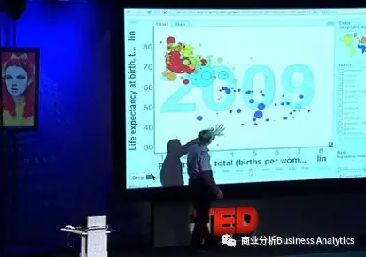
相信不少读者老爷们都看过这个视频。在视频中,统计学家Hans Rosling使用华丽炫目的动态数据可视化生动地展示了各个国家的预期寿命与收入在近200年间的变化。
事实上,制作动态数据可视化并没有你想象中那么难。今天小R就带着大家用R语言来制作动态数据可视化!
gganimate介绍
gganimate是基于ggplot2的动态可视化拓展包。它立足于在绘图上几乎无所不能的ggplot的语句,但拓展了其绘图语法,从而实现动态可视化的功能。其原理是模仿ggplot的渲染方式,继而通过将每一帧(frame)的绘图通过渲染函数,组合成最终的动画效果。
默认的渲染结果为gif,但如果使用者不喜欢gif,其他格式的渲染结果如视频文件ffmpeg也是可供使用的。你甚至可以自己编写自己想要渲染器。
gganimate最初由David Robinson开发。但由于其功能有限,约在今年7月份,旧的gganimate被放弃,改为使用更为完备的语法的新版gganimate。新版gganimate由Thomas Lin Pedersen开发,其中比较大的变化是与ggplot有了更好的融合,不再需要依赖aes()指定geom_*()的调用中的帧的成员资格,也不再需要额外的函数gganimate()去启动动态图的渲染。
以下为新旧版本gganimate代码的差异:
# Old code
ggplot(mtcars) +
  geom_boxplot(aes(factor(cyl), mpg, frame = gear))
# New code
ggplot(mtcars) +
  geom_boxplot(aes(factor(cyl), mpg)) +
  transition_manual(gear)
因此,此前在网络上分享的其他gganimate教程、经验分享的代码基本上都无法运行(除非你坚持拒绝更新包)。

安装教程
小R我安装gganimate的过程可谓是命途多舛,这也是为什么当我发现以前的经验文章中的代码运行不了时,第一时间想到的不是代码过时了,而是我的下载又出问题了。
这里分享大致的下载流程,并总结一下我下载的过程中遇到的一些比较棘手的问题,以避免读者老爷们浪费了过多的时间在gganimate包的安装上,以至于失去了学习该包的热情。
在安装gganimate包之前,需要本地提前安装好ImageMagick这个软件。搜索一下ImageMagick,便可到其官网下载。
但这个过程非常复杂且极其容易出错,想挑战自己的读者老爷们可以去试一试;嫌麻烦的读者老爷可关注本公众号,在后台回复Image Magick,获取ImageMagick的安装包。
由于gganimate仍在CRAN上发布,因此只能够通过Github安装。安装过程如下:
install.packages("devtools")
library(devtools)
install_github("thomasp85/gganimate")
gganimate的安装还需要使用Rtools。幸运的读者老爷们可能能够一次性安装成功,但可能有的读者老爷会遇到和小R一样的问题:”Rtools 3.5 found on the path at ... is not compatible with R 3.5.1”。可是Rtools 3.5已经是最新的版本了,这让小R非常不解、郁闷。

通过和Thomas的交谈,确定了非gganimate包的问题后,小R在Stackoverflow发现了问题所在:Rtools安装包确实将C:\Rtools\bin加入了环境变量Path里(安装时的按钮),但却没有将C:\Rtools\mingw_64\bin加入到Path中,从而导致了Rstudio识别Rtools时产生问题。
总而言之,这是Rtools本身的问题,这个问题从R3.5便已经存在。读者老爷们可以使用下面的代码进行错误修复(如果是32bits的电脑需要更改为相应版本的路经):
# Set path of Rtools
Sys.setenv(PATH = paste(Sys.getenv("PATH"), "*InstallDirectory*/Rtools/bin/", "*InstallDirectory*/Rtools/mingw_64/bin", sep = ";")) #for 64 bit version Sys.setenv(BINPREF = "*InstallDirectory*/Rtools/mingw_64/bin")

library(devtools)
#Manually "force" version to be accepted
assignInNamespace("version_info", c(devtools:::version_info, list("3.5" = list(version_min = "3.3.0", version_max = "99.99.99", path = "bin"))), "devtools") find_rtools()  # is TRUE now
# Now you can install gganimate
devtools::install_github("thomasp85/gganimate")
至此,安装过程应该没有其他比较难解决的问题了。
实战案例
首先先加载一些需要用到的包。其中,gapminder包包含我们需要用到的全球主要国家在1952-2007年的人均GDP增长、预期寿命以及人口增长的数据。这份数据与dslabs包中的gapminder同名,是后者的清洗后版本。
library(gapminder)
library(gganimate)
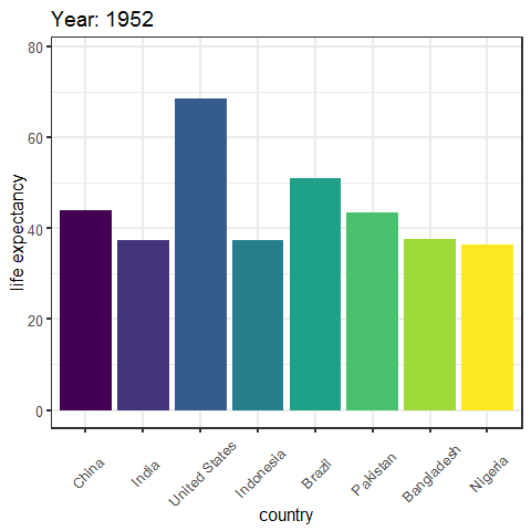
我们先绘制一个简单的动态柱状图。该柱状图反映了1952-2007年间,世界前八人口大国(以2007年数据排序)的预期寿命的变化。
#提取绘图需要的数据
temp.gapminder = gapminder
select.country = c(as.character(head(temp.gapminder$country[temp.gapminder$year==2007][order(temp.gapminder$pop[temp.gapminder$year==2007],decreasing = TRUE)],8)))
temp.gapminder = temp.gapminder[temp.gapminder$country %in% select.country,]
temp.gapminder$country = factor(temp.gapminder$country, order = TRUE, levels = select.country)

##制作Gif
p = ggplot(temp.gapminder, aes(country, lifeExp, fill=country)) +
  geom_bar(stat= 'identity', position = 'dodge',show.legend = FALSE) +
  theme(axis.text.x = element_text(angle = 45, hjust = 0.5, vjust = 0.5)) +
  # Here comes the gganimate specific bits
  labs(title = 'Year: {frame_time}', x = 'country', y = 'life expectancy') +
  transition_time(year) +
  ease_aes('linear')
P
anim_save("C:/Users/Ricardo/Desktop/gganimate/")
Gif结果如下:
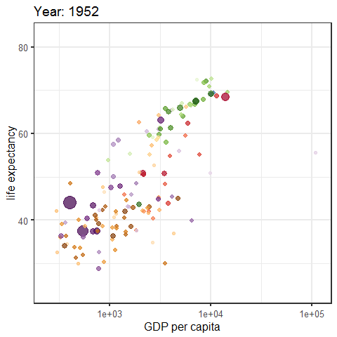
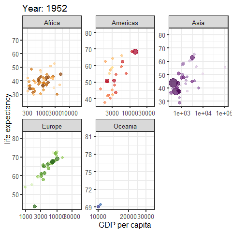
接着,我们再绘制一个动态散点图。该散点图反映了不同国家在1952-2007年间,各国家预期寿命与人均GDP的变化。其中圆圈大小为人口数量,不同颜色指不同大洲。
p = ggplot(gapminder, aes(gdpPercap, lifeExp, size = pop, colour = continent)) +
  geom_point(alpha = 0.7) +
  scale_colour_manual(values = continent_colors) +
  scale_size(range = c(2, 12)) +
  scale_x_log10() +
  # Here comes the gganimate code
  labs(title = 'Year: {frame_time}', x = 'GDP per capita', y = 'life expectancy') +
  transition_time(year) +
  ease_aes('linear')
p
anim_save("C:/Users/Ricardo/Desktop/gganimate/")
Gif结果如下:
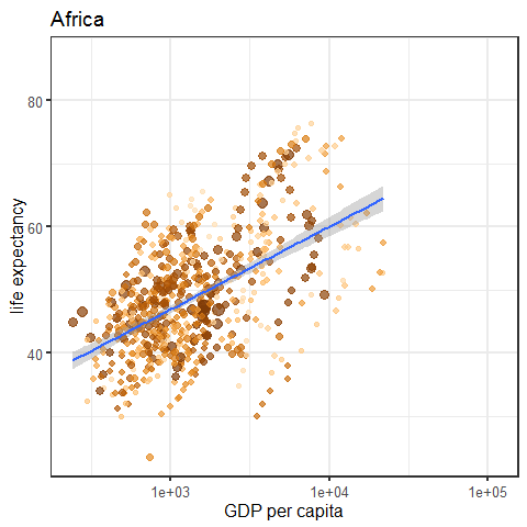
如果我们想看不同大洲预期寿命与人均GDP的相关性的差异呢?该动态转换的变量为离散变量,因此我们需要用到transition_states():
p = ggplot(gapminder, aes(gdpPercap, lifeExp, size = pop, colour = country)) +
  geom_point(alpha = 0.7, show.legend = FALSE) +
  scale_colour_manual(values = country_colors) +
  scale_size(range = c(2, 12)) +
  scale_x_log10() +
  geom_smooth(aes(group= continent), method = "lm", show.legend = FALSE)+
  # Here comes the gganimate code
  labs(title = '{previous_state}', x = 'GDP per capita', y = 'life expectancy') +
  transition_states(
    continent,
    transition_length = 2,
    state_length = 1
    )
p
anim_save("C:/Users/Ricardo/Desktop/gganimate/")
Gif结果如下:
“小孩子才做选择题,我两个都要!”
如果想既要看到预期寿命与人均GDP随时间的变化,又要清晰地看到不同大洲相关性的差异,那么我们可以用ggplot的facet_wrap()将图形分块:
p = ggplot(gapminder, aes(gdpPercap, lifeExp, size = pop, colour = country)) +
  geom_point(alpha = 0.7, show.legend = FALSE) +
  scale_colour_manual(values = country_colors) +
  scale_size(range = c(2, 12)) +
  scale_x_log10() +
  facet_wrap(~continent, scales = "free") +
  # Here comes the gganimate specific bits
  labs(title = 'Year: {frame_time}', x = 'GDP per capita', y = 'life expectancy') +
  transition_time(year) +
  ease_aes('linear')
p

anim_save("C:/Users/Ricardo/Desktop/gganimate/")
Gif结果如下:
最后,我们使用dslabs包中完整的gapminder数据,重现Hans Rosling在他的TED演讲“关于贫穷的新发现”(New Insights on Poverty)中展示的动画。
以下代码基于哈佛大学应用统计学教授Rafael Irizarry提供的旧版gganimate代码,改进为可以运行的新版gganimate代码:
library(tidyverse)
library(dslabs)
library(gganimate)

data(gapminder)

west = c("Western Europe","Northern Europe","Southern Europe",
         "Northern America","Australia and New Zealand")
gapminder = gapminder %>%
  mutate(group = case_when(
    .$region %in% west~"The West",
    .$region %in% c("Eastern Asia","South-Eastern Asia")~"East Asia",
    .$region %in% c("Caribbean","Central America","South America")~"Latin America",
    .$continent=="Africa"&.$region!="Northern Africa"~"Sub-Saharan Africa",
    TRUE ~ "Others"))
gapminder = gapminder %>%
  mutate(group=factor(group,levels=rev(c("Others","Latin America","East Asia","Sub-Saharan Africa","The West"))))

theme_set(theme_bw(base_size=16))
years = seq(1962,2013)
p = filter(gapminder,year%in%years&!is.na(group)&
             !is.na(fertility)&!is.na(life_expectancy))%>%
  mutate(population_in_millions = population/10^6)%>%
  ggplot(aes(fertility,y=life_expectancy,
             col=group,size=population_in_millions))+
  geom_point(alpha=0.8)+
  guides(size=FALSE)+
  theme(legend.title=element_blank())+
  coord_cartesian(ylim=c(30,85))+
  # Here comes the gganimate specific bits
  labs(title = 'Year: {frame_time}',x = 'Fertility rate(births per woman)', y = 'Life Expectancy') +
  transition_time(year) +
  ease_aes('linear')
P
anim_save("C:/Users/Ricardo/Desktop/gganimate/")
Gif结果如下:
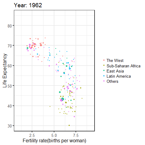
于是问题来了:蛇皮走位的绿色小球,猜猜是哪个国家?
参考资料
[1]https://github.com/thomasp85/gganimate
[2]https://stackoverflow.com/questions/35399182/using-gg-animate-to-create-a-gif?noredirect=1
[3]https://stackoverflow.com/questions/50182443/rtools-3-5-not-recognized
[4]https://stackoverflow.com/questions/52038499/cant-transition-title-or-transition-time-depending-on-using-transition-states-o
[5]https://community.rstudio.com/t/error-dependency-transformr-is-not-available-for-package-gganimate/11134/6
[6]http://bigdata.51cto.com/art/201708/549565.htm
[7]https://www.ted.com/talks/hans_rosling_reveals_new_insights_on_poverty?language=en
欢迎大家加入QQ群一起探讨学习


如需联系EasyCharts团队
请加微信:EasyCharts
【书籍推荐】《Excel 数据之美--科学图表与商业图表的绘制》
【手册获取】国内首款-数据可视化参考手册:专业绘图必备
【必备插件】 EasyCharts -- Excel图表插件
【网易云课堂】 Excel 商业图表修炼秘笈之基础篇