
本文选用一个比较大的贷款数据集进行简单的探索分析,主要目的是想让读者体会到经典的ggplot2和交互式plotly工具的区别。plotly的主要优点就是图形色彩比较炫酷、支持图形共享和在线操作等,但是其占用内存比较大,相对来说比较占用内存。
本文的绘图大致上就是交替使用ggplot2和plotly绘制图做对比,方便大家去区分图。
## 加载所需的程序包
library(readr)

library(dplyr)

library(ggplot2)

library(lubridate)

library(plotly)
使用reader包就是为了使用read_csv函数去快速的读取数据,因为此数据比较大,使用常用的read.csv或者是fread都是比较慢的。使用fread读取需要了将近28秒,read_csv读取使用了15秒,read.csv就不敢尝试了,太慢了。
## 读取数据
loan <- read_csv(file.choose())
## 筛选变量
loan_new <-

  loan %>%

  select(c(loan_amnt, grade, home_ownership,

           loan_status, issue_d, int_rate))
在进行变量筛选的时候,我建议使用dplyr包中的select函数,最直接的一个优点就是变量名不需要加“”,然后其还更加灵活,比如正则匹配等更多功能大家可以查看帮助文档。
## 数据预处理(一)
## 重塑issue_dy和issue_dm两个变量

loan_new <-

  loan_new %>%

  mutate(issue_dn = dmy(paste0("", loan_new$issue_d)),

         issue_dy = as.factor(year(issue_dn)),

         issue_dm = as.factor(month(issue_dn)))


## 提取所有的字符型变量,并且批量转换为因子型

chr_vars <-  names(which(sapply(loan_new, class) == "character"))

loan_new[chr_vars] <- lapply(loan_new[chr_vars], as.factor)
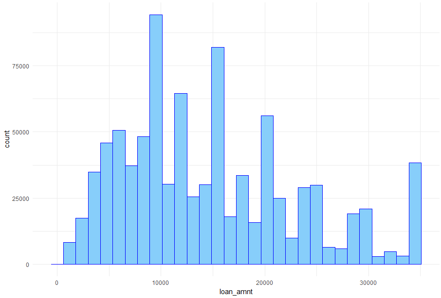
## 探索贷款金额的分布
## 使用ggplot2绘制直方图

loan_new %>%

  ggplot(aes(x = loan_amnt)) +

  geom_histogram(fill = '#87CEFA', colour = 'blue') +

  theme_minimal()
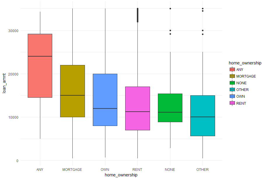
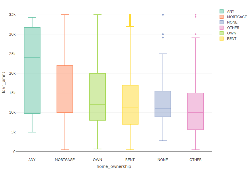
## 探索房屋所有权和贷款金额的关系
## 使用ggplot2直接绘图

loan_new %>%

  ggplot(aes(x = reorder(home_ownership, -loan_amnt, median),

             y = loan_amnt, fill = home_ownership)) +

  geom_boxplot() +

  labs(x = 'home_ownership') +

  theme_minimal()
## 将ggplot函数绘图的结果传入ggplotly函数中,绘制互动图表

(loan_new %>%

    ggplot(aes(x = reorder(home_ownership, -loan_amnt, median),

               y = loan_amnt, fill = home_ownership)) +

    geom_boxplot() +

    labs(x = 'home_ownership') +

    theme_minimal()) %>%

  ggplotly()
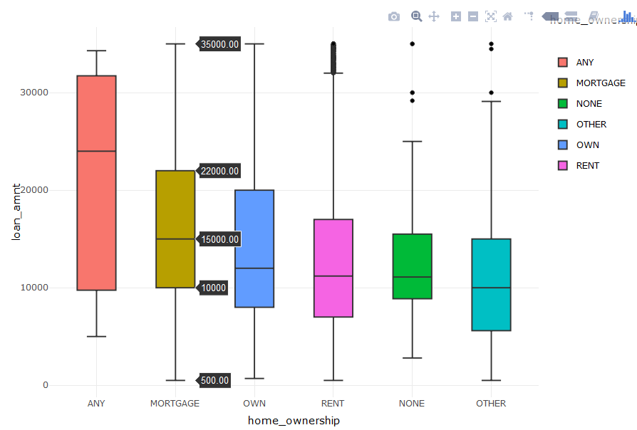
上面的普通箱线图与这个互动的图表相比就显得low一点了,但是绘图所需时间则相对长了一些。下面直接调用plotly的plot_ly函数绘制箱线图,大家对比一下:
## plot_ly函数绘图

plot_ly(loan_new,

        x = ~reorder(home_ownership, -loan_amnt, median),

        y = ~loan_amnt,

        color = ~home_ownership,

        type = "box") %>%

  layout(xaxis = list(title = 'home_ownership'))


## 如果不需要横轴的重排序,只用一行代码就可以绘制漂亮的互动箱线图

plot_ly(loan_new, y = ~loan_amnt, color = ~home_ownership, type = 'box')
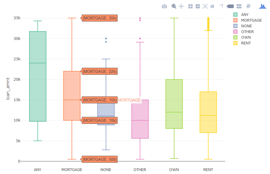
plotly的图就是炫酷,没得说,代码也比较简单灵活。
## 探索这几年贷款金额的变化
plot_ly(loan_new, y = ~loan_amnt, color = ~issue_dy, type = "box")
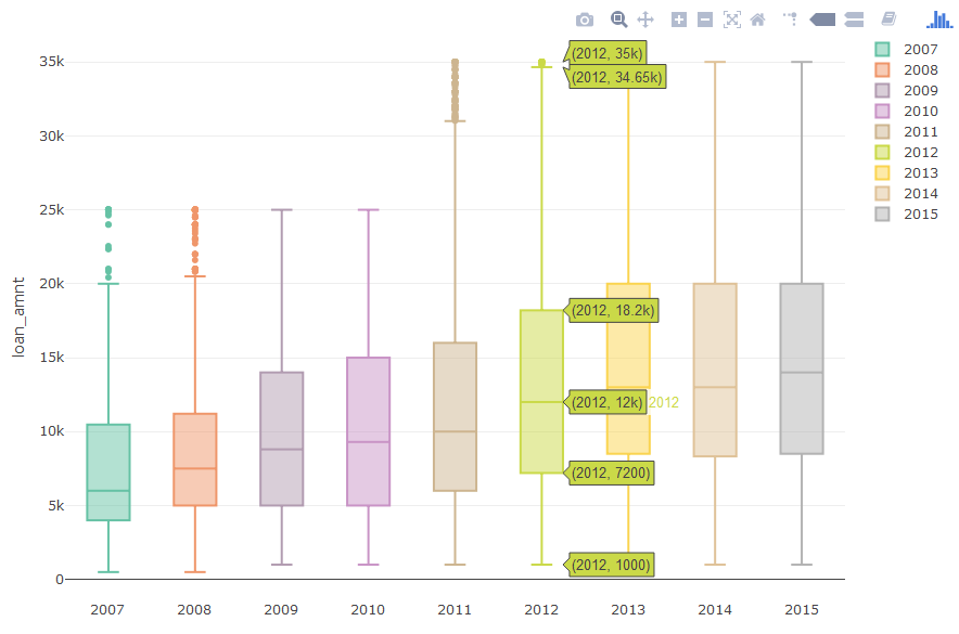
在一定程度上,从此箱线图可以看出从2007年到2015年的贷款金额在不断的增加。下面我们绘制条形图去验证,我们的分析是否是正确的:
loan_new %>%

  group_by(issue_dy) %>%

  summarise(amount = sum(loan_amnt)) %>%

  ggplot(aes(x = issue_dy, y = amount, fill = issue_dy)) +

  geom_bar(stat = 'identity') +

  theme_minimal()


loan_new %>%

  ggplot(aes(x = issue_dy, y = loan_amnt, fill = issue_dy)) +

  stat_summary(fun.y = "sum", geom = "bar") +

  theme_minimal()
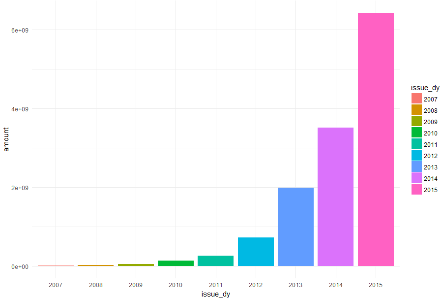
上面的两段绘图代码的功能是一样的,但是因为数据量的大小会导致效率不同,比较推荐大家使用先统计再绘图的代码,相对来说比较节约时间。下面呢,使用plot_ly函数绘制条形图:
loan_new %>%

  group_by(issue_dy) %>%

  summarise(amount = sum(loan_amnt)) %>%

  plot_ly(y = ~amount, x = ~issue_dy, color = ~issue_dy, type = "bar")
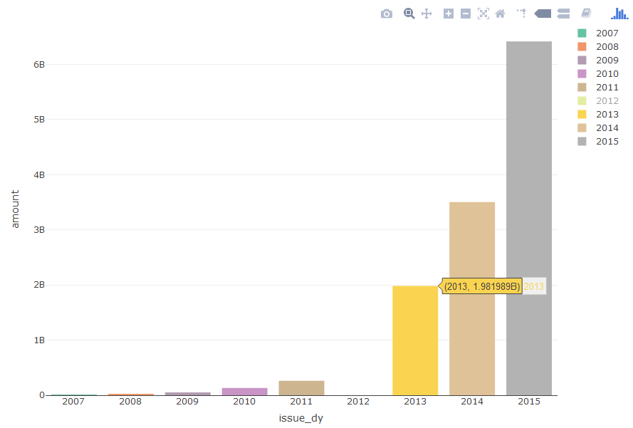
就是这几行简单的代码,这个互动条形图就绘制出来了。细心的读者会发现,2012年为什么没有贷款总额。如果你再细心点,就会发现右上角图例中的2012变为了灰色。那是由于我在图例中单击了一下2012,所以会隐藏2012年的统计图。再点击一次就会重新显示出来,不知道这个小技巧大家知道不知道。当然呢,我们还可以在图中选取需要显示的部分,方法就是在图中尝试去按住左键不放拖动鼠标。
## 探索贷款利率与贷款等级的关系
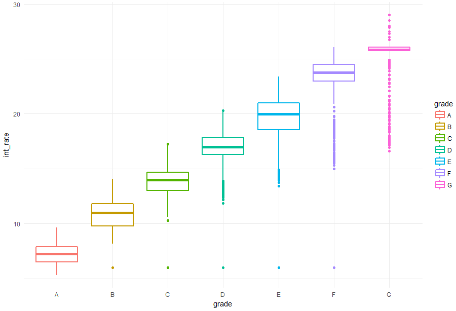
loan_new %>%

  ggplot(aes(x = grade, y = int_rate, color = grade)) +

  geom_boxplot(size = 1) +

  theme_minimal()
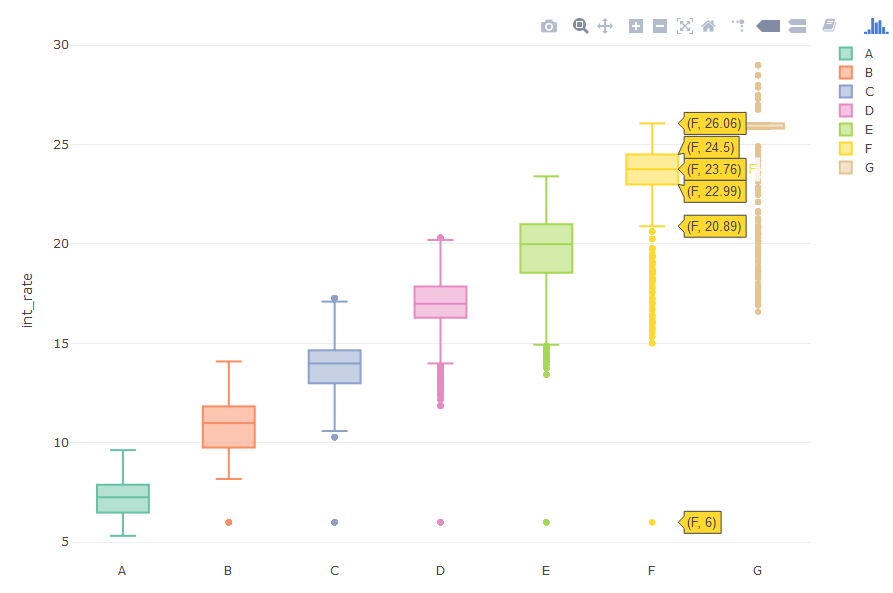
plot_ly(loan_new, y = ~int_rate, color = ~grade, type = "box")
## 探索利率与年份和月份的关系
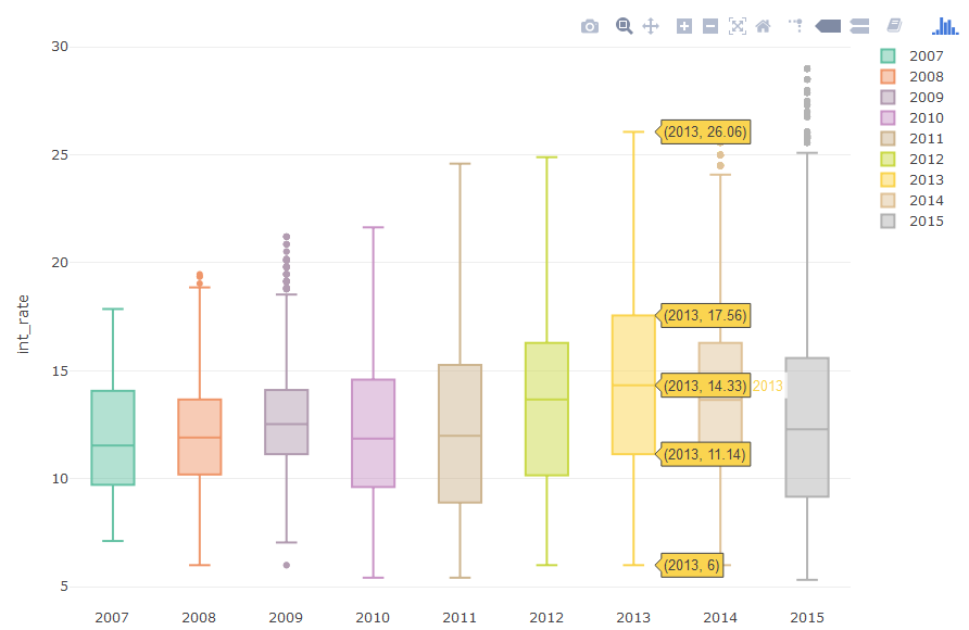
plot_ly(loan_new, y = ~int_rate, color = ~issue_dy, type = "box")
plot_ly(loan_new, y = ~int_rate, color = ~issue_dm, type = "box")
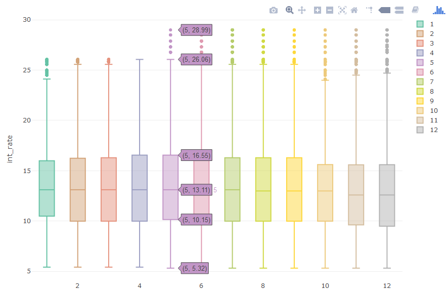
通过上面对不同年份和月份的贷款利率的探索,发现两个变量与利率的关系并不明显,尤其是月份。但是从一定程度上还是可以看出,近几年的利率还是略有上升的,后半年的利率有一些离群点。
## 统计还款状态的事件数
table(loan_new$loan_status)


loan_new <- within(loan_new, {

  loan_status_new <- ''


  loan_status_new[loan_status == 'In Grace Period'] <- 'Grace'


  loan_status_new[loan_status == 'Issued' | loan_status == 'Default'] <- 'Other'


  loan_status_new[

    loan_status == 'Charged Off' |

      loan_status == 'Does not meet the credit policy. Status:Charged Off'

    ] <- 'Charged Off'


  loan_status_new[

    loan_status == 'Fully Paid' |

      loan_status == 'Does not meet the credit policy. Status:Fully Paid' |

      loan_status == 'Current'

    ] <- 'Fully Paid'


  loan_status_new[

    loan_status == 'Late (16-30 days)' |

      loan_status == 'Late (31-120 days)'

    ] <- 'Late'

})


loan_new %>%

  group_by(loan_status_new) %>%

  summarise(counts = n()) %>%

  plot_ly(labels = ~loan_status_new,

          values = ~counts,

          type = 'pie',

          textposition = 'inside',

          textinfo = 'label+percent',

          insidetextfont = list(color = '#FFFFFF'))
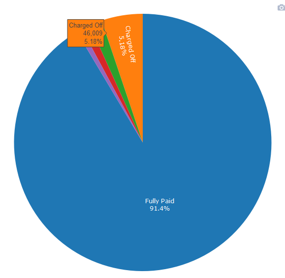
饼图虽然说是查看数据比例的一个好图,但是并不是什么数据都适合的。比如说目前这个饼图就非常丑,其次就是把一个饼分成很多很多很多份,密密麻麻啥也看不清楚。然后呢,下面绘制一副条形图,同样表达出饼图的信息:
loan_new %>%

  group_by(loan_status_new) %>%

  summarise(counts = n()) %>%

  mutate(percent = paste0(round(counts/sum(counts), 4)*100, '%')) %>%

  plot_ly(type = 'bar',

          hoverinfo = 'text',

          x = ~reorder(loan_status_new, -counts),

          y = ~counts,

          color = ~loan_status_new,

          text = ~paste(loan_status_new, '\n',

                        counts, '\n',

                        percent)) %>%

  layout(xaxis = list(title = 'loan_status_new'))
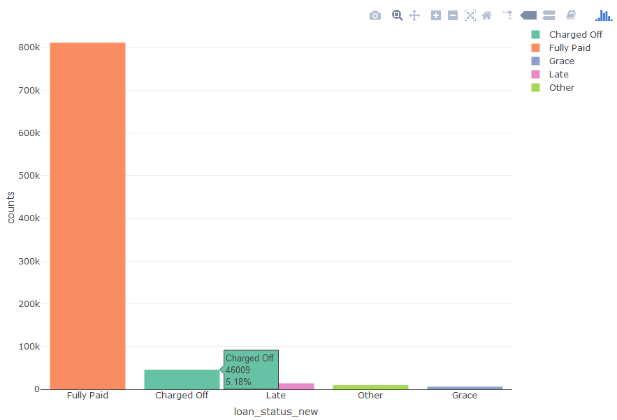
为了在条形图中显示出比例,我们进行了统计、字符串拼接等操作,所以显得这个条形图代码比较复杂,但是如果去拆分代码的话,思路还是很简单的。
注:本案例不提供数据集,如果要学习完整案例,点击文章底部阅读原文或者扫描课程二维码,购买包含数据集+代码+PPT的《kaggle十大案例精讲课程》,购买学员会赠送文章的数据集。
《kaggle十大案例精讲课程》提供代码+数据集+详细代码注释+老师讲解PPT!综合性的提高你的数据能力,数据处理+数据可视化+建模一气呵成!