引言
附视频链接: 天善智能Kaggle十大案例精讲(连载中) 有代码有课件,可以实操。欢迎学习!!
案例背景
介绍:Our example concerns a big company that wants to understand why some of their best and most experienced employees are leaving prematurely. The company also wishes to predict which valuable employees will leave next.
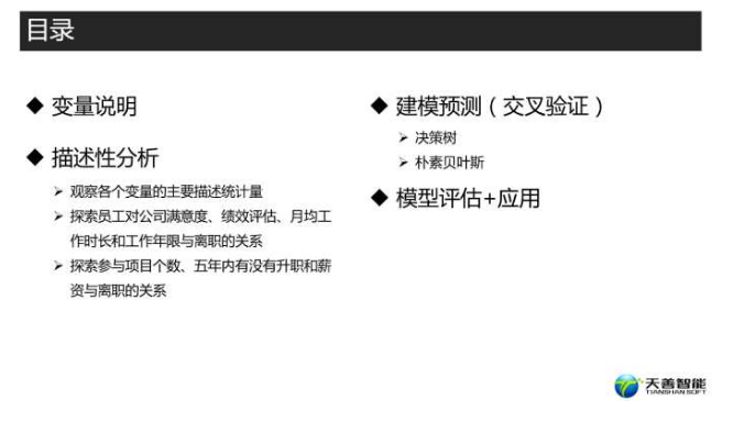
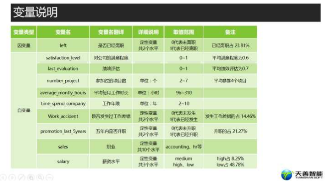
变量说明
################### ============== 加载包 =================== #################
library(plyr) # Rmisc的关联包,若同时需要加载dplyr包,必须先加载plyr包
library(dplyr) # filter()
library(ggplot2) # ggplot()
library(DT) # datatable() 建立交互式数据表
library(caret) # createDataPartition() 分层抽样函数
library(rpart) # rpart()
library(e1071) # naiveBayes()
library(pROC) # roc()
library(Rmisc) # multiplot() 分割绘图区域
################### ============= 导入数据 ================== #################
hr <- read.csv("D:/R/天善智能/书豪十大案例/员工离职预测\\HR_comma_sep.csv")
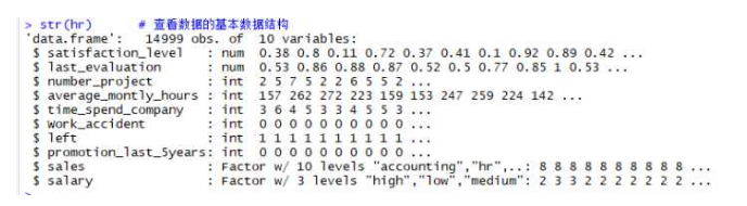
str(hr) # 查看数据的基本数据结构
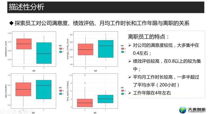
描述性分析
################### ============= 描述性分析 ================== ###############


str(hr)      # 查看数据的基本数据结构

summary(hr)  # 计算数据的主要描述统计量


# 后续的个别模型需要目标变量必须为因子型,我们将其转换为因子型

hr$left <- factor(hr$left, levels = c('0', '1'))


## 探索员工对公司满意度、绩效评估和月均工作时长与是否离职的关系

# 绘制对公司满意度与是否离职的箱线图

box_sat <- ggplot(hr, aes(x = left, y = satisfaction_level, fill = left)) +

            geom_boxplot() +

            theme_bw() +  # 一种ggplot的主题

            labs(x = 'left', y = 'satisfaction_level') # 设置横纵坐标标签


box_sat
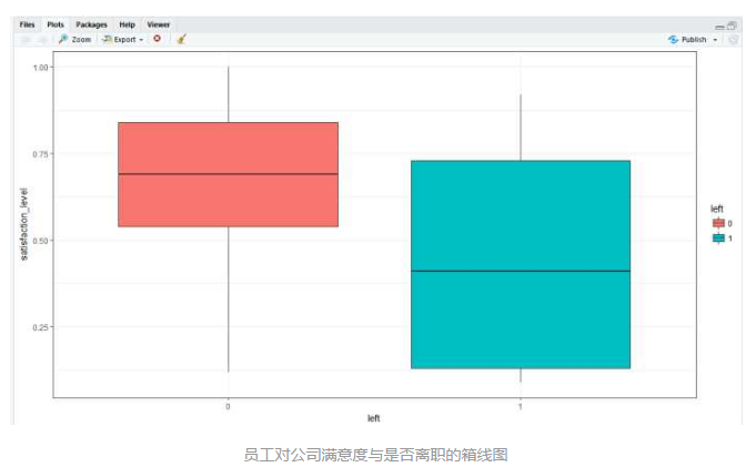
离职员工对公司的满意度较低,大多集中在0.4左右;
# 绘制绩效评估与是否离职的箱线图

box_eva <- ggplot(hr, aes(x = left, y = last_evaluation, fill = left)) +

             geom_boxplot() +

             theme_bw() +

             labs(x = 'left', y = 'last_evaluation')


box_eva
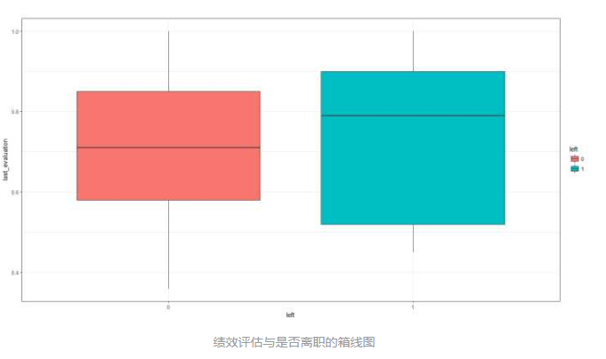
离职员工的绩效评估较高,在0.8以上的较为集中;
# 绘制平均月工作时长与是否离职的箱线图

box_mon <- ggplot(hr, aes(x = left, y = average_montly_hours, fill = left)) +

             geom_boxplot() +

             theme_bw() +

             labs(x = 'left', y = 'average_montly_hours')


box_mon
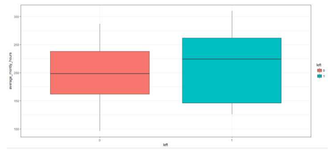
离职员工的平均月工作时长较高,一多半超过了平均水平(200小时)
# 绘制员工在公司工作年限与是否离职的箱线图

box_time <- ggplot(hr, aes(x = left, y = time_spend_company, fill = left)) +

  geom_boxplot() +

  theme_bw() +

  labs(x = 'left', y = 'time_spend_company')


box_time
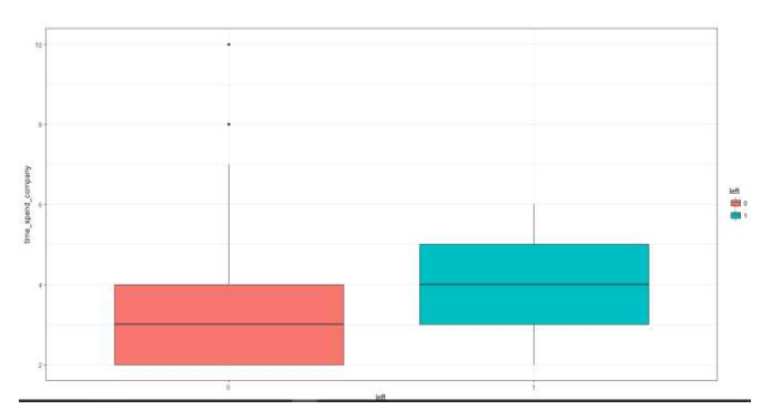
离职员工的工作年限在4年左右
# 合并这些图形在一个绘图区域,cols = 2的意思就是排版为一行二列

multiplot(box_sat, box_eva, box_mon, box_time, cols = 2)
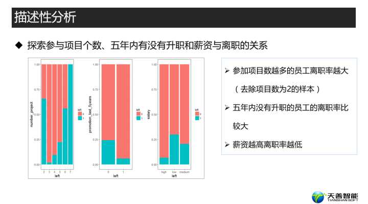
## 探索参与项目个数、五年内有没有升职和薪资与离职的关系

# 绘制参与项目个数条形图时需要把此变量转换为因子型

hr$number_project <- factor(hr$number_project,

                            levels = c('2', '3', '4', '5', '6', '7'))


# 绘制参与项目个数与是否离职的百分比堆积条形图

bar_pro <- ggplot(hr, aes(x = number_project, fill = left)) +

             geom_bar(position = 'fill') + # position = 'fill'即绘制百分比堆积条形图

             theme_bw() +

             labs(x = 'left', y = 'number_project')


bar_pro
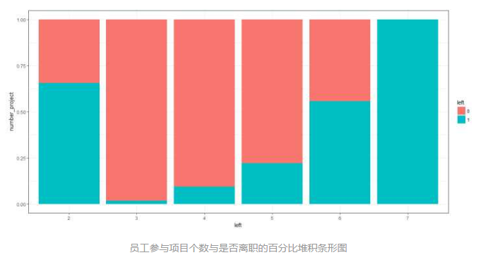
参加项目数越多的员工离职率越大(去除项目数为2的样本)
# 绘制5年内是否升职与是否离职的百分比堆积条形图

bar_5years <- ggplot(hr, aes(x = as.factor(promotion_last_5years), fill = left)) +

                geom_bar(position = 'fill') +

                theme_bw() +

                labs(x = 'left', y = 'promotion_last_5years')


bar_5years
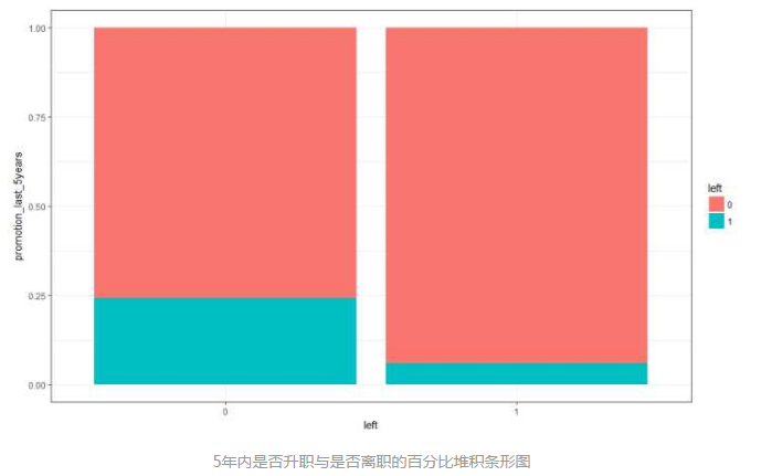
五年内没有升职的员工的离职率比较大
# 绘制薪资与是否离职的百分比堆积条形图

bar_salary <- ggplot(hr, aes(x = salary, fill = left)) +

                geom_bar(position = 'fill') +

                theme_bw() +

                labs(x = 'left', y = 'salary')


bar_salary
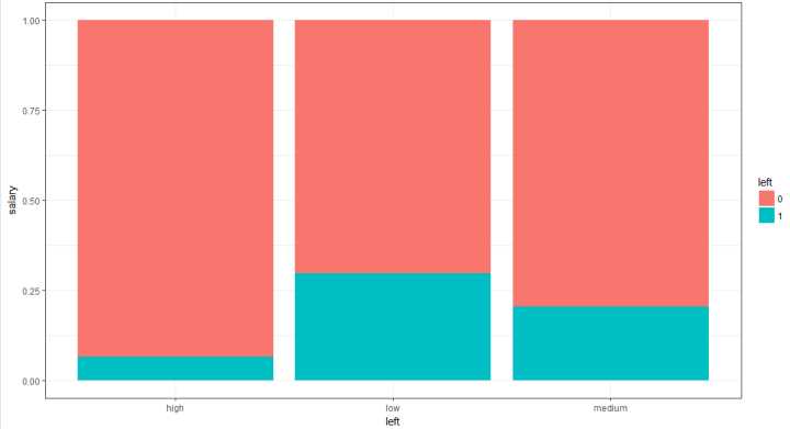
薪资越高离职率越低
# 合并这些图形在一个绘图区域,cols = 3的意思就是排版为一行三列

multiplot(bar_pro, bar_5years, bar_salary, cols = 3)
建模预测之回归树
############## =============== 提取优秀员工 =========== ###################


# filter()用来筛选符合条件的样本

hr_model <- filter(hr, last_evaluation >= 0.70 | time_spend_company >= 4

                   | number_project > 5)


############### ============ 自定义交叉验证方法 ========== ##################


# 设置5折交叉验证 method = ‘cv’是设置交叉验证方法,number = 5意味着是5折交叉验证

train_control <- trainControl(method = 'cv', number = 5)
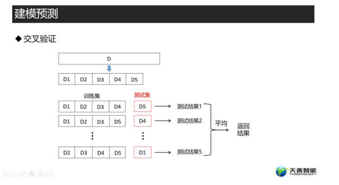
################ =========== 分成抽样 ============== ##########################
set.seed(1234) # 设置随机种子,为了使每次抽样结果一致
# 根据数据的因变量进行7:3的分层抽样,返回行索引向量 p = 0.7就意味着按照7:3进行抽样,
# list=F即不返回列表,返回向量
index <- createDataPartition(hr_model$left, p = 0.7, list = F)
traindata <- hr_model[index, ] # 提取数据中的index所对应行索引的数据作为训练集
testdata <- hr_model[-index, ] # 其余的作为测试集
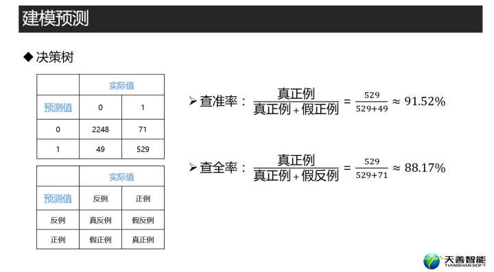
##################### ============= 回归树 ============= #####################
# 使用caret包中的trian函数对训练集使用5折交叉的方法建立决策树模型
# left ~.的意思是根据因变量与所有自变量建模;trCintrol是控制使用那种方法进行建模
# methon就是设置使用哪种算法
rpartmodel <- train(left ~ ., data = traindata,
trControl = train_control, method = 'rpart')
# 利用rpartmodel模型对测试集进行预测,([-7]的意思就是剔除测试集的因变量这一列)
pred_rpart <- predict(rpartmodel, testdata[-7])
# 建立混淆矩阵,positive=‘1’设定我们的正例为“1”
con_rpart <- table(pred_rpart, testdata$left)
con_rpart


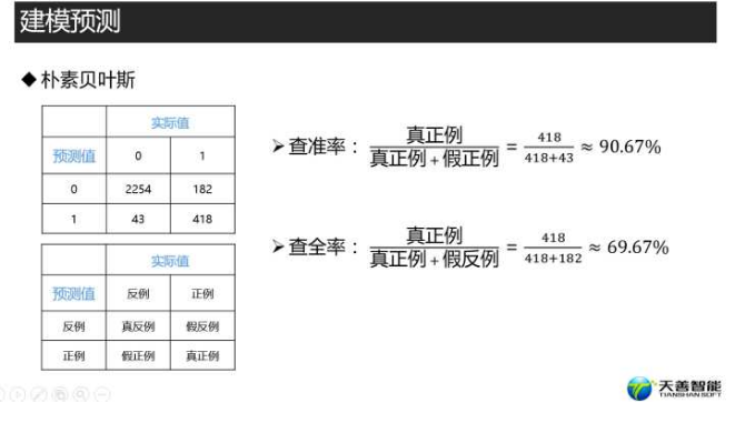
建模预测之朴素贝叶斯
################### ============ Naives Bayes =============== #################


nbmodel <- train(left ~ ., data = traindata,

                    trControl = train_control, method = 'nb')


pred_nb <- predict(nbmodel, testdata[-7])


con_nb <- table(pred_nb, testdata$left)

con_nb
模型评估+应用
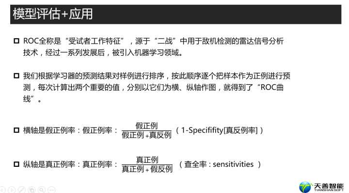

################### ================ ROC ==================== #################
# 使用roc函数时,预测的值必须是数值型
pred_rpart <- as.numeric(as.character(pred_rpart))
pred_nb <- as.numeric(as.character(pred_nb))
roc_rpart <- roc(testdata$left, pred_rpart) # 获取后续画图时使用的信息
#假正例率:(1-Specififity[真反例率])
Specificity <- roc_rpart$specificities # 为后续的横纵坐标轴奠基,真反例率
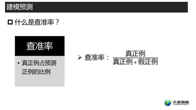
Sensitivity <- roc_rpart$sensitivities # 查全率 : sensitivities,也是真正例率
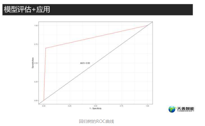
# 绘制ROC曲线
#我们只需要横纵坐标 NULL是为了声明我们没有用任何数据
p_rpart <- ggplot(data = NULL, aes(x = 1- Specificity, y = Sensitivity)) +
geom_line(colour = 'red') + # 绘制ROC曲线
geom_abline() + # 绘制对角线
annotate('text', x = 0.4, y = 0.5, label = paste('AUC=', #text是声明图层上添加文本注释
#‘3’是round函数里面的参数,保留三位小数
round(roc_rpart$auc, 3))) + theme_bw() + # 在图中(0.4,0.5)处添加AUC值
labs(x = '1 - Specificity', y = 'Sensitivities') # 设置横纵坐标轴标签
p_rpart
roc_nb <- roc(testdata$left, pred_nb)

Specificity <- roc_nb$specificities

Sensitivity <- roc_nb$sensitivities

p_nb <- ggplot(data = NULL, aes(x = 1- Specificity, y = Sensitivity)) +

          geom_line(colour = 'red') + geom_abline() +

          annotate('text', x = 0.4, y = 0.5, label = paste('AUC=',

          round(roc_nb$auc, 3))) + theme_bw() +

          labs(x = '1 - Specificity', y = 'Sensitivities')


p_nb

回归树的AUC值(0.93) > 朴素贝叶斯的AUC值(0.839)
最终我们选择了回归树模型做为我们的实际预测模型
######################### ============= 应用 =============####################


# 使用回归树模型预测分类的概率,type=‘prob’设置预测结果为离职的概率和不离职的概率

pred_end <- predict(rpartmodel, testdata[-7], type = 'prob')


# 合并预测结果和预测概率结果

data_end <- cbind(round(pred_end, 3), pred_rpart)


# 为预测结果表重命名

names(data_end) <- c('pred.0', 'pred.1', 'pred')


# 生成一个交互式数据表

datatable(data_end)
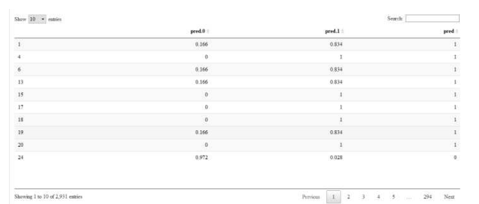
最终我们会生成一个预测结果表
预测结果表第一列代表:员工不离职概率(pred.0)
预测结果表第二列代表:员工离职概率(pred.1)
预测结果表第三列代表:员工是否离职(pred)